Trent, by Dino Stamatopoulos and Leah Tiscione
2017
Hands down, the weirdest thing I've read in years.
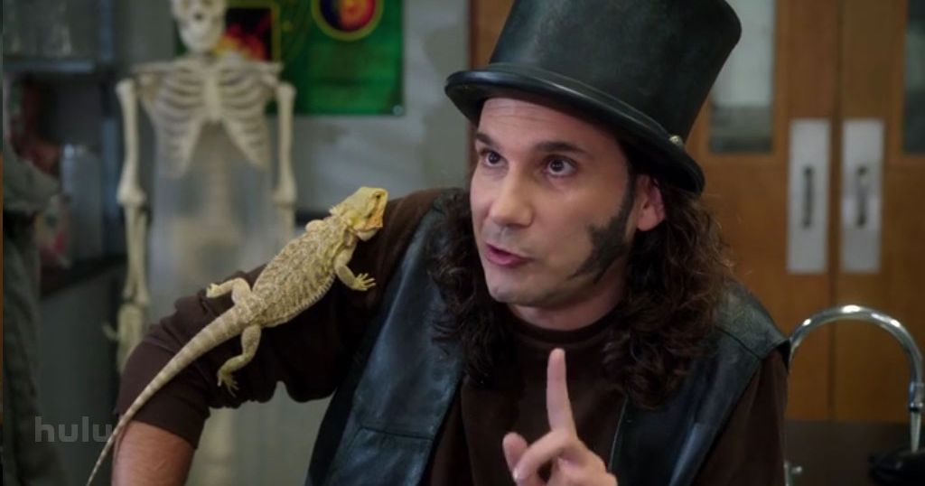
Dino Stamatopoulos is not famous, but he is well-known to comedy nerds as Starburns on Community and even better known to ultra-comedy nerds as one of the main writers on the legendary HBO sketch comedy Mr. Show.
 |
| Was Starburns the greatest thing about a great show? |
He's a writer more often than a performer, but for years, if his name came up on a project, I'd check it out. So yeah, I was interested in buying Trent, and bought it not knowing it was a musical comic book about a dead baby.
It's a musical comic book about a dead baby.
 |
| In case you missed that on the cover |
It wasn't going to be a home run. It's just too far out of the range of regular comics, neither fish nor fowl as the expression goes. Before even discussing what I thought of it, I need to explain how it works.
 |
| The yellow box signals track one |
The book is in black and white, but it shifts into color at certain segments. The color segments are musical, the black and white pages are plain comics. A track notification of what song to play from their website shows up with the color.
That site hosts the eight songs that appear in the book, which are mainly performed by Scott Adsit and Britta Phillips. Adsit is probably best known from his role on the sitcom 30 Rock and is an all around strong performer. Phillips was a name I didn't know, but she was actually singing in a very heartfelt way, and it turns out she was in the band Luna, a great little band in the 90's. The songs are all musical theater in nature, so it's nothing I would listen to outside of the experience of this comic, but it wasn't in any way amateur.
 |
| For the most part, Trent has no face |
And so, Trent tells the story of a couple who weren't excited to have a baby, have one that dies, and they learn to love the corpse. It's morbid humor. The chorus of the first song is, "I hope it's alive."
The art by Tiscione is professional and well done, but it's not a style I enjoy. It seems like a style that might be in appear in a magazine to be read by people who don't usually read comics. I think the concept of the book needed to have 'straight' comic art. It's a book about normal people doing something very abnormal, so having art which leaned into the comedy would make it all less shocking and strange. So it's suitable and well done, just not exciting. Her art style wouldn't be out of place in a Muppets comic.
The book attempts to get into the head of people who are attempting to love a child they hardly knew, and there is room for pathos. The book gets a back cover blurb by none other than screenwriter Charlie Kaufman, who calls the book "touching." And there are poignant points, but it is buried in a lot of goofiness. If you enjoy the goofiness and the art, probably the whole package will be appealing though.
 |
| The grandparents are hooded puppeteers focused on one thing only |
I love Mr. Show, but even there, the musical numbers were usually my least favorite sketches, (until the tenth watch when they sometimes become beloved). And though I've seen comics with soundtracks before, not with musical numbers; this was different. Stamatopoulos wrote this as a comedic play 25 years ago, and self published it through SBI (Starburns Industries). It's a labor of love, but it's hard to call this successful, it reads like theater adapted to comics. It would have worked better as an animated special for Comedy Central. Any time a book comes with instructions, it can't be much more than a novelty.
I don't even dislike it either. It's just weird.


No comments:
Post a Comment