Showing posts with label homework. Show all posts

Tuesday, May 4, 2021

I Really Should Read This 27: Human Diastrophism, by Gilbert Hernandez

Human Diastrophism, by Gilbert Hernandez

1985-1995

That's two collections down, and another five to go.


This book is from the omnibus style collections, and contains the graphic novel Human Diastrophism, plus another 150 pages of comics. All are set in or in relation to Hernandez's fictional town of Palomar, and the intertwined lives of dozens of its residents. 

Things are back to normal!
Right up front, I really wish I'd read this twenty years ago. It is a phenomenal piece of work. I sampled some Love and Rockets issues in the late 1990's, and I found them hard to latch onto. By that point, the characters in both Gilbert and Jaime's stories had hundreds of pages of stories behind them, their writing was building off history that I simply hadn't read and I was lost. I probably had about eight issues that I half-heartedly read, and gave up on them until buying my first of these omnibuses about four years back. I loved the The Girl From HOPPERS and soon voraciously read all I could of Jaime's work, but had a hard time with the first Palomar collection and put it back on my shelf for a year or two unread.
There is storytelling at work here
Thanks to COVID-19 upending everything, I dramatically increased my reading time and made a commitment to finally get through that first collection around New Years... and I loved it. I had the enthusiasm that you get when you just can't enjoy something other people love but then something finally clicks and it works, and you wonder what the problem ever was.

Silhouettes are used liberally

With the Palomar stories, I know some of the things that kept made it a hard book for me to get into. For one, the cast of characters is huge, and following a story can be confusing. He has a character guide for each book, and I made use of it a few times. The second is that I still find something off about his inking. It's tight, and his drawing is great, but I still don't love the overall aesthetic. A third thing was his focal character Luba. She is a massive-chested woman, and as a reader, much like all the male characters in the books, that is all you notice at first. I had an issue or two of Luba, and I just didn't get it. After reading the first Palomar stories, which include Luba's introduction to the town, I saw her as a well-rounded and complicated character in a way I just didn't see at all in my first exposure to her.

A wordless sequence about crossing a trench becomes a statement of Luba's frustration and impotence regarding her new lover
At this point, I get what the fuss is about. Hernandez' art still isn't something I drool over like I do with his brother, but he has other points that I find incredible. His storytelling techniques are so potent, walking a fine line between camp, dreams and pathos. So much of what he does here would be told as talking heads by other artists. Hernandez uses old school panel design to amp up the drama of his story. And he fleshes out all his characters, even if it's just to give them a single motivation. Almost all the characters portrayed in his town are flawed and weak. Most are decent, but they are not perfect and usually do things they regret. It's very humanistic storytelling.  
Hernandez builds a real history in Palomar, the people don't forget their past
So what's this collection all about? It is sprawling, covering the lives of the people of the small Latin American town of Palomar across twenty years. There's a 100-page graphic novel tucked inside the larger 250-page collection that tells the story of a serial killer in the town, while the second half of the collection has a number of stories focusing on Luba's half-sisters in America. Much like Jaime's work with Maggie and Hopey, though there are mini-arcs, there isn't a larger arc other than these people living their lives. There is a difference here though, in that with Jaime's stuff, time is occurring roughly along with the real world. Gilbert's Palomar shifts and jumps. That's part of what makes following the story require a character reference page. A character who's ten years old in one story might be 23 in the next and takes some adjustment from the reader to follow. 
Probably his best creation, the one-armed Casimira
Some stories are 30 pages, some are five, some are single pages. The book was done over a ten year period, and you see Hernandez shifting his storytelling style and his focus of characters as he goes. I'm sure a lot of it was simply to keep the making of comics a fresh activity for himself. As a reader, it goes a long way to keeping the book novel. One of the treats of the book is seeing a character like Guadalupe, one of Luba's daughters, go from a little kid hanging out in the corners of a story to being a central character with a kid of her own. I've heard of Palomar being compared to Gabriel Garcia Marquez's One Hundred Years of Solitude, and at the level of them both being about rural Spanish speaking towns, it's not a useful comparison, but in terms of them both showing generations of development, it's apt.
Hernandez takes a stylistic departure to give a dense character sketch of Pipo
Palomar has it's own specific weirdness as well. For the most part, I wouldn't call the book surreal, but there are peculiarities. Tontazin selling her slugs. Her sister Diana who overdevelops whichever muscle she trains. Luba's handsome lover Khamo who becomes a burn victim, at which point they settle down together. Casimira, who was shot out of a tree as a toddler, runs around the town wielding her artificial arm. It's weird stuff, generally in the realm of "truth is stranger than fiction" weird rather than feeling explicitly like a writer's touch. And that's so important in a work like this to keep it from feeling cutesy or twee.
Young Fritz at home with her sister is a sad portrayal of neglect
Hernandez's Latino heritage gives him an ability to comfortably navigate both American and Latin American culture without any awkwardness. Later chapters taking place in California don't have the lived in quality of Palomar, but that's city life, where there are way more people you don't know then people you know. 
Maria's back story captures some 1950's goofiness. Fantastic use of negative space in those first two panels
As for the art, it's unfair to compare him to his brother Jaime, the tightest comic artist alive. Gilbert has great art as well, particularly in the layout. His characters occupy just the right amount of panel, the story progresses at a solid clip, and he's not afraid to reposition everything for the sake of a solid panel. Contemporary artists often try to do something more natural, as if the panel was a camera, and that's not Gilbert's school of work. As much as a camera-style perspective can be effective, it can also be boring, and the panel composition here is never boring. His pages have a lot of punch.
The book is not exactly magical realism, but there is room for poetry in the it
So, I'm into it. I'm going to get the rest of the Gilbert Hernandez Love & Rockets omnibuses, slowly over the next few years. This stuff is good, and is the kind of comic that resonates long after reading.

Friday, April 23, 2021

I Really Should Read This 26: Hellboy in Hell, Omnibus vol. 4, by Mike Mignola

Hellboy in Hell, Omnibus vol. 4, by Mike Mignola

2018

Sometimes I just want to review a comic, and sometimes I have a hot take: Hellboy in Hell is the closest I've seen a mainstream comic come to applying Chris Ware's techniques.


Up front, yeah, I know the Dave Aja issue of Hawkeye where he copied Chris Ware, but that was a straight single issue homage, not an omnibus collection.

There are six Hellboy omnibuses, the first four of which make up the main saga, and two more which have odds and ends. I ended up starting with book three and have read this one, book four, which acts as a conclusion. 

I liked it but I don't think I'll be buying more of these books at full price. Or maybe I will for ones that Mignola draws himself. I've been spending a lot and need to think about my purchases. The thing is, I bought the original Hellboy Seeds of Destruction issues in the 90s and dropped off them because the story wasn't what I wanted, and here too, the story was beside the point. That said, twenty years had passed between when Mignola drew that story and when he drew Hellboy in Hell, and it seems like he's gotten better. I don't know. I loved his work from the start when I saw it in Rocket Raccoon and his work across Marvel on odds and ends. And I bought Gotham by Gaslight off the stands. But I haven't sat down with his work and given it much thought in twenty years. So maybe the stuff I'm going to talk about here is applicable to his old work. But the work here seems to come from an artist who's been doing the daily practice of art for decades, and is working from his mind rather than a concrete script.

And the book is all the better for it. This is definitely a case of it not what happens that makes it good, but how it's told.

The lower left and upper right panels bleed off the page, the lower left one showing something tucked away in the town, the upper right showing the sky just outside the town. The girl in the window, the family portrait, and the corpse and snake act like mini-sequences within

The story is: Hellboy has died and he's gone to Hell. Hell in this case is conceived as different layers of existence, ending with a city ruled by demons on a lake of fire. Something like that. He throws out lots of mythology, and I got the gist of it, but it was the least interesting part of the book. Hellboy disrupts this by being the one to rule Hell and lead... Anyway, Hellboy has no interest in it. In another book, I'd hate this all with a passion, but as Mignola tells it, it's a kind of gothic prog-rock poetry.

The feeling I was left with at the end was of the musicality of it all. While there is distinct storytelling going on, pages are interspersed with images to create ambiance and rhythm. Mignola uses a technique where pages are drawn on a grid, with no diagonal panels that I noticed, and usually one "framing" panel that bleeds off the page. Within the page, he often uses blocks of panels of one theme, like mini sequences within the larger sequence of the page.

The cat growing in size from panel to panel is a hard thing to convey

These sequences are accented by Dave Stewart's color (who I was praising only days ago for his Daredevil work). I get why Mignola's name is the one on the cover, but Stewart kind of should have been on there too. Flashbacks are used throughout and Stewart's color in these sequences help create a rhythm.

Ten panels on the page, five of them silent
As I finished the main story, I was a little surprised. The "climax" happened in captions and a few images, rather than bloated sequences. Then the story tapered into a denouement of Hellboy on an overcast beach and entering a house. It all felt pretty abstract for an action book. It had a feeling of musicality. 

The second and third panels without a gutter to signify a flashback was a neat little technique
Mignola has some notes at the end of the book where he states he had more issues planned, but as he was coming to the end, he felt it was ready to be wrapped up. And I could see that for the sake of the story, he could have shown more of the end of Hell, but I got what he meant. Hellboy had experienced and learned what he was going to in the story, and the stuff he yadda-yadda'ed over was to resolve a story, but not necessarily going to make it more satisfying to see in action.

A four-page sequence mid-story is done in a watercolor style, and reads like the eye of the (quiet) storm

With Chris Ware, I read interviews with him decades ago where he stated two things: that comics had rhythm and that he let his pages go where they naturally seemed to go. His work can be criticized as boring, and if you're looking for a standard plot with a resolution in his books, you will likely be bored. His pages are about the rhythm and the experience. I think that's where Mignola has gone with his storytelling. He has made a lot of space in his comics to give the atmosphere its own panels. While a lot of panels give story progress, a lot of them don't. A lot of pages would tell the content of the story with multiple panels removed. 

In this sequence, the top left panel on right page has no story-driven reason to exist
Of course the content of the story is important to, to give the reader something to grasp, but having so many superfluous panels creates a more spacious atmosphere, and makes the comic more than merely a story delivery system. It gives you the space to really enjoy the comic form itself.

I really liked this, and my curiosity is to see if this is what Mignola was already doing 20 years ago, like in the Jungle Adventure or Seeds of Destruction. He may well have and I was not that clued into the nuance of how stories were told back when I first read them. I have to imagine that he was somewhat more conventional in his storytelling. With those original Hellboy, he didn't trust himself enough to script them by himself, and he was building up confidence as a writer. With Hellboy in Hell, he had the confidence to substantially change his plan mid-story because of what felt right. He went with the rhythm of the story.

Thursday, April 22, 2021

I Really Should Read This 25: The Collected Toppi: North America, by Toppi

The Collected Toppi: North America, by Toppi

1977-2007, collected in 2020

This is my first time writing about Toppi, it won't be my last.

Magnetic Collection love their rounded corners

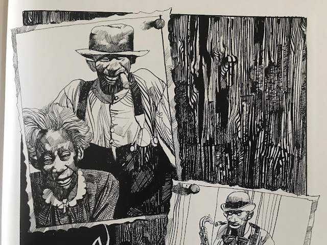
Over and over again, algorithms kept recommending Toppi to me based on what I do online, and about the 20th time, I took the machine's advice and checked it out, and it turns out it was what I wanted to read. I wonder if I had seen this some of this stuff 30 years ago in Heavy Metal or somewhere, but if I had, I was too young to really appreciate it. 

The stories in this volume range from 1976 to 2007, but most fall in the 70s and 80s
So, right up front, regardless of the quality of the writing, people are going to buy this for the art. Toppi draws the hell out of everything.

A shaman 
Every panel of every page is finely detailed and designed. I have no doubt that he got to a point in his art that he could produce this way without a lot of conscious planning: the textures, patches, spirals and strokes that make up his page have an organic quality like forms in nature have. I think that's the strength of it, his pages reflect the design of nature itself, like shapes in physics and biology. It's gorgeous to look at.

Not a lot of artists could make the grain of a wooden door look so compelling.
And there's more to it than just the images. He designs every page and panel to work with each other. Some combinations work better than others, but the guy has a rhythm of his own.

The inversion of positive and negative space between panels one and two is simple but striking, and lets the figures in the second jump out

Repeatedly as I read, I had to pause and take in how he was telling the story as much as I took in the stories themselves.
The bottom panels ascend in height as the characters ascend a slope
One other thing that stands out about his pages is that the panels are repeatedly broken, usually just a little, but it makes pages work as a unit rather than a collection of panels. Just a slight overlap here and there, but it prevents the panels from being rearranged. He's built a form-fitting construction of images.

The fourth panel commands the page by being the biggest, but it also does so by having the house slightly overlap into the first and third panel

This series, The Collected Toppi, is not typical of artist retrospectives. Often, books are done sequentially, with periods of an artist's work presented together. This series is by theme, with this book being North American stories. Other books feature Asia, Japan (technically Asia, but I get it, Japan gets more romanticized than the rest of the continent), South America, Africa, and a general fantasy theme one. Even within the book, the stories are not arranged sequentially. It frustrates the OCD part of me, but across 30 years Toppi's style was mostly consistent, so it isn't jarring to me as a reader. 

For the most part, North America means 19th century stories featuring white settlers and First Nations indigenous, with two stories in the volume about magical negroes, for lack of a better term. In some of the indigenous stories, the people have "magic", not in all. This is the writing of a man born in Italy in 1932, writing about the world, and so he worked in a lot of tropes verging on stereotypes. I'm fully aware of the contemporary discussion of topics in English Western culture, but I've also lived in Asia for 20 years and am aware that people in many countries enjoy their romanticized images of far away lands. The writing is not malicious in any way that I could notice, and generally had sympathy for the horror show that is the settlement of North America.

An Italian view of America's natives

That said, if today the Disney Corporation were to make a movie on the 19th century indigenous person's experiences, they're unlikely to consult the writing of a post-war Italian writer at any part of the process. 

I'm not going to say I'm blown away by the stories in here. These are largely old fashioned stories. These reminded me of Farley Mowat stories I might have read as a kid. In elementary school in Canada, here and there we would read tales of pioneers and explorers in Upper Canada. So they aren't super fresh to me now, but it's not a genre of story I see much in comics or film, so on that level, it's a change of pace.

A story with a samurai immigrant is colored with something like watercolors

What I like in the stories here is that there isn't a set morality or pattern of story. This isn't Uncle Scrooge where at the end of every story will have Uncle Scrooge rich and Donald Duck poor. A story where a man is warned to leave in peace could (and does) go a number of ways. He leaves and reflects on his wise decision. Or he doesn't leave and pays the price. Or he doesn't leave, and he deflates a myth and lives a long life. Toppi wasn't making stories in a clear tradition, and if there is any moral to the stories, it's that every story is different and one size doesn't fit all.


Ultimately though, if Toppi weren't drawing these stories, they'd be of limited appeal. Without his line work, they'd lose so much of their gravitas. 

There are four of these Toppi collections published, with two more on the way. I'm getting all of them. Maybe they'll start to feel repetitive after a few, but with the two I've read, I think that the six will be a very good amount of his stories and I may be interested in getting more.

Sunday, April 18, 2021

I Really Should Read This 24: MIND MGMT Omnibus 1, by Matt Kindt

 MIND MGMT Omnibus 1, by Matt Kindt

2012, collected in 2019

This is another one I'd been wanting to read, and now I have! Or have I?

Kindt does cool stuff with the graphics, and it's not just neat-looking design; it taps into the books themes
I get why some people really like this book. I have some really positive things to say about it. But there are some things that hold it back too and kept me from loving it. I wanted to read this mainly because of the name and the cover. It's a great name and Kindt has a lot of clever ideas. He's got some big fans too, his back cover blurbs are from Brian Michael Bendis, David Goyer, and Damien Lindloff, all people who've reached the pinnacle of success in their chosen field, which says a lot for the quality of the book. 
If you look close and turn your head, you can read some stuff on the side
The MIND MGMT is a secret organization that pulls the strings of society. Sometimes it's very directly, wiping people's minds or inciting action, and sometimes it's subtle, like subliminal content in media to trigger effects. Kindt has created multiple layers of paranoia, like someone catalogued all the doped-up high school students in America's theories about what "they" do. In the 12 issues collected in this book, he packs a lot of weird variations on psychic manipulation: suggestion, mind reading of the general vicinity as a form of future prediction, the power to write advertising that directly manipulates, self-healing by willpower. If you show any form of potential psychic power, chances are you will be recruited by the MIND MGMT organization.
How could they be so heartless as to use a cat?
He layers in history pages between issues that give a better scope of the organization and its history, and gives short biographies of key members. He also throws in fake advertising that captures the themes of the book. He's created a dense story for the world these characters live in. 

The thing that held me back from loving this was the art, and I hate to say that, because Kindt is doing it himself. He's done a few omnibuses worth of work, so his heart is into it, and he's a proper auteur. But I couldn't get with it. And I think he's fully aware that some people feel this way.
He's fully aware that some people feel this way
I have very broad tastes in comic art, and I was trying to like it more, but my main sense was that it lacked form. And the watercolor washes don't have enough variety in them from scene to scene or location to location. The book is printed on a powerful beige color that seeps though. Especially compared to the last book I read, which was also coincidentally watercolors, MIND MGMT looks muddy.

I liked the lettering he did, but every word balloon is perfect oval, and that didn't work with the art, which is extremely loose. I don't think I've ever seen perfect ovals used in a comic from a major publisher. 
The parody ads in the first half of the collection are jarring in their realism, compared to the rest of the book
He does parody ads in the book and the first half look like they were yanked from a magazine. It's a nice idea, but they don't suit the aesthetics of the book. In the second half, the ads are done by hand and look a lot more in line with the overall tone. The ads were a good idea, and I love the attention to detail, so I'm glad to see he was able to develop them to where they fit the book better.
An ad that matches the book's aesthetic better
Breaking the book down into two parts, the first introduces us to the concept of MIND MGMT as we experience it through a journalistic author, Meru. She travels the world in search of answers to unexplained phenomena, specifically a flight that landed and all passengers have amnesia. It's a good story and has an ending I didn't expect, but worked perfectly once I'd read it. I have to be obtuse in writing about it because the pleasure is in the mystery unfolding, and this is a book where the spoilers probably would spoil the book.
At one point, the book has the main story, a novel excerpt on the side, and some stuff going on at the bottom. It's a lot
The second book lets us get to know some MIND MGMT members better, and has a wider focus. It's very well crafted as well, though it overloaded the story for my tastes. Kindt is running three parallel threads at one point, which luckily gets pared down to two quickly. But he also has a lot of marginalia, official document style print on the sides of pages which were, in my case, optional. For some people this might be amazing, but I don't enjoy turning my book sideways every page and I don't enjoy squinting. It's a novelty that wore itself out quickly.
 
He does some of the MIND MGMT personnel files on gray paper, but it's still pretty muddy

On the whole, I liked the book. It has some great concepts which I didn't even get into. The one that entertained me the most was a library in Shangri-la which holds an objective history of the world. It's a beautiful, impossible concept, as if I said I am holding a perfect square in my pocket. It makes sense theoretically, but is beyond what humans are capable of.

Kindt did this all himself, so I have a huge respect for this work, but it didn't translate to a love for it. The good in this is very good though, and I definitely will keep an eye out for his name and other projects he is part of.

Sunday, April 11, 2021

I Really Should Read This 23: Metabarons, by Jodrowsky and Gimenez

Metabarons, by Jodrowsky and Gimenez

1992-2003, collected in 2017

This is a big one. 

I read through a ton of comics and rarely would I ever attach the word "staggering" to anything I read. Chris Ware might get that word, probably Charles Burns' Black Hole. And Metabarons is staggering. I'm not even sure how much I liked it, but it is not something I will ever forget.

There's not so much to relate to on a human level

I read a minor Jodorowsky book in February, and it was enjoyable, but I had a feeling with that one that it was a pretty shallow book. Jodorowsky works with very potent iconography. When characters are fucking and dying, it can feel like something, but how effective that iconography is will depend on the reader. If you're looking for a nuanced portrayal of people, this is not the book for you.
The beautiful are beautiful, and the ugly are grotesque

The male leads of Metabarons, the Metaborons themselves, are the strongest, most powerful men you will ever see. They marry the most voluptuous women you will ever see. They care not for the lives of ordinary folk. They live on a scale we couldn't handle. 

They suffer as well

Metabarons covers roughly four generations of the Metabarons, as they disrupt the balance of the galaxy depending on which path they decide to take.

As I read the book, I was trying to figure out what exactly it's comparable to. At first, I was thinking that Metabarons was to Star Wars as Game of Thrones is to Lord of the Rings.  It's not an unfair comparison. Metabarons allows for an idea of sex and death far beyond what traditional Hollywood fare does and is firmly in the realm of science-fantasy. There is no attempt at scientific realism. Technology exists for whatever the story calls for. 

Perpetually dividing yourself is a good technique for overwhelming the enemy

As I got a few books in, I started to see the book as clearly in the tradition of ancient mythology, where stories of very human emotions are thrust against the impossible. Think of the sirens of odysseus or narcissus staring at himself in a pool until he died. Or Oedipus fatefully, impossibly killing his father before blinding himself. Metabarons is telling stories like that, stories you are meant to relate to on a metaphoric level more than on a personal one.

When the first mother of the Metabarons is shot with an anti-gravity injection at the moment she gives birth, the baby is born without weight. After seven years being raised in a cave without love or kindness, his legs are destroyed and weighted boots are attached so he can be a warrior.  That's an actual story in the book. 

When the genitals of a Metabaron are destroyed, he attaches the steering handle for his phallic spaceship in the empty slot to pilot it. It's stated as a normal thing.

Baby Metabarons are no joke

Basically, the book takes a very old way of storytelling and thrusts it into science fiction, with a fascinating result. It's decidedly unmodern in the story it's telling, and that makes it refreshing. It's a kind of escapism very different from the kind of escapism that overwhelms mainstream comics. 

Which one of those two would you suspect is the clone?

What's great about what Jodorowsky and Gimenez did with this book is that they aren't telling sci-fi versions of classic mythology. They're actually building up new relationships and dynamics with the weight of classical mythology using science fiction. There is genuine inventiveness in the major events of the book.

That's a pretty good picture!

The art by Juan Gimenez is astounding. He's tasked with drawing battle after battle on a massive scale, either with figures or vehicles, and he cuts no corners. Very occasionally, some images get muddy as dark creatures spurt blood or something, but it's such a minor thing to even mention and it occurs less and less as the series goes on. He illustrated this over roughly ten years, and he must have put in an uncountable number of hours.
As someone who hasn't read a lot of Humanoids or Euro comics, I wasn't familiar with Gimenez, and I was sad to learn he died of COVID complications in 2020 at the age of 76. I'm sure he was proud of his work on this book.

There's a lot of stuff like this: Tecnopapal Temple on the Techno-Techno Central Planet

If I have a criticism, and it's a minor one, like complaining about the garnish on a five star meal, it's the robot narrators and the use of vocabulary. 

The story is told by two robots with enthusiasm and respect for their legendary Metabaron master, and repeatedly they envy human biology. At one point, one is so enthralled with the story it pines for a bladder so that it could piss itself with excitement. 

I can't tell if it is humor, or a statement about the magic of human emotion and biology that AI will envy our experience of life. I suspect it's a bit of both, but it was relentless. 

The vocabulary is full of prefixes which started to become like a parody of science fiction. Things that were rooted in Earth were prefixed palio, tons of stuff was prefixed techno and cyborg, and there was other stuff as well. I just didn't get it. I don't understand why a future human society would tell people to go to paleo-Hell. So much of the book I got with after a while, but I didn't get with that. It's a choice, and I don't have to love every one.

*meca-gulp*
But this was a book that demanded a lot from me as a reader and gave a lot in return. There is a lot of stuff in the "Jodorverse", and I'm going to look into some other series, specifically Technopriests and the sequel to this. It might be good, it might not, but I doubt it'll be boring.

Sunday, April 4, 2021

I Really Should Read This 22: Ping Pong Volume One, by Taiyo Matsumoto

Ping Pong Volume One, by Taiyo Matsumoto

1996, English Edition 2020

I consider myself a fan of Taiyo Matsumoto's work, that I've read in English. I have Tekkonkinkreet, Sunny, and Cats of the Louvre. I'm not always taken by the story of these books, but I love the atmosphere and emotion of it. His work has an alien quality that I need to appreciate in a different way from conventional comics or manga. 

The cover of the book isn't very good; this is a better taste of the book


But I was hesitant to get Ping Pong. It's older work of his, done in the sports genre, which was made into a movie and into anime. Without reading it, I just assumed it was more conventional manga made before he became THE Taiyo Matsumoto. And maybe it is more conventional in some ways, but I loved reading every page of this book.
Ping Pong Vol. One 
I'm no judge of the genre of sports manga. As someone who has never watched or played sports, my main experience of them is their use in movies and TV. I was worried about what I would latch onto when I couldn't care who won a match. Ping Pong doesn't seem to care that much about it either. Certainly, it features table tennis matches, but when the tournament comes up, it skips a lot of them too. It puts more focus on the first round of matches than on the final.

Instead, the book focuses on the egos of the players involved. How they feel about winning and why is more important than the games themselves. The book covers the table tennis teams between high schools in a smaller city in Japan, and many players have relationships stretching beyond their extra-curricular team. Only one player, a Chinese transfer student Wenge, is disconnected, but even he has a connection of sorts in that he relies on being better than the Japanese to sustain his ego. Every kid in the tournament calls him "China" to exacerbate that status.
That line on the ball as it impacts against the paddle is exquisite

Matsumoto is a poetic artist. Where a lot of manga is mechanically precise in its illustrations, Matsumoto has what I'd call an "artistic line." He lets the pages breathe. The only perfect lines seem to be in the ping pong balls themselves, which are smooth circles. He also practices extreme perspective throughout. Not Jack Kirby style, but I think Kirby would like what he does here.
The book is worth buying just for the scenery

And of course, he draws the hell out of the table tennis matches. It helps that Matsumoto isn't an artist intent of copying his own work and repeating faces and scenes. Every picture seems new, no matter how repetitive the content is. The art breathes, there doesn't seem to be a better word to express it.
The little nibs on the paddle create a texture on his finger. There's so much love in every image
In the writing too, there is poetry. I don't want to belabor it too much because it may not stand up to deep analysis, but Matsumoto works in ideas that color the overall work. The main two characters are Hoshino and Tsukimoto. Hoshino goes by the nickname of Peco, which is Japanese slang for hungry (ペコペコ). He is an aggressive player and wants to be the best, but he's just as happy goofing off. Tsukimoto goes by the ironic nickname Smile, because he never smiles. He is the best player, but has no hunger to win. He seems to play to be closer to his friend Peco. At the same time, the kanji for their names use 星 and 月, star/hoshi and moon/tsuki. Those are not uncommon last names in Japan, but it seemed too cute to be coincidence. As I read, I saw star and moon motifs used in the book, including a pattern in inner cover, so yeah, they are a hungry star and the unsmiling moon.

And I love how Matsumoto gives players gestures. Smile is constantly pushing his glasses up. It's a choice to have him adjusting himself. 
There are probably 100 pictures of him doing this in the book. Note the moon on his shirt

The closest thing to an antagonist in the book are the students at the Kaio/Neptune school, and their star players, Demon and Dragon, but they are students who want to win more than real villain characters. 

Again, I don't want to belabor the metaphor too much, because these are all human characters. Perhaps Matsumoto uses these grand ideas (star/moon/Neptune/China) to root his characters before he gets to work fleshing them out 
Peco gets a little fat

This is the first half of the complete series (and I love manga like this that clocks in at 1000 pages). I don't know what resolution will come of it. In the first half, no real problem has arisen. Smile is the best player, but has little ambition to win. Maybe he will want to win, but I suspect not.

My favorite part in the whole book is a coach speaking to a student who has lost and will no longer be able to compete in high school table tennis tournaments. The player tells the coach he feels like a pathetic loser. The coach laughs, and tells him as a friend, not a coach, "you're life's just started. You've just arrived at the starting line." For all the emotion these players are putting into this game, it'll end up only being a footnote in their lives.