Sunday, February 28, 2021

One Coin Reads 7: Monsters, by Ken Dahl

Monsters, by Ken Dahl

2009

I've never heard of Ken Dahl, I didn't particularly like the cover, but something in the Amazon listing made me pick it up. It was cheap, and he's Ignatz award winning and Eisner nominated. It's great!


The title and cover reflect the content of the book well, but it didn't reflect the cartooning style inside. I saw this marked down multiple times before making the plunge and buying it, but upon reading, this was right up my alley.

Monsters is an autobiographical comic about Dahl (a pseudonym for Gabby Schultz) and his own experience with herpes. Admittedly, it's not an appealing topic, but that's why it's called Monsters. What I found with it though was that it was as brave and honest an autobio comic as I've ever read. The major theme of the book is the shame and self-destructive emotion the stigma of this very common STD causes. The direct effects of the disease itself isn't what causes Dahl's troubles.


Dahl works in four modes in this book:
-straight autobiographical recapping of herpes' effect on his life and relationships
-reflective self-analysis on his thinking during that time
-more metaphoric autobiographical work, where he illustrates his experiences, but lets himself play as a cartoonist to illustrate his own emotional state
-occasional fact bombs about what herpes is, what its physical effects are, and what the statistics are, but done using cartooning skills

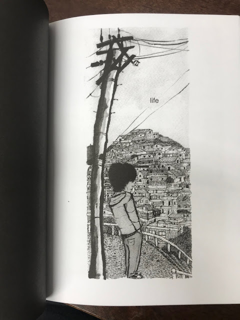
Throughout, he uses a lot of techniques to tell his story. Sometimes it's a very light, loose line, sometimes it's a heavily rendered image. My preference is the zone in between those poles, where he very clearly cartoons, but he has a strong texture to give the cartoons weight. The cartooning quality ranges from good to great.
Dahl shifts his cartooning styles throughout the book, this self-representation is more realistically proportioned despite the not-actual-size herpes virus

This isn't a book for kids. Dahl "goes there", he draws the effects of herpes as he researched on the Internet. The worst case scenarios become his own nightmares, which he fully illustrates even though his own case is mild. That is to say, he sometimes draws scabby genitals. It's not something anyone wants to look at or consider, but it is something a lot of people might confront at some point in their own life even if only the fear of it, so I appreciate Dahl's commitment to honesty and mature presentation.

Some people might have an experience with herpes and just ignore it and pass it along. I don't  think most people are like that. Most would be shell shocked by the news and use it as a starting point for self-reflection, if not the seven stages of grief. That's Dahl, whose social life seems knocked off course for years due to the disease.

Living with shame

Reading this, I was taken back to the indie comics that really excited me when I was 20, when I was trying to figure out just who I was and who I wanted to be. I read the 80's autobio of Robert Crumb, and the work of Chester Brown and Joe Matt. I saw myself in them a lot, and received some relief that my emotions were "normal" but not necessarily excusable or acceptable. It's a challenging territory, which mainstream works don't usually venture into. Dahl's book shares some characteristics with those artists, in its frankness and emotional honesty. It's very personal work, but work that most readers should be able to see themselves in.

Ultimately, Monsters is a book about living with herpes, not becoming a hermit, so it has some resolution, and is not bleak in its final outlook. It's not for everyone, but it's a book, to quote Jeffery Brown on the back cover, "for anyone who has had sex, is going to have sex, or wants to have sex."

Friday, February 26, 2021

Reading Through 2021 37: Anibal 5, by Alexandro Jodorowsky and Georges Bess

Anibal 5, by Alexandro Jodorowsky and Georges Bess

2015

What if Möebius made Austin Powers?


I have barely read any Humanoids. Mostly Dupuy & Berberian, which aren't the Humanoids brand in English. So I asked a friend who's a fan for a few books to read, one of which is Anibal 5. Reading it took me back to high school Heavy Metal reading days.

Anibal 5 is a "sexy" super spy doing sexy spy missions for European Defense Organization. He's supported remotely by a team of scientists and accountants pulling his strings and guaranteeing his success.
This explains the book, more or less: "over the top"

This book is, to me, sexually charged as opposed to erotic. There's nudity on most pages, and sex is a major plot advancer throughout the book, but it's not really masturbation fodder. There are some artists who produce erotic work which are made with that in mind, and artists who render sexual activities without being all that sensual themselves. Manara has a sensual line, Bess does not. Bess is storytelling in this book.

More sexual than sexy

This is a book with lots of sex in it, and that's no problem. That was the major selling point of Heavy Metal. But there are some weird points which I got hung up on. Right from the start, the head of Anibal 5's (A5) department is a Santa Claus looking guy, Pinky, in a Professor X style floating wheelchair, paired with a highly sexualized character that reads as a pre-pubescent girl (very petite, flat chested). It's sci fi, nothing is explicitly stated, so it's not a big deal, but I don't think any adult reader wouldn't take note. That character, Enanita, is written as highly intelligent and is shown to be mutually caring with Pinky, as well as in more normal clothes in later chapters, so it's more of what the reader wants to make of it rather than anything explicit.

In the first of the four chapters, we see an army of naked buxom redheads that A5 fights through, and I, not having read the back cover, was trying to puzzle over what Jodorowsky was trying to say. Was it a sexual fantasy? Was it a statement that clone technology will be used to make mainly super hot people due to human nature? Then I took a break to finally watch Jodorowsky's Dune, and I realized that Jodorowsky was the writer/director/star of El Topo, a cult Western film from the 70s, and it clicked: he's just throwing a lot of crazy stuff at you, and you can read into it if you want, but it's not all that deep except as a revelation of Jodorowsky's mindscape. With that, I went back to the book in a very different frame of mind from when I first opened it.
It is what it is

When all the women of earth are enthralled with pheromones to attack a ship over the Antarctic, that's what it is. Spectacle the likes of which you haven't seen before and haven't considered. 

There's no doubt this is a male centered fantasy, and there is a place for that in the culture. There always has been, always will, no matter what the seemingly endless culture warriors of the West have been saying the past ten years. Two things jarred me in this book though. For the most part, the story is careful to simply avoid sexual politics. The first woman A5 lays is enraptured by his magnificence and they get it on. That's standard Heavy Metal fare. He later beds androids designed for his pleasure. Again, typical male sci fi fantasy. 

Then this scene comes up:

World beauty pageant winners have been kidnapped and hypnotized to serve him, and afterwards, they'll be sent home and their memory of the events will be wiped. As a 16 year old, I'm all over this fantasy, the "I can have sex!" fantasy. As a 45 year old, I understand that this is basically a Bill Cosby situation, believing it's all good if they have no memory of it. It doesn't break the book for me, it's merely a throwaway idea for Jorodowsky, but I can't not take note of it. I don't think it's a problem as a sexual fantasy either, people can fantasize about what they like, but it's the presentation in the book as being equal to the other fantasies in the book when it's actually a lot more rapey, for lack of a better term. That throws me off; having a pleasure android is a very different fantasy than mind controlling women.

The second thing I could help but notice, especially in light of the kidnapping and the hypnotizing scene, is that the only scene in the whole book which acknowledges sexual politics at all is one where A5 is the female in question. The third chapter is all about A5 taking different female animal forms, and "she" is mounted by a male tiger.

A5 flat out calls the tiger a rapist. It's a lot to unpack, that the only concept of sexual sovereignty is in relation to the male character. If this was a mainstream American work, tons of Internet-people would come out from under their rocks to explain that this is an obvious critique highlighting the unfairness in the system, and that A5 complaining about rape shows the hypocrisy of the character, but there is absolutely no difference between this critique and a the mentality of a boys locker room. I think Jodorowsky just thought it was funny.

This doesn't break the book for me either. Jodorowsky is an artist, and Jodorowsky likes fucking. It's not any different than a lot of other "great" creators. Most creators scale it back in their work for the sake of marketability, but Jodorowsky happily lets his id out to play.

This is the absolute median tone of the book

Bess's art is good, it's not stylistically exciting, but he can create space in his pictures, he can create all manner of freaky technological settings, and place a lot of people in it without it looking weird. He does his own the coloring too, and that makes a huge difference in the readability of it. This is a book where the content is the star, more than the art itself, giving Bess credit for helping realize the content.

I have Jodorowsky and Möebius' The Incal, and I never finished it! I really should go back and get that read. I'm not going to be an obsessive collector of Jodorowsky's work, it's a bunch of crazy stuff that doesn't add up to much to me. But it's enjoyable in its relentless novelty. Every page turn has new crazy stuff to process. This book gave me a lot to think about and I didn't get into most of what happened in the book. I am going to try reading more of it.

Thursday, February 25, 2021

I Really Should Read This 12: Promethea 20th Anniversary Edition Book One, by Alan Moore and J.H. Williams III

Promethea 20th Anniversary Edition Book One, by Alan Moore and J.H. Williams III

1999

I read a few issues of Promethea as it came out, and frankly, I didn't get it. The setting was good, the art was interesting, but I didn't get it. Of Moore's ABC line at the time, I read a bunch of issues of Tom Strong, the first two series of League of Extraordinary Gentleman and a handful of Top Ten issues, but I think I only read two issues of Promethea before passing it over. In the past few years, Moore acolytes have said, "No, that was the good one," making sure I knew I had made a grave error in passing it over. After reading the first twelve issues collected... they were right.

Oh, it's Vertigo, is it?

First of all, a big F-U to DC for slapping their logo on this. It's their legal right, but it's gross, really gross. I have to imagine someone in the department putting this together knew how gross it was, but they rationalized that if it wasn't them, someone else would do it. DC is a gross company that has only gotten grosser under the ownership of AT&T. 

Let's have a drink of water to clean my palette.

That's better

1999 was a special time. I think a lot of folks living in the West will remember it as a peaceful time, an exciting time. It was the verge of the new millennium, and it really felt like the cusp of something. This has nothing to do with the reality of many people's lives, it has to do with being in that quiet lull between the Cold War and The War on Terror, when tech stocks were diverse and Google/Amazon/Facebook hadn't made the Internet the tiring corporate landscape it is today. There was a lot of hope that the world was on the right track. When I open Promethea and see Moore state in every issue, New York, 1999, but always over a sci-fi technopolis landscape, it makes me nostalgic for the world that was in my head back then.

New York, 1999

It's hard to do an elevator pitch for this book, but to summarize: Promethea is a character of myth who lives in the Immateria and sometimes takes on form through mortals who conjure her through creativity. The Immateria is the reality of what is imagined, the other side of the coin to the physical reality we live in. People throughout history have channeled Promethea through writing, comics, poetry or other creative acts. In the world of the book, there are no super heroes, but there are science heroes, and she is labeled a super heroine. As of the twelve issues in this first book, she does some superheroing, but it is not a villain of the month book. Most of the stories about what reality and life is.

This book is complicated. It's overflowing with ideas about humanity, mythology, magic, sexuality and imagination, and lots more stuff that I would have had to be taking notes to keep track of. Many issues tackle big themes. I was particularly taken with issues 10, which portrays a sort of tantric sex experience and explores the meaning of male, female, form and energy. This is a deep, mature consideration of human experience, on par with Moore's Swamp Thing 34, where Abby sees the patterns of life after eating the fruit of Swamp Thing. It was an ambitious and beautiful story. From there, Moore caps the volume with a history of reality and life's place in it in issue 12. He describes Adam and Eve as the self-replicating ameba, with the snake in the garden as the DNA that made sex and death part of life. He describes the arc of (Western) society, and does it all through rhyming couplets for 20 pages. While he does this, he creates anagrams of the name Promethea that comment on the poems, rendered as Scrabble tiles 
(as an example, for the DNA, Me Atop Her). It is all a bit too much, and I mean that in a good way. This description only scratches the surface of the issue, there are Tarot cards and Alastair Crowley in it too.

I just need some fresh air to process it all. 

The Immateria is a place where dandelions become baseballs

The art is up to the task. J.H. Williams is a gifted renderer, who can channel Alphonse Mucha in his page design, and I don't know who in his art. I want to say Kevin Nowlan, just from the way almost everything is given a harsh dramatic shadow. There are a lot more artists working in a similar style today, but his work doesn't remind me of anything I was looking at in the 90s. The book is almost entirely double page spreads, and for the most part, readable. A few times I didn't intuitively know if the panels read left-right or up-down, but it was a very small amount for the number of spreads in the book. 

Williams is able to imitate other styles here and there as the story calls for it (I enjoyed a Windsor McKay homage character who pops up a few times). The only criticism, and this is a slight one: I wanted him to restrain himself more.

It's a great page, but he didn't really need to make the panel borders be the floor layout of the hospital

Throughout the book, Promethea interacts with the Immateria, which is the reality of imagination, as opposed to the reality of the physical form we live in. Our world is slow to shift, the Immateria shifts quickly. When the layouts of the Immateria overwhelm the comic layout, it
 thematically makes a lot of sense. When Promethea appears in the our world and is a being of magic and imagination, again, it makes a lot of sense that the comic page breaks away into design. When Promethea isn't there and we're only seeing our world, Williams is still pushing his layouts. I don't think he can turn it off.

That is a minor thing in the big picture of this dense, heavy book. I haven't even wrote about the notable discussion about sexuality Moore is having throughout the book (it's repeatedly noted that Promethea is gorgeous as she is a character made from human imagination, but there is a lot of sex-shaming done as well, done deliberately in contrast to Moore's feelings I think), or the use of popular culture, like the in book character Weeping Gorilla, which by Promethea's rules becomes a form of reality. Moore also gets into magics, and I try to follow, but I can't get it all.

...said Moore in 1999

I ordered the other two books, I'm excited to read them. And I know this will all get a reread in the future, and possibly a Google dive into others' writing on the series, since I suspect better people than me have analyzed this series to bits.

Wednesday, February 24, 2021

One Coin Reads 6: The Dead Hand, by Kyle Higgins and Stephen Mooney

The Dead Hand, by Kyle Higgins and Stephen Mooney

2019

Continuing my dive into steeply marked down trades on comics, I picked up The Dead Hand for ¥458. The cover looked like something I'd like. It has some of the vibes from Steve Epting back on the Winter Soldier era Captain America and I enjoy some Cold War genre work.

It's a nice cover. In retrospect, it doesn't really communicate any of the book plot 

My usual complaints for Image books are that nothing much happens in the first trade until the last couple pages, and the art is Paul Pope Lite, so going in, that's the stereotype I want to get past. I'm happy to say this book is nothing like that. I had some issues with the book overall, but there is more to praise with this than criticize.

The strongest point is the writing and pacing. I have heard Higgins name before, but I don't know him and this is the first time reading any of his work. The Dead Hand collects issues one to six of a series, and Higgins does his best to have a hook drop on the last page of each issue, emphasizing it by making it a splash page. If I'm reading genre work like this, I want this pulpy ratcheting up of the story each issue. This book has pacing very much in line with The Walking Dead in that way. 

Most of the characters are introduced through collage spreads or splashes. It's not story-telling, but it tells a story

It's difficult to discuss the book without spoiling the story, but I'll spoil the first issue of the book for discussion's sake since it's the setting of the rest of the book. We're introduced to an American ex-military ops guy working as a cop in a small town. Some unusual stuff goes down and the first issue ends with the reveal that the town is in Siberia. It's an intriguing set up, and the first half of the book aims to set up situations for later in the book to resolve. If that sounds interesting, you'll probably enjoy the book. As the I got toward the end of the book and fewer and fewer pages were left, I started to get this feeling that the book would be leaving off on a cliffhanger for the next trade. When I finally got to the end, I was very pleasantly surprised:

The story ended. It was an open ending that could be continued, but it ended. It was such a nice feeling. The book has a "1" in the sub-title, and a "1" on the spine, so I was expecting there would be an issue seven out in the wild, but this is self-contained. I'm guessing the intent is to continue if it sold gangbusters, but make it its own story. That's great. 

That said, it wrapped up much more abruptly than was satisfying. The pace leading up to the sixth issue was spaced out, decompressed storytelling. The final issue crams the resolution together and yada yadas itself to the end. If I were the editor, I probably would have wanted issue six to be double sized or compress the opening of the book to make space in the last two issues for the conclusion. Overall, the writing was well-done though; it was solid genre writing with a solid premise.

Jordie Bellaire on colors makes things better

The art is really hit and miss for me. Some of it is good, Mooney does grounded spy action pretty well. The thing is, it's not consistent. Sometimes, he is drawing freely, and there is artistic looseness. Other times though, he's so reliant on photographs that the work moves into Greg Land photo-collage territory. Characters don't interact with the backgrounds much less each other. I liked the loose work better.

Mooney has an ambition to do realistic art, and maybe he's going to get there in a satisfying way, but he's not quite there on this project. The art ranges from solid to janky. I like Michael Lark's work so much, but nobody starts their comics career making work like that. That seems to be where Mooney is headed, and power to him if and when he does it.

Things that rubbed me wrong in this pic: her pose, the cop's elbow, the family photo to establish family relations shows the daughter at her current age rather than something showing family history, no curtains or blinds, the table and the floor... that's nit-picky, but it's not immersive and in a less "real" image, these problems would disappear

There's some of the Photoshop image duplication as well. Lots of folks have come to terms with this as a creative comics technique in the 21st century, but it's never going to be anything other than irritating in a book to me. Just get a light box and trace your own work.

Did Higgins tell Mooney to use the same face four times? Is that the artist's choice?

This is a genre product, and it was successful at what it was trying to do. I'll check another Kyle Higgins book in the future if the price is right. Mooney isn't to my tastes. 

It was a real treat to get an Image trade that wasn't the first part of an epic you'll never finish reading.

Tuesday, February 23, 2021

Reading Through 2021 34: Twists of Fate, by Paco Roca

Twists of Fate, by Paco Roca

2013, English edition 2018

This was a lucky buy over the summer. I'd never heard of Roca, and it was 75% off. It ended up being one of my favorite things I read last year, just as a good, solid comic. Last week I reread it as part of a comic "book club" and I appreciated it even more. 

The cover is a repurposed panel from the book


I think this is a "great" comic. When I say that, I'm not saying it's life-changing, or game-changing or any of the other adjectives that are usually applied to "great" comics. This is a solid 300-page story that is personal, interesting, and well-told. The art is impeccable and is in service to the story, not generally flashy or suited to pin ups. This is a top quality book lacking things that usually bring hype to a book. But this kind of book is in very short supply in the English market, when it should be the norm. When I first finished reading this last summer, I was immediately depressed how many times I had seen something about DC's Three Jokers without any interest or desire to, but had never once seen any digital ink spilt on this book. It became an underdog in my eyes.

The original Spanish cover is a graphically more interesting, but conceptually harder to understand at a glance

Importantly, the book is a translation from Spanish, and it was already five years old when it was released by Fantagraphics, so it probably was less of a priority for the company than their American artists who can attend domestic release parties and participate in English language social media, That's conjecture on my part, I don't know. But I understand there are many reasons that Roca's work doesn't receive coverage anywhere near DC's flagship characters. It's just a depressing reality of America's comic industry.

Roca uses a different graphic style on the present and past storylines. The color makes the war story more vivid, though as a secondhand retelling, must have had some artistic license taken


So what is it about? The book is written, drawn and colored by Roca, who interviews Miguel, a 90-something Spaniard living in France, about his experience helping liberate Paris in WWII. Roca makes the interview part of the book itself, and so we see how Miguel is processing these memories from some 65 years before. The WWII narrative is the bulk of the book, but the contrast between the two periods, and how Miguel has compartmentalized this time of his life is a major part of it. The closest thing to a friend Miguel has, a divorcee neighbor who's known him since he was a child, knows nothing of Miguel's history despite living close to him for decades. Without Roca's interest in interviewing him, Miguel might never have discussed these events again.

Miguel "only killed fascists and only in combat."


One of the key themes of the book and Miguel's memory of that time is that Miguel killed lots of people. It was war, that's what you did. Miguel had fled the fascist Franco regime in his home country, and spent some years in refugee/concentration camps in North Africa. He and his mates had a deep hatred of what the fascists were doing to his country, and by association, what the Nazis were doing in Europe. As Miguel drudges up these old memories, he is pained. He has had decades to live with the deaths he saw and was part of. He is never proud of killing, but he never shows regret either. From Roca's portrayal, it feels like it's taken a toll on Miguel, and is a reason he hadn't spoken about it since the war.

In one of the most affecting scenes, Miguel and a small group of soldiers find Germans at a small French farmhouse and kill them. They then sit down at the table to eat the food the Germans were about to eat. The one soldier was shot in the head, having just taken off his helmet to eat. Miguel sees the photo of the dead soldier's girlfriend tucked into the helmet. 

The book focuses on the participation of Spanish in the war, as opposed to Spain which sat the war out. Throughout the book though, there are stories of dispossessed people from around Europe; Poles, Italians, French, even Germans against Hitler. Nationality is important to these people, and it's a snapshot of a world very different than mine. My upbringing in Canada lacked the passionate connection to my roots that the people in Miguel's world have.

"A Frenchman..." "Armenian."


The art in this is gorgeous, even though the subject matter is quite dark. I think the closest comparison to Roca's art in the American market would be 1990s David Mazzuchelli, the work around Batman: Year One and Rubber Blanket. Roca's work has a strong foundation to its structure: the buildings, the vehicles, the land, and the people all look like they should, but are rendered in a loose line that lets it all breathe. 

He draws so many tanks, jeeps, airplanes and other vehicles that it makes my head spin. Many artists make it a point to avoid drawing cars

Indeed, though the characters in the book can be difficult to distinguish in places since they all have the same clothes and similar military haircuts, they each have their own facial features. And Roca animates his characters, panel to panel, so that they move like people. Not a single corner was cut (I'm looking at you, Alex Maleev, who has a pocket stuffed with corners he's cut).

This is deceptively difficult cartooning


As a very amateurish cartoonist myself, this is the kind of book I might pull out on a Sunday to take lessons from.

I liked this even more on the second read. The second time with it, I knew the broad strokes of the plot, and focused more on Miguel as a character. Roca is juggling a lot with this book, and like a lot of books with a dense plot, it often takes most of your concentration at first exposure just to know what's going on. Once you have a handle on that, you can focus on appreciating the details. 


I felt much more for Miguel this read, and while you get a picture of who he is, you don't get to go in his head. Roca keeps a distance and relates what Miguel says. He doesn't try to explain what Miguel thinks.

I don't know how much Roca is writing this to interact with the politics of the world today, but it gave me a lot of reflection about the life I'm leading, the number of democratic places in the world starting to trend toward fascism, and how for the generation that won WWII, fascism was obviously the enemy. Growing up in the late 20th century in Canada, I have to wonder how much I take peace and safety for granted, and how real the danger to it is.

This is a rich work, and it seems to have already fallen through the cracks of the English language audience. Roca's still working and making great books (Winter of the Cartoonist just came out in English last year), so maybe in time he'll be able to capture some of the success in America that he's had in Spain.

Monday, February 22, 2021

I Really Should Read This 11: Forever People, by Jack Kirby

Forever People, by Jack Kirby

1970, collected in 2020

I had read in some places that Forever People was one of the weak links in Kirby's Fourth World. After reading it? It's not his best!


Since last summer, I've read New Gods, Mister Miracle, and the Demon of 70s Kirby work, and the Eternals from his 70s Marvel. To be fair to the Forever People, it's worse by a matter of degrees, but none of it is flawless. All these works have really high highs, and really really low lows. I still had a ton of moments in this where I delighted at what I was reading.

Not one of these characters' names give a hint of their character

I'm not going to make a big issue out of it, the characters are what they are, but Vykin the Black is a poorly-named character. Around issue five, a Japanese character is introduced, Sonny Sumo. Vykin the Black is DC's first black superhero. Kirby was trying to broaden the scope of the comics, but he was also in his 50s. By modern standards, it's laughable, but his heart was in the right place.

All of these characters look great; Kirby was great at designing, but, like the New Gods and the Eternals, their names and powers are generally vague. Mark Moonrider has a "megaton touch." Serifan has capsules on his cowboy hat that can do what the story calls for. Only Beautiful Dreamer has a power that can survive an elevator pitch: she can pull images out of your mind and make them temporarily real. Compared to the characters he made with Stan Lee in the 60s, they don't have the same hook. Kirby was pretty free to run with his imagination, but maybe he was well-served by having someone to bounce ideas off of from time to time.

What else about the Forever People? They're from a place in New Genesis called Supertown, and when they put their hands together and say the word TAARU they change into Infinity Man (whom they have an arrangement with).

This is about all the explanation Infinity Man gets

It's not an easy read. Kirby had so many ideas, and he picks them up and drops them at a whim. On the stands, as single issues, they likely worked fine, with each issue overflowing with new concepts. But as an 11 issue collection, they don't make much sense when read as a whole.

He talks about the Omega Effect and the Anti-Life Equation, and as best I understand it the Anti-Life Equation is a kind of fascist mind control that obliterates free will, but I don't understand it. I just go along for the ride. I just finished Grant Morrison's Batman Omnibus Two, which uses these concepts from the New Gods, and I didn't understand it much there either.

I think if Infinity Man had become a bigger character, his look wouldn't feel so generic-Kirby

Infinity Man seems like a bad name, and an uninspired costume, and I didn't like him at all. After, I was looking at the costume, and it's not so much better or worse than other Kirby designs, but probably the name and lack of personality meant that it didn't click with me or with readers. It's not a bad idea, it's like Captain Marvel/Shazam, but with a team instead of a single kid, but then Kirby moves on from it. After issue three, this character I disliked so much disappeared from the book and this aspect of the Forever People is ignored. In the final issue, they announce Infinity Man is back! and I had all but forgotten he existed. 

Hmmm

The Forever People are modeled on hippies, and hippies are referenced in places. Kirby was trying to stay in touch with the kids. They sometimes talk about peace and love. The final issues of the book, the Forever People rent a room with a retired ex-flapper named Mrs. Magruder and we get to see the generation gap play out. Mrs. Magruder says things like, "Well, I never --!" It's entertaining, but it's not a justification to buy the book.

One of the first pages that really floored me. It's creepy, bold, and that's a Kirby gun if ever there was one

The art and relentless novelty of the images are the justification to buy the book. The book is reinvented a few times in its 11 issue run. This is part of the first wave of post-Marvel Kirby DC books, and he was still finding his new footing. By the Demon, he had really gotten into the swing of it, lots of splash pages and he regularly did double page spreads on pages 2 and 3 that I got really excited to see each issue. With this book, the art is good from the start, but it's a few issues in before he starts running wild with it.

That is a horse. Cut it out and plaster it on a giant canvas, and it's an futurist painting from the 1910s that sells for millions

The more New Genesis and Apokalips stuff he throws in, the better. It's weird, it's idiosyncratic, and I can't get enough of it.

Page 2-3 double page spread. It's so good

He has a time travel story in the middle, "I'll Find You in Yesterday!" where he goes wild drawing Abraham Lincoln, Spanish Conquistadors, and Roman Centurions. Sure, I'm happy to read that.

He just felt like drawing this

A lot of this Kirby work can be a hard read for modern readers, myself included. The pacing and the overdone narration can be a slog. It was made as disposable work for children and not to be overanalyzed by adults. So some of the criticisms I would have for a 21st century book aren't applicable. I appreciate the aspects that appeal to me now, and am able to brush aside the stuff that was never targeted at me. 
Over the coronavirus lockdown, I took the time to really read Kirby's work and not just admire the artwork. It took a long time, maybe 20 to 30 issues, to get my head synced up to the pace of his books. And this is the ninth fat trade collection of his work I've read cover to cover in the past year. I'm into it. I like it. Unironically, without reservations, it's just good work.

Sunday, February 21, 2021

Reading Through 2021 32: The Loneliness of the Long-Distance Cartoonist, by Adrian Tomine

The Loneliness of the Long-Distance Cartoonist, by Adrian Tomine

2020

What an enormously frustrating book.

AAA production values

I love Tomine's work. I really do. I was buying Optic Nerve in the 90's, I love his New Yorker illustrations, and Killing and Dying is one of my favorite comic collections period. Killing and Dying is incredible. Right from the first preview of this, I was not down with The Loneliness of the Long-Distance Cartoonist, a collection of autobio strips about how embarrassing Tomine's life is.

In 2020, it ended up being what seemed like the most reviewed work of the year. Not best-reviewed, but most reviewed. Tomine is a comic artist with fans in a lot of media organizations, so Rolling Stone or EW or the Guardian or the New York Times will weigh in on his work, along with lots of comic sites. And they kept saying it was very good. Everywhere kept saying it was very good! Only a few places, like Solrad, gave mixed to negative reviews of it. The thing is, the positive reviews of it highlighted what I expected would be a negative about it. The Guardian (pulled up as the top pick on an Internet search as an example) said:

 In a series of autobiographical sketches from childhood to the present day, Tomine casts a cynical and unforgiving eye on his fragile ego, the dubious rewards of his successful career and the absurdity of the comic-book industry.

That doesn't sound great to me: a successful artist showing he was unhappy and frustrated in the comic industry. 

"This one time, I was at Dan Clowes studio, and I felt bad."
The majority of the book is a series of vignettes where Tomine is experiencing the dream of indie success and feeling bad about it. He's one of the youngest nominees at the Eisner awards, and he feels bad. He's at a book signing in Tokyo, and he feels bad. He's the subject of a TV documentary program in Angoulême, and he feels bad.

It's honest, and I'm sure he felt that way, but the jokes are only mildly amusing, not really funny, and not so insightful. For most of the book, I was just wondering why I was reading it at all.

"This one time, I was a guest at the world-renowned Angoulême Comics Festival, and I felt bad."
Around the mid-way point, he starts to add some dating themed strips. He hopes that if his girlfriend will see he's a popular cartoonist, it might impress her. This sort of detail was more endearing to me than the cringe stuff, since it was a lot more of a peek into his psychology. It's his own weakness as a person rather than the world not boosting him up enough. But this sort of thing is in a minority of the stories in the book.

The thing is, I knew from reviews and previews before I read the book that this was the main thrust of the book, and I bought it anyway. After reading, I don't think this is what the book is actually about, despite it being the majority of it. The final story is about a near-death panic he has where he reevaluates his life and everything he knows. Tomine is very frank, and direct to the reader in the form of a monologue to his wife about where his head is, that all his perceived slights are nothing compared to the love he has for his family. That final story is that Adrian Tomine magic that I love.

It doesn't change that the first hundred pages of the book are a guy highlighting the negative in every aspect of a long and successful career. He got to where he is through hard work. It wasn't given to him, so I don't want to say that he isn't thankful for it. But I don't enjoy reading a book where he makes success out to be such an emotional burden. 

What he's really trying to say

Other than that, the packaging is gorgeous. It's made up to be a Moleskine notebook, with the elastic band and everything (clout in the industry has some benefits when asking for frills in publishing at least). And the cartooning is incredible. Really incredible. He drew in this style in some of the stories in Killing and Dying. I loved it there, and I love it here too. It's very elegant, very precise, and the level of nuance in the facial expressions is simply amazing. I was regularly comparing panels to see the level of detail, for example, in jaw lines as mouths opened and closed. It's a weird thing to comment on, but it's difficult to draw and he does he perfectly. He's doing very simple images, but the structure behind them is sound. 

He's at the top of his game as a cartoonist. And he's got decades ahead of him to do more great work if he chooses to. 

When I saw him put that text balloon tail in the third panel, I cursed the cartooning for being so elegantly simple and clever
Books can change upon a reread. Maybe knowing that the book uses the first two thirds as a set up of the lonely cartoonist to contrast the family man learning to appreciate his life in the third act will work on a second reading. 
I read all his stuff twice, so maybe it won't be so frustrating next time. 

Friday, February 19, 2021

Reading Through 2021 31: Nineteen, by Ancco

Nineteen, by Ancco

2000s, published in English in 2020 

I used to love Drawn and Quarterly. In the 1990s, I bought pretty much everything they published. Some time in the 2000s I started getting tired of some of their books. They branched out into more artsy fare that I didn't enjoy reading. I still think they are a publisher worth checking out though. Their 2020 release, Ancco's Nineteen, is everything I ever loved about the publisher's output.

The cover was what made me pull the trigger and buy it


This is a collection of mostly autobiographical stories, loosely drawn. No rulers, possibly no pencils. Ancco is one of those artists that just has a strong personal style. I've seen work graphically similar before, but it's not overly common in comics. It's very readable. You are quickly pulled into what's happening in each story.

The stories were done over a number of years, and her style evolves over time. They portray her life being a high school student to an independent 20-something.

I always appreciate comics where they suck the fun out of drinking

This is dark, personal comic work. It's really sad too. She very frankly portrays vignettes of her life without melodrama or self-pity. She shows alcohol use within a family without labeling it alcoholism per se, but shows how it affects family dynamics. She shows physical abuse in the family, without making explicit criticism of it. One story, she gets beaten up by her father, in another she's eating at the table with him. That's how family has tended to work for most of history: a family can have serious problems, and you just take it as the status quo. The concept of breaking things off with "toxic" family members is a relatively new Western idea (not that people didn't do it, but that you would receive widespread encouragement and support for doing so).  I think she as a writer knows the alcohol and abuse is not healthy, but that's not necessarily how people think while in the midst of their family life.

Reading this was very cathartic to me. It just tapped into a lot of emotions I don't touch on much, in my life or in other reading. If I had 50 books that were on the topic of coping with a depressing life, I wouldn't be as moved, but it's not that common, and especially not with this tone. This is not a survivor's tale, of how she escaped, it's her just showing her life. In multiple places she shows herself to be a difficult person to the people around her, and it complicates things. If you have guilt or self-loathing, it's easy to place blame on yourself despite being a victim of abuse. 

Absolutely my favorite sequence in the book

This is not a didactic book. It's simply straightforward storytelling which probably reads differently to each reader, depending on your emotional background.  

Family

I found it to be in that sweet spot of indie books: graphically interesting, very readable, and memorable. I can't recommend it enough.