Sunday, January 31, 2021

Reading Through 2021 15: The Golden Age, by Roxanne Moreil and Cyril Pedrosa

 The Golden Age, by Roxanne Moreil and Cyril Pedrosa

2018, translated 2020

This is an incredible book! I can't believe I never heard of it until I saw it on a single best of 2020 list.


I bought it based on this cover, which reminded me of the Disney's Sleeping Beauty

This is a translated edition of a French book, with a second book promised this fall. I may be guilty of hyperbole, but I think this is a masterpiece work, or at least the a near-flawless start to one. Of course, it all depends on where future books go, but between the writing and the art, I have no doubts that this team knows where they are going and are capable of pulling it off.

The colors verge on gaudy at first, but once you're in the frame of things, it's entirely natural

The art in this is incredible. I have long lamented the use of computers in comics, but it wasn't an inherent problem with computers; it was how they were used. Pedrosa uses computers everywhere in this and I think it's incredible. He's using them to produce artwork that would just be impossible to do in a timely manner in a traditional method. He's not simply leaning on computers to cut corners in the creative process. He's using them to create complex images and unique color schemes.

The double page spread with characters moving through it is a regular motif

Pedrosa worked for Disney as an animator in the 1990's, and you can see it in the character design, which is expressive and every character is pretty much immediately distinguishable from others. But he adds a far more artistic layer to the work, with design that calls back to the illustration of the 1950's, and also to woodblock print works, which aggressively work with negative space. In certain sequences, the art breaks into expressionism and it all works together as a whole. The feeling of the book is like watching a movie more than with most comics. The flow from panel to panel is languid, and each scene is given the space to breathe.  Personally, I'm not a massive Disney fan, but to see an artist commanding the page as Pedrosa does, I have nothing but respect.

The art gets much more expressionistic that this, but I think this captures the woodblock tone

Moreil's story is rooted in a medieval/renaissance era kingdom, with the king dying being the story catalyst. The peasantry is suffering the greed of the lords, and everything is unstable. The story is very much about the personal though, and the plight of Princess Tilda. The narrative of her with her childhood friend is a properly dramatic arc that goes to a very interesting place, but all the characters have personality and motive. Very quickly, you have an understanding of who everyone is.

The plot of the story is very political, perhaps more than even more so than it should have to be. The book focuses a lot on the division between the peasantry and the upper class, and if it were written in the 1950's, it would merely be a fairy tale, but with the middle class being destroyed in the world as I type, and the uber-rich not caring one bit for the growing number of poor, the book can't help but feel political in a contemporary sense. I guess the rich abusing the poor makes for a timeless tale. And it can be dark. As much as the Disney tone looks like it's made for kids, there are deaths and hangings in this. 

What's in the trees? Not something from a Disney book

It's book one of a series, advertised as such, and I'm all in on number two. I already pre-ordered it. Hopefully it's only a two or three book series, as I'm not excited to wait a decade for a seven book series, but I want to read it regardless, which is saying something. This book is a bold, mature, virtuoso product. 

English speakers need to read more European comics.

The Color Kittens from 1949. Remember when we had good art in kids books?
 

Saturday, January 30, 2021

One Coin Reads 1: The Red Hook, by Dean Haspiel

 The Red Hook, by Dean Haspiel

2018

Image puts out a ton of books these days, more than I can keep track of. Every year, Amazon Japan marks down a bunch from the past few years, and I sample ¥2000 collections marked down to ¥500. I bought about eight this December, including the Red Hook.


The big difference between this and the rest of the books I bought was that I'd actually heard of Haspiel. I can't say where first exactly, but I think it was in the SPX collections in the late 90s. My vibe then was that he was too genre-loving for the twee indie world, but too indie-inky for the mainstream. It was interesting work, but I never followed him. His name popped up here and there, including in illustrations for HBO's Bored to Death a decade ago. So at ¥500, it was a pretty safe buy.

The city illustrations look real nice

It was totally fine. The liner notes, at the start and at the end, describe it as part of a New Brooklyn trilogy, about a world where Brooklyn secedes from America, and art becomes its natural resource of sorts. It's a cool hook for a story, but it's not in this book. This book is 95% fight scenes.

The concept behind the character is stated to be a mix of Jack Kirby and Alex Toth. The Red Hook is a boxer with a hook punch that left opponents bloody and red. He starts a thief, but is is magically forced to help people due to the dying final act of another superhero.

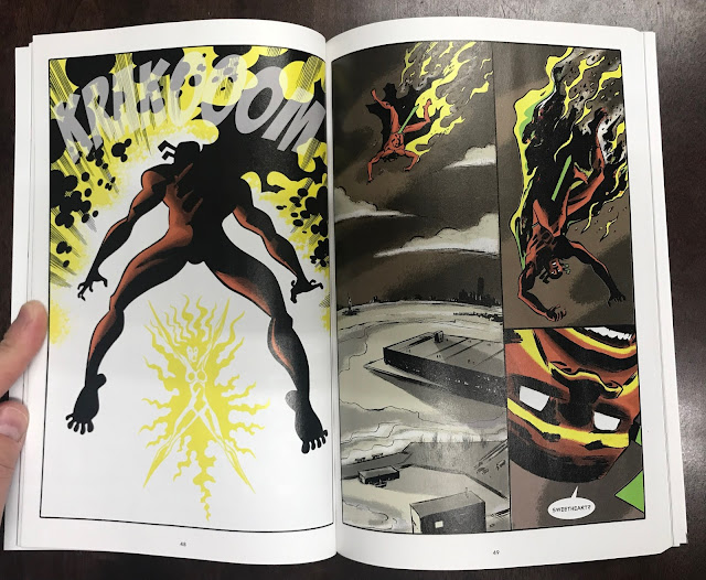
There's some Kirby Crackle there

And it's all fine. 

The art is good, retro cartooning, with some flourishes into loose brush work. He gets the boombasticness of Kirby, and the movement and shadows of Toth. It's very confident. The color is unusual, this brown/gray background with bright figures. 

But that's the book: a bunch of fights, with an origin story thrown into one of them. Maybe the closest book to it is COPRA, a book done for the love of superheroes, capturing the vibe, but not always a coherent story. There is a relationship between the Red Hook and his girlfriend, the Possum, but she's not a very clearly delineated character. And I have to wonder if it had to do with the original format...

Most of the book was originally printed in LINE Webtoon, and I wonder what difference it would be to read it that way. I'm not going to do read it like that. I like comics on paper, and am about as interested in reading comics on my smartphone as my grandpa was when I tried to get him to play my Gameboy in '88. Anyway, I don't know how much of a story Webtoon distributes at a time, but I imagine there's some demand to keep people's attention, and that might mean less time is spent on slow scenes. I don't know, I'm trying to think about why the book was so fight focused. Probably that style does work a lot better when scrolling on your phone.

It won a web comics award, so some people were excited by it.

"Break your heart," a reference for the type of people who read retro superhero comics

Of the Image Comics I read, I rarely want to read more. (Price and the joy of uncovering a gem keep me sampling them.) Most of them end their trades on a cliff hanger and an incomplete story. This has a tag on the end promising further adventures, but it's a relatively one-and-done trade, so it was satisfying in that way. I don't think I'd read more unless it was similarly marked down in price though.

The actual concept of New Brooklyn as described is cool. A pro-art new society is totally something I want to read about. That wasn't this. Since there are other books in this world, maybe as a piece of the whole tapestry, this works really well, but on its own, it's not quite compelling.

Friday, January 29, 2021

Reading through 2021 13: Uncanny X-Men Omnibus 2, by Chris Claremont, John Byrne, Dave Cockrum and many more

Uncanny X-Men Omnibus 2, by Chris Claremont, John Byrne, Dave Cockrum and many more

c.1980, printed in 2020


I could write about ten different essays about this book, so I'm trying to boil it down to essential ideas and not just my nostalgia from reading and rereading these in the mid-80s.
Before X-Men was a movie, before it was a cartoon, before it was product line at Marvel, it was just a minor title with creative freedom. Chris Claremont was the writer of the book for 17 years as it became a juggernaut. Rereading these now, I learned a lot about his writing.


The first half of this is one of the most acclaimed Marvel stories ever, the Dark Phoenix Saga, written by Claremont, drawn by Byrne, and plotted by the both of them together. Byrne later used to joke that if Claremont was writing by himself, it would have just been conversations between characters. Byrne would have major creative differences with Claremont and abruptly leave the book to write and draw Fantastic Four, and if I compare those two books, there is a lot of crossover. Byrne is fun, but he's a "hard sci-fi" guy, he wants to pretend his space aliens have some basis in reality. His run of X-Men shows that.

Then he leaves the book, Dave Cockrum comes on as penciler, and man, the book gets ridiculous. Doctor Doom encases Storm in an organic metal shell and she subconsciously causes the biggest hurricane ever. Cyclops is in the Bermuda Triangle and ship wrecks on an island that just happens to be next to the ancient island Magneto raises from the sea floor to be his new base. The White Queen zaps Storm with a Personality Exchange Gun which swaps their bodies. In the Marvel Fanfare issues included, the Savage Land Mutates use a de-evolving ray to reverse the effects of evolution, turning Spider-Man into a giant spider. Claremont was dead serious about characterization, but at this point, his plots aren't so far off from when he had Wolverine tussle with leprechauns around issue 97.

But then, within this, he uses these ridiculous plots as places to hang incredible character beats. Probably the best is having Magneto take down a fourteen-year-old Kitty Pryde. Looking at her body, he realizes that he's completely lost his way and is becoming the kind of person he claimed to be fighting against. It's pulp storytelling, but Claremont goes on to develop the story for the next four years, as Magneto tries to become a better man and eventually takes over for Xavier. This is essentially what all the X-Men under Claremont did: They saw their own faults, and looked at the other members, even the ones they didn't like, and had respect for them, and used them to be better people. And when they didn't, the other members were there to encourage them to be their best. This isn't what was going on in other team books of the time.

This is a super hero comic ostensibly for kids. Look at that art!

My favorite story in the book exemplifies the amazing character work among the ridiculousness: a short story about Jean Grey's sister Sara remembering an adventure together with her. At Jean's grave, Sara Grey thinks about how much she misses Jean, and remembers when she learned Jean was a mutant. The two were having a day sailing, and Sara thinks about how she was then less comfortable around Jean having learned that Jean is a mutant. She worried that if Jean was a mutant, then possibly her kids could be mutants too. (this is a very clear "coming out" metaphor) Then their sailboat is attacked by Attuma of Atlantis, who brings them to his undersea kingdom and changes them to blue water breathers in order to be his new brides. Absolutely stupid story, and it wasn't a favorite of mine at the time. But then the final page, Sara talks to Jean's grave, and thinks about how different she feels now. She misses her sister, and realizes that she wouldn't care one bit if either of her children were mutants, she only hopes they can grow up to be half the people her sister was. It's such a potent, honest expression on how people can get divided from the people they love due to prejudice and hate, but at the end of the day, (hopefully) it's love and respect that will be the legacy of the relationship. Incredible emotion, well-told, in a story about Attuma using Atlantean technology to capture human brides.

A particularly touching letter

The book also includes letter pages, and they're very interesting, especially the ones written by people who take the book to heart. It really was trying to capture emotions that other books of the time had no interest in. For folks who felt like they couldn't be seen, this book gave them hope.
I enjoyed reading this so much. I still read some new X-Men comics, but after reading this, I'm well-aware of why I loved this group so much, and how much was lost when it simply became a franchise.

Reading Through 2021 12: Our Expanding Universe, by Alex Robinson

Our Expanding Universe, by Alex Robinson

2015

One of my COVID plans was to read less new stuff, and fill up gaps in my comics knowledge. Reading something of Robinson's was on the list. His Box Office Poison was well-received when it came out, but I never read it at that time. Since then, I've listened to his one podcast, Star Wars Minute, for about eight years now.


I liked this book and found it interesting, but there was a little frustration with it too. His style is rooted in the indie books of the 90's, and I think it suffers from not being enough in any one direction. It's not super cartoony, it's not super realistic, it's not super dynamic. It reminds me somewhat of my own comics 😮 The first chapter or so, the art took me out of the story a bit, but after I got into the book, I could very much appreciate its consistency and clarity. That sounds like faint praise, but that's one of the biggest faults in comics: comics where I can't tell what's going on. It made it an easy read. And some pages he definitely takes more time on the art than others, and those pages stand out

I like the rendering in the top panel a lot!

The story is about three adults of the same age but different stages. Two guys are married, one single. One of the married guys has kids, the other is hoping to. They're very clearly delineated characters. And though the guys are the main feature, the wives get their own space to tell their story too. Robinson is trying to portray a spectrum of characters. But because it's about 30-somethings just living life, there isn't so much happening; or at least what's happening is done through dialogue more than action. It's really interesting dialogue, but you could see this being done as a stage play as much as a comic.


Netflix has some similarly toned dramas, like Love or Easy, and I'm very happy to see adult stories that deal with what we think and what we do in our lives. So it's a good, solid book. Not mind-blowing, but not every book has to be.


Reading Through 2021 11: The Troublemakers, by Baron Yoshimoto

The Troublemakers, by Baron Yoshimoto. c.1970s, translated by Ryan Holmberg 

2018


This is part of Ryan Holmberg's attempt to dramatically increase the amount of Gekiga (mature manga) available in English. It seems to be the first translated work by Yoshimoto. Right off the Batman that's a stunning cover, and representative of Yoshimoto's work. Most of the stories are about sex or violence. The stories are mostly about Japan in the 60s and 70s, though one story is about WWII in Europe. Gangsters, strippers, gamblers, aimless lower class folk, upper class folk exploiting their money... Yoshimoto writes about tough times.

The art is a mystery to me. The art in the early stories is super-tight, in a way I don't care much for, but he does some pages with a loose Japanese brush, which are beautiful. 


The WWII story veers into full Tezuka-style cartooniness. The essay at the back shows some samples of his work over the decades, so I have no real handle on what Yoshimoto's style actually is. 


Was he someone following his muse as his style evolved, or was he adjusting his style to suit what he could get paid to make? I don't know yet, but he certainly made some stunning images.


It's the first time I've ever read Yoshimoto's work and I'm definitely interested in reading more.

I want to see a book done with this brush!


Reading Through 2021 10: J & K, John Pham

J & K, John Pham

2019

I'm reading these books everyday, I read three at a time (one tome, and two more normal sized books), so I finish one a day on average. So I'm not writing about good books, I'm simply collecting my thoughts on what I've just read. Generally, I like the books I read, but not always.


I'd wanted to read this for a long time, and heard a lot of good things John Pham. The positive about this: it's a great looking book. The production is top notch. I don't know how it was made, I think he made a Risograph-style print and replicated that as a traditional full color print. If not, he has an incredible eye for imitation. And the art is very good for what it is, cartoon illustrations in the vein of Adventure Time.


The thing is, there was nothing I enjoyed in the reading of it. The characters are two depressed girls hanging out in a mall, and later a cemetery. There are jokes that I didn't laugh at, and pathos that I didn't feel because the characters are vague. It treads in some of the same territory and tone of Simon Hanselmann's Megg and Mogg, but I regularly laugh out loud at that stuff. This stuff didn't hit me at all.

The book comes with an assortment of stuff tucked into the inside cover: stickers, a magazine referenced in the book, trading cards, and a record that I'll never be able to play but you can listen to online.

I can imagine being a 20 year old stoner and getting this and being blown away. I probably would have loved it 20 years ago. At this point though, I regret spending the money on this hardcover. I would rather have just bought a single issue to sample Pham's work to know it wasn't for me.


Reading Through 2021 9: Superman's Pal Jimmy Olsen; Matt Fraction, Steve Lieber, Nathan Fairbairn

Superman's Pal Jimmy Olsen; Matt Fraction, Steve Lieber, Nathan Fairbairn

2020

I had to break my "no new DC comics" rule to read this. DC is a dumpster fire of a company, that is slowly destroying their comics business in favor of supporting properties to be leveraged into other media. Just with their changes over the past year, I doubt this book would have got the green light were it proposed today.


And it's really really good! Like, this might be a new classic, along the lines of All Star Superman. Matt Fraction did a similarly great run on Hawkeye a few years ago, Steve Lieber had similarly great art on Superior Foes of Spider-Man a few years ago. This is the first time I've recognized Nathan Fairbairn's name, but he does pretty amazing color work. The colors in this are almost flat, with a slight tone to them, and the pages are matte instead of glossy, so they work with the flatness. It's a great looking book.


I read this faster than expected because I was just enjoying it so much. It's hard to know what to compare it to, because it's not like other books. Maybe this is to silver age DC as Coen Brother movies are to classic noir movies: embracing the genre, making it modern, and embracing the ridiculous without making it stupid. It's this fine line of really dumb things done in a very smart way. Jimmy Olsen is a character a lot in my generation thought was everything wrong with old comics: A bow-tie wearing, happy-go-lucky "pal" to Superman, who got into hijinx. He sucked (and Zack Snyder made a point of putting a bullet in his forehead in the classic shitfest that was Batman V. Superman, because Zack Snyder's brain is firmly lodged in 1995). Fast-forward to 2021, where DC has made death, rape and mental illness pillars of their publishing line, where they made a comic showing Batman's penis because "we're grown up!", and yeah, I wanna read about the happy-go-lucky guy in the bow tie who gets into hijinx.


This book is a murder mystery (Jimmy's own murder!) told in the most complicated way possible, with a dozen independent mini-stories that seemed unrelated at first, but slowly start coming together into one big story. Some of the stories:
-Jimmy gets wrecked on "gorilla champagne" and wakes up married to an intergalactic jewel thief
-Jimmy has a prank war with Batman, including stealing the Batmobile's wheel
-an embarrassed Batman tries to establish that he has a sense of humor
-We meet Jimmy's siblings, Julian and Janie, and learn that one of Jimmy's given names is Jimberly
-Journalist Jimmy Olsen is dead, but blogger Timmy Olsen is on the scene, and has a mustache.
-In the wake of Jimmy's death, four new Jimmy's appear: a robot Jimmy, a steel covered Jimmy, a cool 90's kid Jimmy, and sunglasses-wearing silent Jimmy
Much like classic Coen Brothers movies, the story is simply a plot to hang character, humor and experience on. It's not what they do but the way that they do it. There's no other comic out today that has blue blood-barfing cat in it.


And there is a bad guy named Stealy Thieverman, and it's so dumb, and made me laugh out loud.

Reading Through 2021 8: To Know Your Alive, Dakota McFadzean

To Know Your Alive, Dakota McFadzean

2020

Some Can-Con comics, funded in part by the Canadian government!


McFadzean has been publishing comics for about a decade, and it's absolutely criminal that I have never seen his name mentioned on an American website. I'm sure it has, as he's been printed in some American magazines, but his three collections just don't get properly reviewed it seems.
I first saw his work through his daily comics on Tumblr. He spent a few years making daily strips, and you can see it in his inking and story-telling. He's put in the 10,000 hours already.


This is a collection of short stories from different publications, so there isn't a strong through line in them, except that he goes over a lot of the same themes. If I were to put a finger on his main topics, it would be existential horror and existential banality. I had three favorite stories in this. In one, a new kid at a school is bullied, but the kid is also rotten, so nobody is at fault and everybody is at fault. It's kids. In another, a woman gets a gig as a game tester and wonders what life she has. Another more surreal one has the world's first contact with an alien, and how boring it becomes a few weeks later when the next big news story breaks.


I kind of lean toward the existential banality ones, but he also has lots of stuff about faces melting off. He likes drawing faces coming off.

The art is really good, classical cartooning. In terms of modern artists, I can see Seth, Chester Brown, and Hartley Lin in his work. Clean, easy-to-read work. The only problem with this collection is that the works were originally formatted to different sizes, so the ones that were made to be printed on A3 paper are a little difficult to read compressed to the collection size. All the same, I think this is a phenomenal book, especially if you miss the Drawn and Quarterly and Fantagraphics books of the '90s.

I Really Should Read This 5: Fantastic Four Epic Collection 5 (issues 68-87), by Jack Kirby and Stan Lee

Fantastic Four Epic Collection 5 (issues 68-87), by Jack Kirby and Stan Lee

late 60's

I've been doing a read through of the Kirby/Lee FF run since summer. These are 400 page collections that read like they're 800 pages thanks to Stan Lee just forcing himself onto every page*. The first issues I read, I could only read half an issue at a time, they simply made me tired, but there was something enjoyable to them. The more I read, the more I got with it and now can read two issues at a time. I think if you culled half the text from any given issue, they would be so much better. Lee has flair, but there's just too much of it.


They look great though. The art in this era is inked by Joe Sinnott, who was the Kirby inker I liked most before getting turned onto Mike Royer. The bold, chunky lines are beautiful.
As stories, the ideas are great, but these were meant for kids, and they weren't meant to be reread by adults 50 years after the fact. An issue has a ton of stuff thrown at the wall, page after page, and a tidy resolution or cliffhanger at the end. Once I got that, I could just enjoy the ride, not looking for a traditional story.
I have one more collection to read to finish off this run. I'm going to wait a month or two to get to it, but it's been really enjoyable to read the run of comics that built the Marvel universe, that made Lee and Kirby into legendary creators, and inspired the artists that inspired me as a kid, like Walt Simonson and John Byrne.
*It's very well-known among comics readers, but not so much among the general public the writing style that made Stan Lee the face of comics in America until the day he died was this: he made a pitch to the artist, like, Doom catches the Fantastic Four and takes away their powers! Then the artist went home and drew 20 pages to tell that story. All subplots, character work, design, 'acting' etc was done by the artist. They gave the pages to Stan, and he scripted it, usually over scripting, explaining exactly what readers could already see, and finally slapped his own name down first in the credits. He was the publisher's nephew. That's how he 'wrote' 10-20 comics a month.

Reading through 2021 6: Pittsburgh by Frank Santoro

Pittsburgh by Frank Santoro

2018


This is an incredible book, a piece of art in comic form. Santoro reflects on the relationships between him, his parents, and his grandparents, and also how his understanding of their relationships has evolved and gotten more complicated as he got older. He bases it around his family house, which has been in his family since his grandparents bought it.


It uses mixed media to put it together: pencil crayons, markers, tracing paper and tape. I've never seen cheap markers look so good.


And here's the thing, it's an easy read. I love Chris Ware and Dan Clowes or any other titan of comics, but their work can be hard to dig into. They can be intimidating. I think a lot of non-comic readers (with some taste in art) could intuitively read and enjoy this. It's a book you could leave out on a coffee table, and I mean that as a complement. I read his last book (Pompeii) and liked it, but I wasn't prepared for this.


I Really Should Read This 4: The Invisibles, book 3 by Grant Morrison and Phil Jiminez

The Invisibles, book 3 by Grant Morrison and Phil Jiminez 

late 90's

Look at that cover! Incredible, I want it black and white on a T-shirt! Of all the comics I had laying around the past year, that one got comments from people who noticed it, enough that I started leaving it face down.

I read books 1 and 2 in the summer, and enjoyed them. I'd read the first issue when it came out in the 90's, but it didn't grab me then. It's a book that requires more patience than I had at age 19.
It's a grab bag of cool stuff, especially 90's cool stuff: anarchy, conspiracy, deviancy, technology, spirituality, philosophy. This was all the stuff that was exciting about alternative culture at the time that eventually got squeezed out as companies figured out how to market and exploit the culture more effectively. The Invisibles is 90's culture distilled into an intimate epic.
Book three is the second volume of the series. This collection has one artist instead of a rotating cast, and is slightly more coherent. The first two collections have a lot of tangents. It's not quite as WTF as the first two, but it's a more enjoyable read. I found it easier to binge.
Morrison works really hard to communicate these metaphysical ideas he has, and after enough time, it made sense to me. Sample dialogue:
-"If our words are circles, theirs are bubbles."
-"The universe is a hologram created by the overlapping of two meta-universes."
I really like the attitude and the ideas of this series, and wish I'd been reading it all when it was new!

Reading through 2021 4: Blue in Green, by Ram V and Anand RK

 Blue in Green, by Ram V and Anand RK

2020

Image has a house style now, which is tonally very close to the MCU: slick genre work with doses of humor, but usually some sex, swearing, and gore because of Watchmen. This book isn't that.

It's a dour character piece about a depressed jazz musician looking into his family history. It really had me at the first issue, it was a real change of pace for the publisher, and then they put in a tentacle monster. Not every book needs monsters, Image!
That said, Anand RK channels 1980's Bill Sienkiewicz quite well, and it's hard to see where the analogue art ends and the digital art starts. It's a solid package. It's a good book in the moment, but the story makes me think of something in a 1990's music video: in the moment, it makes emotional sense and is interesting, but afterward, it can't hold up to any scrutiny.

I Really Should Read This 3: the biologic show by Al Columbia

 the biologic show by Al Columbia 

2020, reprinting work from the early 90s


This is a book. It’s hard to describe it. It was printed by an Italian company, and I pre-ordered it before Colombia made death threats to the publisher over liner notes (or something similarly minor) and the publisher severed all ties to Columbia. That was last fall or so? So Columbia is still a ‘difficult’ artist.


But the book is interesting. Real horrific stuff. Nightmares, abuse, body horror drawn like 1930’s animation. It’s so skin-crawling but so good too. I wanna read a bit more.