Showing posts with label Lion Forge. Show all posts

Thursday, April 22, 2021

I Really Should Read This 25: The Collected Toppi: North America, by Toppi

The Collected Toppi: North America, by Toppi

1977-2007, collected in 2020

This is my first time writing about Toppi, it won't be my last.

Magnetic Collection love their rounded corners

Over and over again, algorithms kept recommending Toppi to me based on what I do online, and about the 20th time, I took the machine's advice and checked it out, and it turns out it was what I wanted to read. I wonder if I had seen this some of this stuff 30 years ago in Heavy Metal or somewhere, but if I had, I was too young to really appreciate it. 

The stories in this volume range from 1976 to 2007, but most fall in the 70s and 80s
So, right up front, regardless of the quality of the writing, people are going to buy this for the art. Toppi draws the hell out of everything.

A shaman 
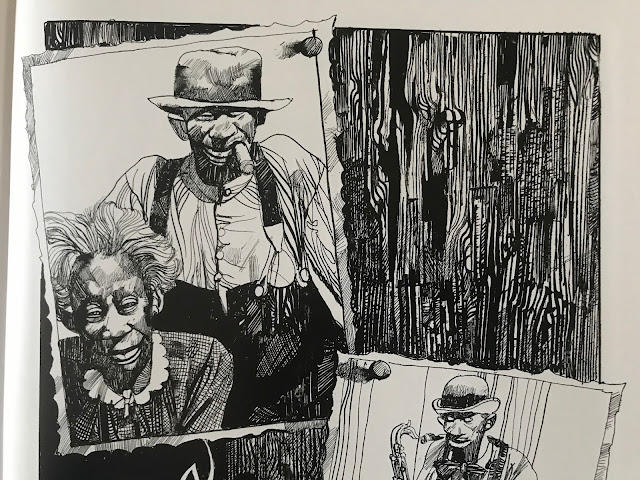
Every panel of every page is finely detailed and designed. I have no doubt that he got to a point in his art that he could produce this way without a lot of conscious planning: the textures, patches, spirals and strokes that make up his page have an organic quality like forms in nature have. I think that's the strength of it, his pages reflect the design of nature itself, like shapes in physics and biology. It's gorgeous to look at.

Not a lot of artists could make the grain of a wooden door look so compelling.
And there's more to it than just the images. He designs every page and panel to work with each other. Some combinations work better than others, but the guy has a rhythm of his own.

The inversion of positive and negative space between panels one and two is simple but striking, and lets the figures in the second jump out

Repeatedly as I read, I had to pause and take in how he was telling the story as much as I took in the stories themselves.
The bottom panels ascend in height as the characters ascend a slope
One other thing that stands out about his pages is that the panels are repeatedly broken, usually just a little, but it makes pages work as a unit rather than a collection of panels. Just a slight overlap here and there, but it prevents the panels from being rearranged. He's built a form-fitting construction of images.

The fourth panel commands the page by being the biggest, but it also does so by having the house slightly overlap into the first and third panel

This series, The Collected Toppi, is not typical of artist retrospectives. Often, books are done sequentially, with periods of an artist's work presented together. This series is by theme, with this book being North American stories. Other books feature Asia, Japan (technically Asia, but I get it, Japan gets more romanticized than the rest of the continent), South America, Africa, and a general fantasy theme one. Even within the book, the stories are not arranged sequentially. It frustrates the OCD part of me, but across 30 years Toppi's style was mostly consistent, so it isn't jarring to me as a reader. 

For the most part, North America means 19th century stories featuring white settlers and First Nations indigenous, with two stories in the volume about magical negroes, for lack of a better term. In some of the indigenous stories, the people have "magic", not in all. This is the writing of a man born in Italy in 1932, writing about the world, and so he worked in a lot of tropes verging on stereotypes. I'm fully aware of the contemporary discussion of topics in English Western culture, but I've also lived in Asia for 20 years and am aware that people in many countries enjoy their romanticized images of far away lands. The writing is not malicious in any way that I could notice, and generally had sympathy for the horror show that is the settlement of North America.

An Italian view of America's natives

That said, if today the Disney Corporation were to make a movie on the 19th century indigenous person's experiences, they're unlikely to consult the writing of a post-war Italian writer at any part of the process. 

I'm not going to say I'm blown away by the stories in here. These are largely old fashioned stories. These reminded me of Farley Mowat stories I might have read as a kid. In elementary school in Canada, here and there we would read tales of pioneers and explorers in Upper Canada. So they aren't super fresh to me now, but it's not a genre of story I see much in comics or film, so on that level, it's a change of pace.

A story with a samurai immigrant is colored with something like watercolors

What I like in the stories here is that there isn't a set morality or pattern of story. This isn't Uncle Scrooge where at the end of every story will have Uncle Scrooge rich and Donald Duck poor. A story where a man is warned to leave in peace could (and does) go a number of ways. He leaves and reflects on his wise decision. Or he doesn't leave and pays the price. Or he doesn't leave, and he deflates a myth and lives a long life. Toppi wasn't making stories in a clear tradition, and if there is any moral to the stories, it's that every story is different and one size doesn't fit all.


Ultimately though, if Toppi weren't drawing these stories, they'd be of limited appeal. Without his line work, they'd lose so much of their gravitas. 

There are four of these Toppi collections published, with two more on the way. I'm getting all of them. Maybe they'll start to feel repetitive after a few, but with the two I've read, I think that the six will be a very good amount of his stories and I may be interested in getting more.

Tuesday, April 13, 2021

One Coin Reads 23: Infinity 8, volume five, by Lorenzo de Felici, Lewis Trondheim, and Davy Mourier

Infinity 8, volume five, by Lorenzo de Felici, Lewis Trondheim, and Davy Mourier

2017, English edition 2019

Normally, you shouldn't jump into an eight-volume series with volume five, but for a sci fi book about a temporal loop with a different artist and different lead character on each volume, it shouldn't matter.

There is a Captain America vibe to this character

This is yet another of the discount Lion Forge Magnetic Collection books I've picked up. At worst, they've all been pretty good, and at best, great. This one is different in tone to those in that it's science fiction, but I thought it a relatively safe risk. It's decent, but I probably like it the least out of all the ones I've read. It's an action story that's well done, but it doesn't seem to have as much below the surface as the other ones.
This guy can draw
The concept behind it is strong: a massive spacecraft is stuck between galaxies due to an anomaly, and Protocol 8 is put into effect. This protocol involves setting up eight timeline probabilities for eight super agents to investigate. Each of the volumes features a different agent and artist, with co-writer Lewis Trondheim keeping the stories harmonious with one another. It's a very cool idea for a series. 

I like the detail of her saluting her watch

This book features agent and mother Ann Ninurta who performs her job regardless of risk to herself. She carries a shield that doubles as a weapon and a hoverboard
. She also endures what we'd call sexual harassment, but is treated in the world of the book as part of the job.
There's so much room in sci-fi to explore variations on inter-personal work space

Early in the book, she gets her mission to investigate an unexplained occurrence at a space-graveyard, and from there, the book is a non-stop sci-fi zombie rollercoaster.
Not a scene in the book but a pin up reflecting the contents
The art in the book is good. I especially like the colors. It has a tone of Jamie Hewitt, and the coloring is reminiscent of Jerome Opeña at times. The action is clear.

In the book notes, the artist notes on Ann's creation, he wanted a strong, attractive character without having her be sexualized. He gave her a shield like Captain America that could be used like the hoverboard from Back To the Future II. He's having fun with this, it's meant to be light.
That's a bit like Jerome Opeña, right?

The writing is good. It's a sort of "into the frying pan into the fire" kind of vibe, with Ann going from one deadly situation to the next. Where the book explains what's going on, my eyes glazed over and I filtered it out. Like so much sci fi, it can read like gobbledygook, but some readers might appreciate it more than me. But they manage to create a number of distinct locales in a small pocket of the galaxy.
More and more, it's the silent passages in stories which tell stories effectively for me, where characters show, they don't tell

Whether I would pay $20 each for all eight volumes to see how it all comes together is another thing. I liked this, but I wasn't dying to read more. It strikes me as being like a Marvel or DC crossover, but at half the length and double the price. Maybe it's a home run when read as a whole, but it's a heck of an investment for a new single story. I am interested in checking out another volume or two though. It's an interesting concept to build a story around, and maybe another book would add a layer to this one.

Wednesday, March 31, 2021

One Coin Reads 20: Curtain Call, by Lugano and Rodguen

 Curtain Call, by Wilfred Lugano and Rodguen

2013, English edition 2018

I went in to this book with no expectations, and finished it with a tear leaving my eye.

The cover fits the content of the book, but maybe the first impression was misleading 

One of the great discoveries of my bargain book purchases has been Lion Forge's Magnetic Collection of books. Before buying these books, I had never heard the name Magnetic Collection that I could remember, despite having a volume of their excellent Toppi collections. I just glossed over the publisher label on that one, I have too much information hitting me every day to have it all sink in. 

Once I got a few books though, their name stuck and I realized a few things about them:
-They are putting out some great translated works.
-They must be having difficulty getting their name out their consistently.

I'm not in the shops or at the shows, so maybe they are having better luck in the real world. So much of my experience of what's happening in comics is through the Internet, so I'm not an accurate barometer.

Vincent is the smarter one, Gaby the dumber one
Anyway, Curtain Call was a mere ¥491, not a difficult chance to take. At a quick preview, it looked to have animation style art and coloring, and I wondered if it would be a turn off when reading, but my eyes adjusted to it almost immediately. Rodguen was a Dreamworks animator for 15 years according to his bio, and his illustrations and character designs are full of life. I don't think there was a confusing or awkward drawing in the whole book.

The story is about a screw-up named Vincent who has a plan to rob an armored truck and get out of France, and start over. While the main story is fairly linear, there are a lot of flashbacks for Vincent and other characters to show their background and give an understanding of where they're coming from. It's all narrated from Vincent's point of view, giving the story a conversational feel and a natural flow.
Vincent's home life is fine. It's not great, not terrible. Maybe people can relate to this?

Early on, we see a twist in the heist of the story: Vincent wants to do an ethical heist. He's convinced that he has a way to pull it off where nobody will be hurt and all the people directly involved will be better off. Then the story leads to a climax with the heist, taking lots of turns that all manage to feel organic.

The plan

What's so good about this book is that Vincent is very real character. Writer Wilfred Lupano places him in a realistic setting where Vincent realizes he doesn't have a great upbringing or foundation, but he still has a much better one than so many of the people around him. Vincent isn't a good guy, but he wants to be better, he really wants to change who he is.

The story isn't overly political or about racial politics, but a lot of Vincent's spiritual awakening happens during a trip to Senegal, and the politics of race in France are an undercurrent. Vincent's partner Gaby is a homophobic racist and displays other negative qualities, but he manages to be portrayed in a sympathetic light while showing that he doesn't even understand what he's saying or why he thinks what he does (for example, he calls anyone brown a raghead, not understanding that the slur is aimed at a specific group). It's a clear contrast to the Manquette/Tardi book I read last week where I had difficultly separating the character's racism from the writer's racism. Here, I clearly can tell the writer is using to illustrate the character. 
Gaby is terrible at telling people off because he's just not that smart

Overall, I was just impressed with this book and closed it with a smile on my face. It wasn't predictable, but when it was over the arc of story made sense. By the end, I could see that the story was revealed with precision to get the maximum effect, but nothing felt like a writer's cheat, like information was withheld to create tension. The story unfolded in a naturally as Vincent, the character, would tell it.
The coloring by Ohazar is great. Lively and clear

And yeah, I had a tear in my eye at the end. The book has people who do bad things or stupid things, but it doesn't really have bad guys you're rooting against (at least not for more than a page or two). By the end, you just want everyone to be okay. 

I want to read more books where you like everyone.

Monday, March 1, 2021

One Coin Reads 8: Herakles Book 1, by Edouard Cour

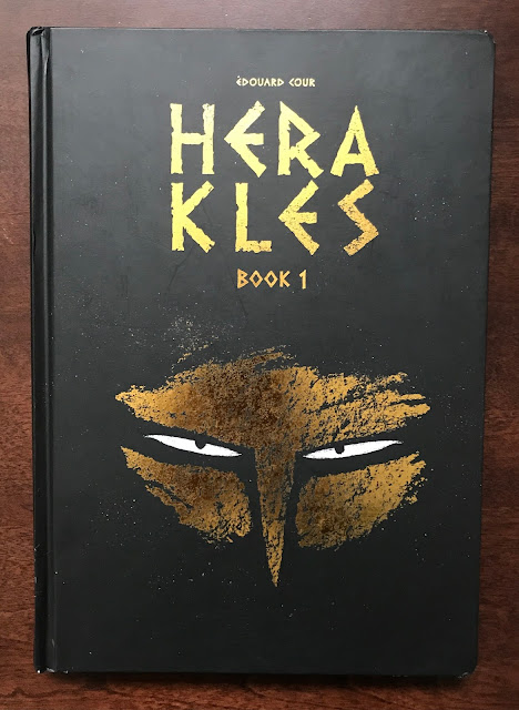
Herakles Book 1, by Edouard Cour

2018

This is exactly why I buy discount comics. The number of books which fall through the cracks in the market is beyond count. This was ¥525 and I thoroughly enjoyed it.


In the last few months, I've bought a few books from Lion Forge, enough that I was curious about their publication history. A quick wikipedia search reveals that they aren't that interesting as a publisher. Like Dynamite, IDW and a few other start up publishers, they copied the Dark Horse model and secured some licenses to guarantee an audience, and made a publishing line from there. I understand the importance of licensed properties to get kids reading comics, as I enjoyed Marvel's Star Wars comics in the early 80's. As a comic reader, they aren't interesting whatsoever, except in the odd case where an idiosyncratic creator wants to make a book as opposed to merely get paid to make one, like with Tom Scioli's nutty Transformers Vs G.I.Joe book.

So why have I been buying Lion Forge books? They bought out a publisher, Magnetic Press, a few years ago and made it a sub-brand, Magnetic Collection. They publish international comics in English. While more international work than ever is getting an English release, there still seems to be mountains of work yet to be translated. This stuff is really interesting to me, I want to see more of what is being done around the world.

So with this book Herakles, I'm hearing of Edouard Cour's name for the first time. It was first published in 2012, when Cour was in his mid-20s. This is a great early career piece of work.

Once you get used to the stylized illustration, it's very easy to sink in to

Cour is writing and drawing with an animator's eye. It's a book which would take effort not to read, with the images on each page coming alive. He has a strong design sense as well. At a glance, the stylization of Herakles was a little off-putting for a few pages, but pretty quickly it simply becomes the aesthetic of the book and is unnoticeable.

Herakles chases the Ceryneian Hind around the world for a year, eating as he goes. The book isn't a comedy, but it has a mixture of light and dark tones


Graphically, the pages are bold. I'm not sure what he's using to draw. It might just be pencils straight to scans and then colored. His website shows a deluxe black and white edition of the books, and it looks like pencils. However he's doing it, his pages have a nice texture and depth thanks to his technique.

He works in silhouette a lot, and one of the great motifs of the book is the dead and the gods appearing in the world in shadow. When the design is already strong, silhouettes can take it to the next level.

Side by side the black and white and colored editions

I don't have any strong criticisms of the book. It's part one of three, telling of the 12 challenges Herakles undertook in myth. It's a story I'm familiar with, but don't know well. It's great subject matter. Ultimately, this would be easiest to sell as an all ages book, but in a few places Herakles gets full frontal naked. I would let my kid read it, but it's a decision that Cour and his publisher have made that goes against publishing rules in the States. Likely in France, it's not a big deal. But without that minor thing, the book would be an easy purchase for any elementary school library in America.


Herakles speaks to Apollo and Athena

I enjoyed this a lot, and I'm tempted to buy the next two books, except that they aren't readily purchasable in Japan. It's a timeless tale, and these books will age well.

Sunday, February 14, 2021

One Coin Reads 3: POS by Pierre Paquet and Jesus Alonso

Piece Of Shit, by Pierre Packet and Jesus Alonso

2017

This was not technically one of my ¥500 books, but it was pretty close: ¥683, marked down from ¥2884. How could I not sample an oversized hardcover 250 page French book at that price?

If all the line work in the book was like those figures in red, I would have been a very happy reader

I know lots about American comics, but with French and European comics, I only know the broad strokes, generally the stuff published through Heavy Metal, Fantagraphics, or Drawn & Quarterly. I'm working on learning something about Humanoids.  Probably I should know about Pierre Paquet, publisher of Paquet Editions, but I don't. This is the first time I remember hearing of him. So I went into this cold. The cover is good. It doesn't exactly reflect the insides of the book, but it's a compelling image.

So, this autobiographical book is about Pierre and his falling outs with people over a decade or so of his life, roughly the lifetime of the dog on the cover, who is the one *person* he's able to maintain a healthy relationship with. He is a "piece of shit" in the story, a paquet de merde in the original translation (playing on his name), and the book is advertised as a mea culpa of sorts. But it's not. He burns some people on publishing by not being able to sell their comics, but this book shows he really tried and had things working against him. He is sued by an artist for not being paid, but the real truth was the artist was lying and abusing their relationship. Paquet as the big bad publisher ends up taking the heat. He has a falling out with an old friend and misses seeing them on their deathbed, but it was communication failure, not actually Paquet's fault. The stuff with women (the stuff on the cover), is late in the book, and he is wishy washy in a supposedly good relationship, so in that case, he is a piece of shit, but not really? Like, he lets the relationship trail off, he's not abusive or cheating. He's pretty human in his self-portrayal.

Paquet and Alonso aren't afraid to show a story visually

And so as I was reading, it was interesting to read, and it's well-told, but it's weird to see a book a guy wrote about his own life where he's taking blame in the title and concept of the book, but the book itself is him basically saying it wasn't really his fault, that he was doing his best but everything was working against him. Probably if the title and the description of the book was just about him being a screw up, it would have made more sense on the whole. 

I had a lot to think about and consider after though, which is more than I can say for a lot of books, so that's a positive thing. I'd rather it was interesting but frustrating, than competent but boring.

Alonso adjusts his palettes based on the lighting of the location. It's really subtle work

All of that before I even discuss the art! I didn't love the style overall, Jesus Alonso's art is a little looser than I care for. Especially for the main figures, I prefer tighter lines. I'm okay with impressionistic backgrounds. But it's still really good art. The color in it is near perfect. It has different color schemes on every page that look completely naturalistic, but aren't sampled from photographs. This is the kind of color work from the 50s and 60s in illustration that I marveled at as a kid. It's really a beautiful looking book. It's digitally drawn, and I don't love seeing digital brushstrokes compared to real brushes. I got over that pretty quickly though.


And the storytelling is great, panel to panel, scene to scene. His dog gets sick and has a bloated stomach, and Alonso is able to communicate that in a panel. He does a good job of animating the dog's facial expressions as well, without going into Disney territory. Alonso captures mood and expressions well, and each figure has their own distinct face and way of being drawn. 
I get this feeling there are hundreds of incredibly hardworking comic artists in Europe like Alonso, super competent in the fundamentals of comics, whose work rarely sees the light of day in English.

So I kind of liked this book? It was interesting, good looking, and easy to read. If it was just a fiction book, and not autobiography, I'd probably would have liked it more, but I can just pretend it's fiction on the re-read in a few years.