Showing posts with label European. Show all posts

Sunday, August 8, 2021

Reading Through 2021 100: The Interview, by Manuele Fior

 The Interview, by Manuele Fior

2013, English edition 2017

I had originally meant to stop at 100 entries in this blog, and as I prepared my 100th in May, a sprawling look at Uncanny X-Men Omnibus 3, I suffered extreme disillusion. The Internet is extremely disillusioning. I realized that people clicked through on reviews mainly on things they'd already read or had interest in, and mainly commented to express a disagreement. I think the saddest thing was posting some reviews on Reddit, and one time having negative votes. For posting a review. As if what American comics needed was fewer people thinking about, writing about, and caring about comics.  

I've continued to think about and care about comics, but not write about them. I'm sure I've read another 100 books in the last four months. The previous books in this blog feel like a year ago, not months. But I still do want to talk about and share the comics I read, especially the work that hasn't gotten the attention it should. 

In April, I read 5,000 km per second by Italian artist Manuele Fior. It was beautiful, emotional, and really exciting. It wasn't entertaining, or of the zeitgeist, nor did it have Batman in it. It was just a good book. I ordered two more of his books, and months later they arrived. I wasn't prepared for just how good and how different the first one I read would be.

Weird sexuality is a theme of the book

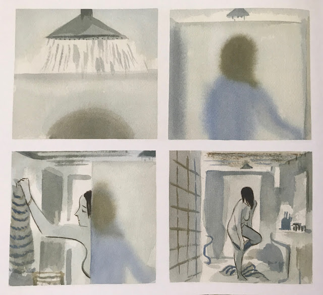
The first thing I noticed about it was that, while graphically in line with 5,000, he really was working a different part of his skillset with this. 5,000 was done in loose watercolors, with shifts in color palette throughout the book to match shifts in time and space. Here, he works in ink, both chunky brush and precise nib work. He uses something to texture the pages. Sometimes it's a gray wash, sometimes it's a pencil-like texture. His illustrations are, at their core, cartoony, but the pages carry a photographic weight in many places.
The book has a unique atmosphere, never exactly realistic, but with very natural structure underlying  the images
Like 5,000, it's a mild sci-fi. The story takes place in 2048, but it's very recognizable as our world. Some youth fashion shows it's in the future, and most of the cars are self-driven (
part of an early plot point has the middle-class protagonist driving his own car as a luxurious indulgence), but for the most part, this is our world. In 5,000, the story takes place over a few decades, so it was clear why the later half would go into the future. Here, the future setting isn't so important other than it gives Fior space to play with youth movements and how the older generations have difficulty grasping them.
This was the first real virtuoso page in the book. The movement on display with his hair and broken glass flying conveys the scene perfectly, with even the camera angle seeming to rock from left to right. It feels like being in a car accident

The book has two intertwined plot threads: The protagonist, a psychologist named Raniero, has a car accident late at night after a UFO sighting. This is haunting to him, as he knows it's 'crazy', but he also trusts himself enough to trust his experience. This happens as he's in the midst of separating from his wife.

The second thread involves a young patient named Dora he starts seeing, who has been admitted by her parents. She's a part of The New Convention, a youth movement that is against monogamy and traditional family structure. Immediately there is some connection between them as she doesn't feel she needs psychiatric assistance at all, and is only there because her parents can't understand her point of view. The two of them have their views of the world rubbing up against the conventional understanding of life.
If this were a modern American mainstream book, the artist would have simply copy-pasted the illustrations. Fior animates his characters from panel to panel, breathing life into them.
From there, there is some inevitability that they will sleep together, as dual protagonists in a story, but also that they have established an emotional connection. But that isn't the story. I'd be hard-pressed to say what the story actually is. It's a series of emotional shifts as two people with unstable lives navigate the world, a world that pushes against their own personal realities. 

I haven't watched them in decades, but I greatly enjoyed the 60's New Wave films of Jean-Luc Godard when I was in my twenties. There was barely a story, just emotional truths and gorgeous images. This book has a lot of that. In the wrong hands, this book will be extremely boring. This book is much closer to 'art' than to entertainment. I have a lot of entertainment books, not a lot of 'art' books, which is probably why this resonated so strongly with me. I'm hungry for work like this.

While the art has a feeling of cartooned realism like the best of Disney movies, a sex scene is interrupted by a nude panel that is borderline photographic except for Dora's face. It stops you in its tracks, and likely that is the emotion Raniero himself is feeling as his world stops and he takes in the body in front of him. 
I have no idea of the techniques going on here

Fior has violence trickle through the book as well, that casts a shadow over the rest of 
"normal" life.
Fior's storytelling is fluent, if I had to choose one word
Fior balances down to earth talky scenes with panoramic scenery, and spurts of sex and violence. It's about the glacial shifts of emotion people go through in their lives. People change slowly, but they still decidedly change.

At the end of the book, I was wondering just what I had read. It was not a story in a conventional sense. But I loved it. It had resonance. I thought about it for days after and opened it up again to look at the art a few times. It's a short list of books that come off the shelf so soon after they go up.
Young people, ugh
I was taken by the body language, the facial expressions, the lighting, the architecture. Fior is a comic artist at heart, but he's working in a school of art far outside of what I'm accustomed to. I've been reading alternative comics for decades now, through Raw, Drawn & Quarterly, Fantagraphics, L'Association, and so on, and while I've often seen masterclass work through those venues, I don't see so much these days where the artist is staking out new territory like Fior seems to. 
Once you see what you're looking at, this is a pretty incredible two panel sequence
I have one more Fior book on the pile, and I'm just going to have to order the others Fantagraphics have made available. I don't know if they'll all be as exquisite as this, but they have to be worth the read.

Monday, May 17, 2021

Reading Through 2021 98: I, Rene Tardi, Prisoner of War in Stalag IIB, by Jaques Tardi

I, Rene Tardi, Prisoner of War in Stalag IIB, by Jaques Tardi

2012, English edition 2018

It's a great story, and it has great art. Is it a great comic?

The oversized hardcover is perfectly printed
Previously I read the first volume of Tardi's Streets of Paris, Streets of Murder, and I loved it.  It really clicked for me.

I promptly ordered this series to see more personal work from Tardi and it's great. The cover notes promise "an artistic triumph," and it's hyperbole, but maybe accurate. The book is 180 pages of impeccably drawn and researched images of WWII era France and the camps of Germany.

The vast majority of the book is black and white, except a select few pages with accents
For Tardi, the book couldn't be more personal. This is his deceased father Rene Tardi's story of WWII. Tardi had asked his father to record as many memories of the war as he could, and his father obliged with detailed accounts supported by illustrations to make things clearer.

Father Rene's image on the left, and Tardi's own image based on it
Tardi then went and did his own research to create a more fleshed out image of the period, and proceeded to make three books out of it. This first volume covers the start of the war until the fall of the Reich in 1945.

Tardi inserts himself in the narrative as a boy, critiquing or questioning his father's story
The book maintains a consistent three-tiered, three-panel page throughout, and is narrated by the father as it happens. While the father goes about his life as a soldier or later, a prisoner, Tardi himself has dialogues with him about exactly what is happening.

Actually killing a person for the first time leaves the father with something like PTSD
As a story, it's as compelling as any other serious war narrative that takes the time to show the human cost and that there is no easy solution. Rene Tardi was a young man in his early 20s, and five years of his life are wasted fighting and later imprisoned in a neighboring country. France is occupied early on in the war, and the French soldiers are interned deep behind enemy lines where they are often used as slave labor. 

Tardi adds a little humor to his role as the artist of the book
Rene has few illusions about the reality that his life there sucks, but that it's also a lot better off as soldier from a country at peace (through its occupied government) than to be an interned soldier from a warring country like Russia. He is suffering, but realizes he could be suffering a whole lot more.

Tardi cuts no corners with the art. Every picture is drawn with attention to detail
Relative to war stories, it's not overly horrific, or I'm just getting numb to it all in my old age. Rene acknowledges all the other horrors of Nazi Germany, but is lucky to be shielded from the worst of it.
Camp life
This is an amazing story, it's a comic, but comparing it to his noir work, he avoids making this compelling or exciting with comic techniques. It's told in a dry manner. I read Paco Roca's excellent Twists of Fate this year, another book about a personal recollection of WWII. That book attempts to put you in the action, to let you experience what the main character did. In contrast, I, Rene Tardi, Prisoner of War in Stalag IIB seems more comparable to a Ken Burns documentary. It is full of scenes of the war, but doesn't so much show them as they happened as it does show that they did happen. 
The use of photos is one of the rare instances of comic panel-like images
I can't know why, but I imagine Tardi simply didn't want to "write" what happened to his father. He wanted his father's words to speak for themselves. Rene left ample personal notes on his time, and it seems to be an appropriate choice.
Nationality divides even prisoners in this world
A true story of war is not a happy one, but even acknowledging that, I was disappointed at first with this book. So much of the energy that I loved in Streets of Murder wasn't in here. As I sat down with it, I enjoyed it for what it was, and furthermore, understood that this approach to the book was the appropriate one. 
Tardi has managed to pay tribute to his father, and also give a vivid and personal account of WWII. We're all the richer for him sharing it.

Monday, May 10, 2021

Reading Through 2021 93: The House, by Paco Roca

The House, by Paco Roca

2015, English edition 2019

Paco Roca is a sensitive man, and I'm here for it.

The cover is a pretty good summation of the vibe of the book. If you like this, you'll like the book
This is my third Roca book, following Twists of Fate and Winter of the Cartoonist. He has at least another two books I haven't read, but it's only a matter of time because I am going to become a completist. He's making a kind of comic which few others are: mature, refined stories without any manufactured melodrama. 
Roca uses strips within strips on many pages, capturing multiple small moments
Twists of Fate and Winter of the Cartoonist were both true stories, more or less. Fate was based on one man's account of WWII, while Winter was based on the lives of a number of 1950's Spanish cartoonists. The House isn't explicitly autobiographical, but the degree of detail and the similarity of a central character to Roca in age and job gives the feeling of true experiences.
The use of color is impeccable. The story shifts between the past and the present through an adjustment of the tint. Here it's more pronounced, but he uses many subtle changes as well
The book starts with the death of the elderly father of a family. His three grown children are left to take care of his rural weekend home and prepare it for sale. It begins with the younger brother (who seems to be the Roca analogue), and later introduces the oldest brother and a sister. 

While the other books of his that I've read were done in brush and ink, this seems to be done with something like a Rapidograph. I'm partial to brushwork, but Roca gets a lot of life out of his line, and his coloring manages to capture an organic, brushlike stroke. He manages to create a very clear, structured image, but still maintain a lively feel to the lines.
Color here is used to highlight how different memories are just thrown away 
The book uses a wide, panorama format, on whose pages Roca crams multiple rhythms. A page might have three or four horizontal sequences, or two horizontal sequences and one vertical. The panel layout remains intuitive to read no matter the format.

As a writer, Roca navigates a number of threads as we're introduced to these characters. The first is the relationship of each grown child to their father. The father having passed away, all are confronted with the things unsaid, the promises they never quite kept, and just accepting that a period of their lives has closed.

The three siblings themselves have a relationship dynamic that is slowly revealed through their interactions.  All three are married and show different dynamics within their own new families as well.
Another page with multiple rhythms. An elderly neighbor sheds insight on their father's experiences in his later years
All of these relationships are nuanced without veering into cliché. Perhaps the relationship of the two brothers is the simplest, as the older brother has a bitterness to him over feeling pressure to be the responsible one in the family and having to handle the most of the father's estate. Still, their dynamic manages to have complexity as they deal with their relationship to one another as well as both to their father. Both had very different perspectives on how their family life was.
A particularly nice use of time shifting as a brother remembers the view he once saw when he was a child
I was only a few dozen pages in before I started deeply considering my own life and my family. The situations Roca is portraying are all too real. He pulls out a lot of emotion from the reader by showing realistic dynamics rather than amped up ones, and that is no easy feat. The patriarch of the family is absent in the story, but his presence still weighs on everyone. All of them spent long amounts of time at this second house, but less and less as they got older. Eventually it became their father's house more than the family's house. Simply being in the house makes them recall parts of their lives long past. Not necessarily better days, but different days long gone, impossible to reclaim.

As a reader, it's hard not to reflect similarly on your own life.
Here, the present and past overlap, as a grandson remembers only a few years back
As they look after the house, they see how their own relationships have moved away from each other, and to an extent have to reckon with their own families which might someday suffer a similar fate. 
The book has very cinematic vibes, with the consistent use of space and people in it, allowing the reading of the work to be intuitive  
The book is in no way a sad or depressing, it's got some humor mixed in too. It's simply a reflective, contemplative work, recalling those times in your life when you stop for a while and survey the state of your life. The act of reading this caused me to consider my own. 

Roca writes as well as he draws, creating a space for the characters' emotional lives and for readers' emotional lives too.

Friday, April 30, 2021

One Coin Reads 29: Marilyn's Monsters, by Tommy Redolfi

Marilyn's Monsters, by Tommy Redolfi
2016, English edition 2018

A dreamlike biography of Marilyn Monroe? Not what I consider the Humanoids brand.
It's a kind of weird cover, but not out of line with the story
Just from seeing the front cover blurb by David Cronenberg, you would know this isn't going to be a normal book. The tone of Marilyn's Monsters isn't Cronenberg by any experience I've had of his movies, but it is very much in the tone of David Lynch. Normal people doing normal-ish things, but everything is off and everything is a little too intense. 
There are some parallels between Betty Book and Marilyn

The story is Marilyn Monroe's story, but it isn't. It's emotionally Marilyn Monroe's story told through a dreamy, fairytale style window. It wasn't what I was expecting, but even if I was told in advance what this was, I would have had a hard time grasping it. It's just outside of my frame of reference for comics.
Holy Wood isn't very glamourous
Whereas in the real tale of Marilyn Monroe, young Norma Jean Baker went to Hollywood to become a movie star, in this story, young Norma Jean Baker goes to Holy Wood, a series of cabins in the forest to become a celebrity. There is talk of movies, but they seem an export of Holy Wood the way oil is an export of the Middle East. 
Graphic shifts like this add to the atmosphere
After applying and getting through auditions, Norma Jean is approved and gets to make the transition to Marilyn, which involves being reconstructed. And she becomes a star, but also becomes an item, and has more and more difficulty being a person as the story goes on. If she isn't going to function as a movie star, what good is she to the people around her?
"36 days to M.M."
The theme of "famous people are people too," is one that carries weight. No doubt that the rich and famous have luxuries the common folk don't, but it doesn't automatically give them happiness, and in lots of ways, it can get in the way of a healthy life. Marilyn here is desired, not as a person but as an object, and her success brings a deep loneliness.
It's kind of gross
Writer/artist Redolfi is doing some really nice work here. The art style is a bit grotesque and it's not something I instinctively like, but it captures the mood nicely. Especially in the close up images, you can see great uses of shape, colour and texture. Throughout the book, he drops in shifts in style and colour to emphasize the atmosphere.
Another shift
When Marilyn finally is revealed, he bathes her in white light and often renders her only in colour without lines, to make her appear, well, not human the same way others are.

Whether you like this or not may come down to just how much you like the movies of a filmmaker like David Lynch. I like Lynch's movies, and have seen most of them... but in the 90s. Mulholland Drive was the last I watched. I thought they were really exciting, I watched them, and didn't have much desire to rewatch them or follow up on his work after a point.

Likewise, I liked this book a fair bit, and read it in two days or so. I wasn't so blown away with it that I looked up what else Redolfi has done though.  It's a good piece of work that isn't what I get excited at reading. I could imagine a lot of people, especially people who avoid mainstream comics entirely, really liking this.

As a Humanoids book, it is a world away from Jodorowsky. I know they put out a variety of books in France, but it's nice to see some of that variety in their English bookline as well.

Thursday, April 22, 2021

I Really Should Read This 25: The Collected Toppi: North America, by Toppi

The Collected Toppi: North America, by Toppi

1977-2007, collected in 2020

This is my first time writing about Toppi, it won't be my last.

Magnetic Collection love their rounded corners

Over and over again, algorithms kept recommending Toppi to me based on what I do online, and about the 20th time, I took the machine's advice and checked it out, and it turns out it was what I wanted to read. I wonder if I had seen this some of this stuff 30 years ago in Heavy Metal or somewhere, but if I had, I was too young to really appreciate it. 
The stories in this volume range from 1976 to 2007, but most fall in the 70s and 80s
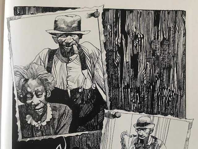
So, right up front, regardless of the quality of the writing, people are going to buy this for the art. Toppi draws the hell out of everything.

A shaman 
Every panel of every page is finely detailed and designed. I have no doubt that he got to a point in his art that he could produce this way without a lot of conscious planning: the textures, patches, spirals and strokes that make up his page have an organic quality like forms in nature have. I think that's the strength of it, his pages reflect the design of nature itself, like shapes in physics and biology. It's gorgeous to look at.

Not a lot of artists could make the grain of a wooden door look so compelling.
And there's more to it than just the images. He designs every page and panel to work with each other. Some combinations work better than others, but the guy has a rhythm of his own.

The inversion of positive and negative space between panels one and two is simple but striking, and lets the figures in the second jump out

Repeatedly as I read, I had to pause and take in how he was telling the story as much as I took in the stories themselves.
The bottom panels ascend in height as the characters ascend a slope
One other thing that stands out about his pages is that the panels are repeatedly broken, usually just a little, but it makes pages work as a unit rather than a collection of panels. Just a slight overlap here and there, but it prevents the panels from being rearranged. He's built a form-fitting construction of images.

The fourth panel commands the page by being the biggest, but it also does so by having the house slightly overlap into the first and third panel

This series, The Collected Toppi, is not typical of artist retrospectives. Often, books are done sequentially, with periods of an artist's work presented together. This series is by theme, with this book being North American stories. Other books feature Asia, Japan (technically Asia, but I get it, Japan gets more romanticized than the rest of the continent), South America, Africa, and a general fantasy theme one. Even within the book, the stories are not arranged sequentially. It frustrates the OCD part of me, but across 30 years Toppi's style was mostly consistent, so it isn't jarring to me as a reader. 

For the most part, North America means 19th century stories featuring white settlers and First Nations indigenous, with two stories in the volume about magical negroes, for lack of a better term. In some of the indigenous stories, the people have "magic", not in all. This is the writing of a man born in Italy in 1932, writing about the world, and so he worked in a lot of tropes verging on stereotypes. I'm fully aware of the contemporary discussion of topics in English Western culture, but I've also lived in Asia for 20 years and am aware that people in many countries enjoy their romanticized images of far away lands. The writing is not malicious in any way that I could notice, and generally had sympathy for the horror show that is the settlement of North America.

An Italian view of America's natives

That said, if today the Disney Corporation were to make a movie on the 19th century indigenous person's experiences, they're unlikely to consult the writing of a post-war Italian writer at any part of the process. 

I'm not going to say I'm blown away by the stories in here. These are largely old fashioned stories. These reminded me of Farley Mowat stories I might have read as a kid. In elementary school in Canada, here and there we would read tales of pioneers and explorers in Upper Canada. So they aren't super fresh to me now, but it's not a genre of story I see much in comics or film, so on that level, it's a change of pace.

A story with a samurai immigrant is colored with something like watercolors

What I like in the stories here is that there isn't a set morality or pattern of story. This isn't Uncle Scrooge where at the end of every story will have Uncle Scrooge rich and Donald Duck poor. A story where a man is warned to leave in peace could (and does) go a number of ways. He leaves and reflects on his wise decision. Or he doesn't leave and pays the price. Or he doesn't leave, and he deflates a myth and lives a long life. Toppi wasn't making stories in a clear tradition, and if there is any moral to the stories, it's that every story is different and one size doesn't fit all.


Ultimately though, if Toppi weren't drawing these stories, they'd be of limited appeal. Without his line work, they'd lose so much of their gravitas. 

There are four of these Toppi collections published, with two more on the way. I'm getting all of them. Maybe they'll start to feel repetitive after a few, but with the two I've read, I think that the six will be a very good amount of his stories and I may be interested in getting more.

Friday, April 16, 2021

Reading Through 2021 76: 5,000 km per second, by Manuele Fior

5,000 km per second, by Manuele Fior

2009, English edition 2016

All of a sudden, I have a hankering to call up my high school girlfriend.

I thought this was just more digital paint at first, but no, this is real, analogue art
This artist was brought up on an Internet thread, while at the same time that I've been trying to explore more European works, so I took the plunge on it. It's a short book, a breezy 135 pages, and when I closed it, I had a lot of emotions.

The illustration has a design/fine art sensibility that is not found in most comics

Before even looking at the story, you have to take in the art, and Fior is channeling a number of different influences, all working off of each other. The big one is Disney, and there are a few explicit Disney images in the book, but that just seems to be an anchor for the characters and storytelling. It's all done in watercolor, and he embraces the looseness of the medium. He's not tightening the color with an ink outline, he's rendering it all in paint. He does work reminiscent of 20th century modern art, like some Picasso or German Expressionism. And there is a quality of illustration from 20th century fashion magazines. It all has a feeling and flow, without ever veering too far into the abstract. I'm a little jealous, to be honest.

Fior captures a moment that will rightfully never leave the memory of either person

He frames each image in a white frame, and you can feel that the picture extends beyond the frame in part by the unpainted pieces that peek through. It's a technique that embraces the medium rather than try to create an illusion. 

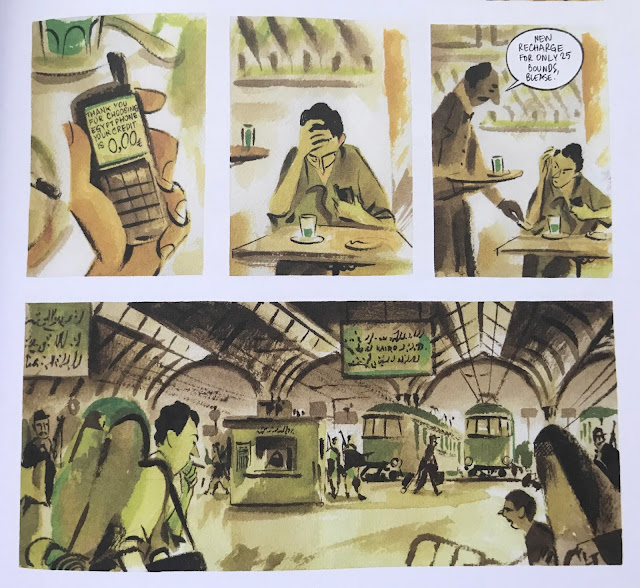
On top of that, he uses a different color scheme for each scene and location, letting the reader instantly make associations just at a glance. Fior either had a lot of experience before making this, or incredible intuition.

The book attempts to convey multiple languages, with some challenge as the original text was in Italian
There is a story too. Piero and Lucia meet as teens in an Italian town. Just as they meet, the story ends, and we're transported years later to Lucia visiting Norway. When it returns to Piero, he is working an archeological site in Egypt. The two are separated romantically, but are still tied together emotionally.

This set of panels is painfully good
I don't want to tell more, because part of the pleasure of reading this book is seeing time unfold. The title 5,000 km per second isn't any literal thing in the book, but would seem to be an acknowledgement of how quickly "now" can become "then." Seeing where Lucia and Piero's lives go and getting an understanding of their inner life definitely made me reflective of my own. Just typing this brings up the feels. This is a book that unlocks the memories that will always make you feel good.

Egypt gets a different color palette than Norway or Italy
The closest comic I could relate this too was some of Jaime Hernandez' less straight forward stories. Some of his Maggie and Hopey books have time jumps and changes in setting, and it's up to the reader to get the clues and fill in the details. At one or two points in this, I had to flip back a few pages to check if I missed something. The main issue was that I hadn't remembered the main characters' names, but once I realized this was a book that jumped in place and time, I was with it. Like Hernandez's books, Fior captures regret, longing, frustration... moods that often come out of having love in your life. Life would be much easier if you never cared.

Time passes

I liked this, and I'm interested in seeing if Fior's other books are similarly emotional. The other European artist I discovered last year, Paco Roca, is much more methodical in his art and story, though both artists have something similar in their sensibilities.  They both make a very mature type of full color story that is appealing to adults in a way that likely would be unappealing to a teenager.


This kind of work feels like a breath of fresh air, and reminds me of what life is about.