Friday, April 30, 2021

One Coin Reads 29: Marilyn's Monsters, by Tommy Redolfi

Marilyn's Monsters, by Tommy Redolfi
2016, English edition 2018

A dreamlike biography of Marilyn Monroe? Not what I consider the Humanoids brand.
It's a kind of weird cover, but not out of line with the story
Just from seeing the front cover blurb by David Cronenberg, you would know this isn't going to be a normal book. The tone of Marilyn's Monsters isn't Cronenberg by any experience I've had of his movies, but it is very much in the tone of David Lynch. Normal people doing normal-ish things, but everything is off and everything is a little too intense. 
There are some parallels between Betty Book and Marilyn

The story is Marilyn Monroe's story, but it isn't. It's emotionally Marilyn Monroe's story told through a dreamy, fairytale style window. It wasn't what I was expecting, but even if I was told in advance what this was, I would have had a hard time grasping it. It's just outside of my frame of reference for comics.
Holy Wood isn't very glamourous
Whereas in the real tale of Marilyn Monroe, young Norma Jean Baker went to Hollywood to become a movie star, in this story, young Norma Jean Baker goes to Holy Wood, a series of cabins in the forest to become a celebrity. There is talk of movies, but they seem an export of Holy Wood the way oil is an export of the Middle East. 
Graphic shifts like this add to the atmosphere
After applying and getting through auditions, Norma Jean is approved and gets to make the transition to Marilyn, which involves being reconstructed. And she becomes a star, but also becomes an item, and has more and more difficulty being a person as the story goes on. If she isn't going to function as a movie star, what good is she to the people around her?
"36 days to M.M."
The theme of "famous people are people too," is one that carries weight. No doubt that the rich and famous have luxuries the common folk don't, but it doesn't automatically give them happiness, and in lots of ways, it can get in the way of a healthy life. Marilyn here is desired, not as a person but as an object, and her success brings a deep loneliness.
It's kind of gross
Writer/artist Redolfi is doing some really nice work here. The art style is a bit grotesque and it's not something I instinctively like, but it captures the mood nicely. Especially in the close up images, you can see great uses of shape, colour and texture. Throughout the book, he drops in shifts in style and colour to emphasize the atmosphere.
Another shift
When Marilyn finally is revealed, he bathes her in white light and often renders her only in colour without lines, to make her appear, well, not human the same way others are.

Whether you like this or not may come down to just how much you like the movies of a filmmaker like David Lynch. I like Lynch's movies, and have seen most of them... but in the 90s. Mulholland Drive was the last I watched. I thought they were really exciting, I watched them, and didn't have much desire to rewatch them or follow up on his work after a point.

Likewise, I liked this book a fair bit, and read it in two days or so. I wasn't so blown away with it that I looked up what else Redolfi has done though.  It's a good piece of work that isn't what I get excited at reading. I could imagine a lot of people, especially people who avoid mainstream comics entirely, really liking this.

As a Humanoids book, it is a world away from Jodorowsky. I know they put out a variety of books in France, but it's nice to see some of that variety in their English bookline as well.

Thursday, April 29, 2021

One Coin Reads 28: Fear Agent volume 3, by Rick Remender, Tony Moore, and Matthew Hawthorne

Fear Agent volume 3, by Rick Remender, Tony Moore, and Matthew Hawthorne

2009-2011

Purchased at the same time I got the second collection, I finally finished off the book Fear Agent.

Grizzled
With this, I've read half of the run. I haven't bought the first, and there is a fourth odds-and-ends book, but Book 3 officially ends the story. With Book 2, I was a little confused as to what the whole concept was, as the first of the two arcs there occurred before the events of the first book. Here, I mostly understand the world and have a history with the characters, but it's wrapping up storylines I missed the first chapter of. As a result, perhaps some of the things don't hit quite as deeply. But for the most part, any praise or criticism I have for this isn't too connected to the bigger story.

Space cowboys
As a quick refresher, Fear Agent is pulp sci-fi, with the name and title font being a big hint of that. It's closer to 50's sci-fi in tone than to the "hard sci-fi" which is normal today. Humanity has largely been wiped out, and star Heathrow Huston is an alcoholic Texan floating from one crappy situation to the next, surviving by the skin of his teeth.

The best thing about this is that it has fun. It's full of dark, bleak situations, but tries to make the story pulpy and crazy. The flip side of that though is that when the book wants to have heavy emotion, it struggles because it's all so goofy.

There's a lot of flashback exposition in this run
The last collection had an arc by Tony Moore, and another by Jerome Opeña, and with that, I definitely preferred Opeña's. Here, Opeña was probably busy drawing X-Force or something, and the art is done by Moore and Matthew Hawthorne. Both are very competent artists, but they both lack the ability to give the book drama. The back cover has a blurb of praise from Jack Davis, of E.C. Comics and Mad fame, and he was a guy who could have pulled it off. A book like this requires some old school skills to ground the ridiculous.
It's a solid sequence, but the grizzle isn't grizzled enough for me
Moore and Hawthorne are doing fine work on this, but I don't think they are a perfect match for the material.

The collection contains two arcs, and the second works better than the first. In the first, I Against I, Huston crash lands on an alien planet with a Wild West style city filled with humans, some that he knows. The reason for this is very convoluted and probably what held it back for me. There is a time-displaced version of Huston there, a doppelgänger, and trying to make it make sense was too much for me. Remender had a vision of Huston fighting Huston, and a plot resolution of the story that was really inventive, so I understand why he wanted to get there, but the book creaks while trying to make this goofy sci-fi make sense. I would just as well have seen him do some hand-waving and go straight to the fireworks factory.

The fireworks factory
The second arc, Out of Step, worked better for me, with a winding yet coherent path to the end of the series. An aged, lonely Huston wanders the galaxy nursing an unhealthy degree of alcoholism. The book has had some time travel shenanigans in the previous arcs, and the final solution for the depressed Huston is to fix time itself.

This isn't a very honest portrayal of alcoholism as Huston is super high functioning. At this point, he should at least have puffy skin
The story is about someone on their last legs, having mostly given up, and it's decent. As an end to the series, the climax tries to make it both galaxy-altering and personal to Huston. This series has had so many shock endings and deaths of main characters, that there is actually a lot of doubt as to how it might resolve. A happy ending isn't a given in the world that's been set up here. 


At the end of it all, it was a satisfactory resolution. Not mind-blowing, but plot resolutions rarely are.

Overall, I liked this series. I didn't love it, but the idea behind it, to make a modern, expanded version of the old pulp stories, was nice to read.

Remender is one of the contemporary comic writers who I've been trying to get a better understanding of. I never quite love what he's doing, but I really find it compelling. With this series, I like the exploration of grief and alcoholism in a book with exploding space monsters. 

There's a lot more flashback exposition in the second arc too
I have a couple more series of his that I'm looking forward to digging into. I've read the first arc of Low and Black Science, and especially with Low, I felt like the art was capable of carrying the drama of the book. 

A book like Fear Agent though seems more fun than anything else. The pathos and the emotion end up being dressing for the blood and aliens.

Blast off!
That's okay though. I definitely got my worth out of these collections. They were enjoyable and worth revisiting someday.

Tuesday, April 27, 2021

One Coin Reads 27: Doctor Strange: Herald, by Mark Waid and Barry Kitson

Doctor Strange: Herald, by Mark Waid and Barry Kitson

2019

Marvel pumps out over 50 comics a month. A couple of them are pretty good, the rest are folks paying rent. Which is this?

The cover looks epic
I generally won't touch monthly Marvel and DC books anymore because they are so editorially driven. The books must exist to fill up space on the shelf, so they find some people to work on it. That's not a recipe for good books. Good books happen in spite of this system, not because of it.

I think Doctor Strange is a neat character, though I've never been deep into any of his books. This collection was marked down to ¥315 (less than the price of a single issue of this new!), so I figured it would be a chance to read some Doctor Strange and see what the state of Marvel's monthly books are like at the same time. Mark Waid is generally a reliable super-hero writer, but I haven't read much of his work in the past twenty years.

The art is competent yet bland for most of the book
Doctor Strange is pretty well-known at this point, as a B-list comic and movie character. Here, Waid wants to cross him over with Marvel's cosmic side for a fresh spin on the character. In the first issue of the five in this book, Galactus is transported to the realm of magic, where the realm begins transforming Galactus and putting the entirety of reality at risk. Doctor Strange must serve as the herald of Galactus!

Are you really the herald if Galactus doesn't proclaim it?

That was the first problem: you can't put reality at risk all the time, Marvel. Whether it's the M'kraan Crystal, the House of M, the Age of Ultron, whatever, after sixty years of this stuff, it's nearly impossible to establish convincing stakes at that level in a Marvel comic anymore. Four times a year, all of reality in the Marvel universe is put at risk. It isn't an epic situation in and of itself.  Make no mistake: not a single Doctor Strange reader hasn't seen the whole of existence threatened before (in a comic). This is nobody's first comic anymore.

The only time I liked the art was when Kitson was directly channeling Kirby

The second problem was that it was done in a five issue story which tells the danger of Galactus but doesn't show it at all. This story probably should have been done in two arcs, spaced out. Do a five issue story getting Galactus to the magical realm and solving a related issue. Let him putter around in the background in the next two arcs, and then have it out of control in a final arc, which would let it feel epic, like something that had built up. This story was just Doctor Strange saying Galactus can't handle the magic energy, then someone else saying it, then another person saying it. It was very tell-don't-show stuff. 

The third problem is that none of it is really exciting. Galactus is taken over by Dormammu for 12 pages, Dormammu monologues, then Galactus absorbs him. There are no stakes, nothing is really explored. Just a bunch of stuff happening without consequence. Before decompressed storytelling took over the mainstream, I think you could make a five-issue epic, but this story simply doesn't have the space to examine the ramifications of anything.

Kitson could draw any crazy shit he wanted to, and this was what he went with

I read all of this, as that's part of the challenge for me this year, to read everything, but it was bland. The art really didn't help. This is the first time I've ever read Kitson's work to my memory, but there was no joy in it. It really seemed like a guy drawing what he was paid to draw, and little else. There were some pictures of Galactus going power-crazy which had some passion, but it was hard to find elsewhere in the comic. I don't know his work, so it's hard to say if inker Scott Koblish helped or hindered it. At different points he draws dozens of Marvel characters, and I'm taken back to the days of Secret Wars II, where the best compliment I could make was that the characters were all on-model.

"Ah, yeah..."
The biggest disappointment with this was the lack of character. The book was so concerned with dishing out plot that there wasn't really space for Waid to make any of the featured characters people. That's probably the thing that I enjoy most when reading mainstream comics, the chance for characters to really take on a personality. When comics are being published at such a high frequency, we should really get to know the characters well, and I didn't get that here. It was focused on plot, and not a very interesting one.

The main value in reading this was so that when I go back to saying mainstream comics aren't worth sorting through on a monthly basis, I have a recent concrete example to back that statement up with, it's not just a blind statement.

Hey Marvel and DC, you want me to buy new books? Make something good and get it Eisner nominated. 

Monday, April 26, 2021

One Coin Reads 26: Black Kiss 2, by Howard Chaykin

Black Kiss 2, by Howard Chaykin

2012

This was not very good.

Chaykin does an interesting thing with cut out textures 

Purchasing this, even at a price of ¥428, might be a kind of trolling, as people had said it's not good. I just thought, for the price of a sandwich, why not?

Do you want pornography layered with blood and hate? This is it.

When they find out their babe is man, they decide to rape him and kill him, before all getting slaughtered. That's a complete story
I am definitely particular about the use of graphic sex in comics. In a mature comic, like a Hernandez Bros story, it's perfectly done. It's sexy and natural and tells a story. In some of the Italian erotica comics, like Manara's, it's sexy for the point of being sexy. In something like this, I don't get it. It's not erotic, and explicitness isn't necessary to the story, so I'm left with the idea that Chaykin just wanted to draw penetrations and make money off of it. And power to him, I'm all for creative freedom, but it doesn't make for an interesting comic.

Chaykin is not repressed

There is an over-arching story, told in ten-page vignettes. Beverly is a succubus that exists from 1900 to 2010, fucking and killing her way through... not high society exactly, but semi-glamourous locations. Along the way, people are as cruel and hateful as they could possibly be. 

As a plot, there's not much of one. Beverly finds a gay partner, anointed Dagmar, who transforms into her doppelgänger to help her live the lifestyle she wants. The gay partner gets killed, and is replaced by another gay man anointed Dagmar II. The next one is Dagmar III.  Beverly encounters lustful, cruel men who she kills.

The book uses gay identity interchangeably with trans identity, and that's not exactly the way the world is, but some people do have shifting identities, and in the past, there wasn't the space mapped out to differentiate. It's commendable that a book like this can recognize sexuality as a fluid thing. But then it's buried in decapitations, rape, slurs and other things which aren't compelling on their own.

I'm more comfortable posting explicit blood than explicit sex, because that's how society has programmed me

I have little experience with Chaykin's work. When I was twelve, I bought an issue of Black Hawk he did, because it was going to be the next Dark Knight Returns. I ignored his work after that, including the original Black Kiss, which didn't make it to my suburb. I mainly know him from the past few years where he had some controversy about The Divided States of Hysteria, but I'm reading this book as it is, without any baggage of him as an artist or an outspoken figure. And this isn't a good comic.
What am I reading?

The art is fine. I like the rendering in a lot of it. There are some janky pictures, but I like the overall aesthetic. The is a weird cut and paste vibe with backgrounds made interesting because there's a graphic element to them, they're not simply processed photos.  The story is not much of a story, but that's fine enough as well. I think you could take the content and make something aesthetically compelling with it. As a package though, it's such an emotionally stunted vision of a dark adult life, it's mind-bending. 

All the people in this talk in this highly eroticised misogynistic and homophobic way.  Almost every page talks about cocks or whores or cunts or faggots.  And I get it, the past could be cruder in the way people talked, but it wasn't every single person. It was how some people talked and thought. Okay, so Chaykin is telling a story about some folks in particular? No. He's doing twelve vignettes in twelve periods and locations, and it just so happens that the people he's telling stories about in every place and period talk the same way. Chaykin is choosing to make gross people the focus of his whole book. At a certain point, this is not Chaykin telling a story with characters who talk a certain way, it's simply him doing the talking.

And none of it is shocking. It's just unappealing.


For me, it doesn't have compelling ideas, the art is fine but unexceptional, and it's not sexy so it doesn't even work as pornography. Chaykin had fun drawing it at least.

Sunday, April 25, 2021

One Coin Reads 25: Magnus, by Kyle Higgins and Jorge Fornés

Magnus, by Kyle Higgins and Jorge Fornés

2018

I can now say I've read a Dynamite comic.

That's a neat cover
Dynamite is a company that I know because of Zorro and Green Hornet comics, which was enough to avoid them up to now. I read comics, not property delivery vehicles. After I read this, I realized this was a property of sorts: This is a variation on the Gold Key character Magnus Robot Fighter that was revived in the 90s under Valiant. But this isn't the Magnus character, just the name attached to a new character that does stuff with robots. The book itself doesn't explain what it is either, I gathered that from ads in the back for the actual Magnus Robot Fighter. I get that I'm an outlier in comics: more folks will sample a character they've heard of than avoid a revived IP because it's just a husk that publishers think they can make a buck off of.

There's a metaphor to be had about corporate IP exploiters and the slave class of AI in this book

With this book, I bought it for its sweet clearance price of ¥441, and it was written by Kyle Higgins whose Dead Hand Image book I enjoyed. With this book, I'm confident to say: Higgins is a good writer.

I've only read the two books now, but both books had some things in common: they doled out information at a solid pace, they had a firm sense of the world they were in, and created ethical questions for the characters. And they told a complete story!  There is Philip K Dick heart to both, where the artificial life in the books have human qualities, and the humans in the book have substantial difficulties empathizing with them. I don't think he's a next-level must buy writer, but the books are reliable page-turners with interesting ideas. So I know his name and will give his books a second look if they cross my path and they aren't Nightwing.

A textbook example of dishing out world-building info without feeling like an info-dump
The book revolves around a murder on a future world where AI robots are a slave class. It navigates the world-building with the story nicely by having a protagonist that is at the center of this whole concept. Magnus as envisioned in this book is a woman with a special ability to live in the virtual space called the Cloud where AI spend their free time. 

AI in the Cloud can appear any way they like, this character lives in shadow 

The setting is complicated: AI were used as tools in this society, but achieved sentience. To make their slave class acceptable, they were given the Cloud to live their time off in. But they still aren't respected as equal to humans in the real world, and tensions are rising. The Cloud drives human minds mad, with Magnus one of the only humans capable of extended periods of time there, and she has become not a robot fighter, but a robot therapist.

Fornés art shifts in styles. Sometimes he channels Mike Allred

Once you have that established, things move at a brisk pace, as Magnus navigates both AI and humans. Neither side is going to see eye to eye soon, but the question becomes one of whether they'll try to meet in the middle or simply go to war. 
Fornés has some Steve Lieber, Dave Aja or similarly rough artists style too. It all looks good, but it's not all aesthetically consistent
I'd be lying if it didn't seem a lot like the racial tensions America can't escape from. We see the humans versus the AI, with most humans barely even able to admit there might be a problem despite every AI being frustrated. It echoes so much of what minorities in America have been expressing: not just a difficulty in addressing the problem, but even in getting mainstream America to admit it there is a problem. What's great about this is that the book isn't writing anything with a direct one to one parallel (a la "Have you tried not being a mutant?"), but just borrowing nuances from the frustration that occurs on all sides. The story tapped into the ethical problems that will occur if AI ever develops anything resembling a will.
People wouldn't really rally to hate on an underclass, would they?
Jorge Fornés has really solid art throughout the book, though it's not stylistically consistent. It didn't throw me off too much though. His storytelling is really good. Pages have a good movement from panel to panel, and characters are instantly recognizable. Like Higgins, he does incredibly solid, if not astounding work.

This two page spread is the most interesting of the book, as the action moves upward on the left page, and downward on the right. I can imagine Fornés was pretty pleased when he conceived of and completed this
I don't mean to sound critical. It's hard to make a good comic. This is a very good comic. We're inundated with sci fi comics these days, so it's getting harder and harder to map out your own space. This book is inventive, well-constructed, and enjoyable. It's also modest. It tells a complete story, but where I would be happy to see a sequel. It's not laying the groundwork for five years of comics they hope you buy. Sometimes I just want to read a good book. This was good.

Looks like he drew it, instead of copy-pasted. Nice!

Friday, April 23, 2021

I Really Should Read This 26: Hellboy in Hell, Omnibus vol. 4, by Mike Mignola

Hellboy in Hell, Omnibus vol. 4, by Mike Mignola

2018

Sometimes I just want to review a comic, and sometimes I have a hot take: Hellboy in Hell is the closest I've seen a mainstream comic come to applying Chris Ware's techniques.


Up front, yeah, I know the Dave Aja issue of Hawkeye where he copied Chris Ware, but that was a straight single issue homage, not an omnibus collection.

There are six Hellboy omnibuses, the first four of which make up the main saga, and two more which have odds and ends. I ended up starting with book three and have read this one, book four, which acts as a conclusion. 

I liked it but I don't think I'll be buying more of these books at full price. Or maybe I will for ones that Mignola draws himself. I've been spending a lot and need to think about my purchases. The thing is, I bought the original Hellboy Seeds of Destruction issues in the 90s and dropped off them because the story wasn't what I wanted, and here too, the story was beside the point. That said, twenty years had passed between when Mignola drew that story and when he drew Hellboy in Hell, and it seems like he's gotten better. I don't know. I loved his work from the start when I saw it in Rocket Raccoon and his work across Marvel on odds and ends. And I bought Gotham by Gaslight off the stands. But I haven't sat down with his work and given it much thought in twenty years. So maybe the stuff I'm going to talk about here is applicable to his old work. But the work here seems to come from an artist who's been doing the daily practice of art for decades, and is working from his mind rather than a concrete script.

And the book is all the better for it. This is definitely a case of it not what happens that makes it good, but how it's told.

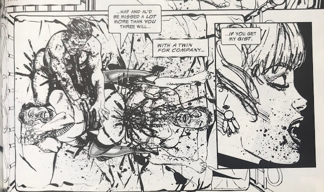
The lower left and upper right panels bleed off the page, the lower left one showing something tucked away in the town, the upper right showing the sky just outside the town. The girl in the window, the family portrait, and the corpse and snake act like mini-sequences within

The story is: Hellboy has died and he's gone to Hell. Hell in this case is conceived as different layers of existence, ending with a city ruled by demons on a lake of fire. Something like that. He throws out lots of mythology, and I got the gist of it, but it was the least interesting part of the book. Hellboy disrupts this by being the one to rule Hell and lead... Anyway, Hellboy has no interest in it. In another book, I'd hate this all with a passion, but as Mignola tells it, it's a kind of gothic prog-rock poetry.

The feeling I was left with at the end was of the musicality of it all. While there is distinct storytelling going on, pages are interspersed with images to create ambiance and rhythm. Mignola uses a technique where pages are drawn on a grid, with no diagonal panels that I noticed, and usually one "framing" panel that bleeds off the page. Within the page, he often uses blocks of panels of one theme, like mini sequences within the larger sequence of the page.

The cat growing in size from panel to panel is a hard thing to convey

These sequences are accented by Dave Stewart's color (who I was praising only days ago for his Daredevil work). I get why Mignola's name is the one on the cover, but Stewart kind of should have been on there too. Flashbacks are used throughout and Stewart's color in these sequences help create a rhythm.

Ten panels on the page, five of them silent
As I finished the main story, I was a little surprised. The "climax" happened in captions and a few images, rather than bloated sequences. Then the story tapered into a denouement of Hellboy on an overcast beach and entering a house. It all felt pretty abstract for an action book. It had a feeling of musicality. 

The second and third panels without a gutter to signify a flashback was a neat little technique
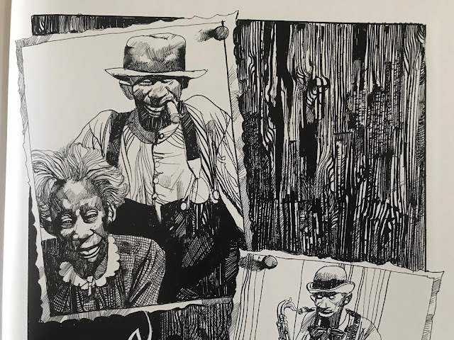
Mignola has some notes at the end of the book where he states he had more issues planned, but as he was coming to the end, he felt it was ready to be wrapped up. And I could see that for the sake of the story, he could have shown more of the end of Hell, but I got what he meant. Hellboy had experienced and learned what he was going to in the story, and the stuff he yadda-yadda'ed over was to resolve a story, but not necessarily going to make it more satisfying to see in action.

A four-page sequence mid-story is done in a watercolor style, and reads like the eye of the (quiet) storm

With Chris Ware, I read interviews with him decades ago where he stated two things: that comics had rhythm and that he let his pages go where they naturally seemed to go. His work can be criticized as boring, and if you're looking for a standard plot with a resolution in his books, you will likely be bored. His pages are about the rhythm and the experience. I think that's where Mignola has gone with his storytelling. He has made a lot of space in his comics to give the atmosphere its own panels. While a lot of panels give story progress, a lot of them don't. A lot of pages would tell the content of the story with multiple panels removed. 

In this sequence, the top left panel on right page has no story-driven reason to exist
Of course the content of the story is important to, to give the reader something to grasp, but having so many superfluous panels creates a more spacious atmosphere, and makes the comic more than merely a story delivery system. It gives you the space to really enjoy the comic form itself.

I really liked this, and my curiosity is to see if this is what Mignola was already doing 20 years ago, like in the Jungle Adventure or Seeds of Destruction. He may well have and I was not that clued into the nuance of how stories were told back when I first read them. I have to imagine that he was somewhat more conventional in his storytelling. With those original Hellboy, he didn't trust himself enough to script them by himself, and he was building up confidence as a writer. With Hellboy in Hell, he had the confidence to substantially change his plan mid-story because of what felt right. He went with the rhythm of the story.

Thursday, April 22, 2021

I Really Should Read This 25: The Collected Toppi: North America, by Toppi

The Collected Toppi: North America, by Toppi

1977-2007, collected in 2020

This is my first time writing about Toppi, it won't be my last.

Magnetic Collection love their rounded corners

Over and over again, algorithms kept recommending Toppi to me based on what I do online, and about the 20th time, I took the machine's advice and checked it out, and it turns out it was what I wanted to read. I wonder if I had seen this some of this stuff 30 years ago in Heavy Metal or somewhere, but if I had, I was too young to really appreciate it. 

The stories in this volume range from 1976 to 2007, but most fall in the 70s and 80s
So, right up front, regardless of the quality of the writing, people are going to buy this for the art. Toppi draws the hell out of everything.

A shaman 
Every panel of every page is finely detailed and designed. I have no doubt that he got to a point in his art that he could produce this way without a lot of conscious planning: the textures, patches, spirals and strokes that make up his page have an organic quality like forms in nature have. I think that's the strength of it, his pages reflect the design of nature itself, like shapes in physics and biology. It's gorgeous to look at.

Not a lot of artists could make the grain of a wooden door look so compelling.
And there's more to it than just the images. He designs every page and panel to work with each other. Some combinations work better than others, but the guy has a rhythm of his own.

The inversion of positive and negative space between panels one and two is simple but striking, and lets the figures in the second jump out

Repeatedly as I read, I had to pause and take in how he was telling the story as much as I took in the stories themselves.
The bottom panels ascend in height as the characters ascend a slope
One other thing that stands out about his pages is that the panels are repeatedly broken, usually just a little, but it makes pages work as a unit rather than a collection of panels. Just a slight overlap here and there, but it prevents the panels from being rearranged. He's built a form-fitting construction of images.

The fourth panel commands the page by being the biggest, but it also does so by having the house slightly overlap into the first and third panel

This series, The Collected Toppi, is not typical of artist retrospectives. Often, books are done sequentially, with periods of an artist's work presented together. This series is by theme, with this book being North American stories. Other books feature Asia, Japan (technically Asia, but I get it, Japan gets more romanticized than the rest of the continent), South America, Africa, and a general fantasy theme one. Even within the book, the stories are not arranged sequentially. It frustrates the OCD part of me, but across 30 years Toppi's style was mostly consistent, so it isn't jarring to me as a reader. 

For the most part, North America means 19th century stories featuring white settlers and First Nations indigenous, with two stories in the volume about magical negroes, for lack of a better term. In some of the indigenous stories, the people have "magic", not in all. This is the writing of a man born in Italy in 1932, writing about the world, and so he worked in a lot of tropes verging on stereotypes. I'm fully aware of the contemporary discussion of topics in English Western culture, but I've also lived in Asia for 20 years and am aware that people in many countries enjoy their romanticized images of far away lands. The writing is not malicious in any way that I could notice, and generally had sympathy for the horror show that is the settlement of North America.

An Italian view of America's natives

That said, if today the Disney Corporation were to make a movie on the 19th century indigenous person's experiences, they're unlikely to consult the writing of a post-war Italian writer at any part of the process. 

I'm not going to say I'm blown away by the stories in here. These are largely old fashioned stories. These reminded me of Farley Mowat stories I might have read as a kid. In elementary school in Canada, here and there we would read tales of pioneers and explorers in Upper Canada. So they aren't super fresh to me now, but it's not a genre of story I see much in comics or film, so on that level, it's a change of pace.

A story with a samurai immigrant is colored with something like watercolors

What I like in the stories here is that there isn't a set morality or pattern of story. This isn't Uncle Scrooge where at the end of every story will have Uncle Scrooge rich and Donald Duck poor. A story where a man is warned to leave in peace could (and does) go a number of ways. He leaves and reflects on his wise decision. Or he doesn't leave and pays the price. Or he doesn't leave, and he deflates a myth and lives a long life. Toppi wasn't making stories in a clear tradition, and if there is any moral to the stories, it's that every story is different and one size doesn't fit all.


Ultimately though, if Toppi weren't drawing these stories, they'd be of limited appeal. Without his line work, they'd lose so much of their gravitas. 

There are four of these Toppi collections published, with two more on the way. I'm getting all of them. Maybe they'll start to feel repetitive after a few, but with the two I've read, I think that the six will be a very good amount of his stories and I may be interested in getting more.