Showing posts with label DC. Show all posts

Sunday, May 2, 2021

Reading Through 2021 87: Batman by Grant Morrison Omnibus Volume Three, by Grant Morrison and Chris Burnham

Batman by Grant Morrison Omnibus Volume Three, by Grant Morrison and Chris Burnham

Collecting work from the 2010s, published 2020

Omnibus One was fun. Omnibus Two was better. Now for the story of Batman Inc.

It's very good cover, but the set of omnibuses aren't unified as a set outside of the logo
Right up front, this is not as good as Omnibus Two. It has the problems of high expectations working against it. I really enjoyed Two and was hoping for it to keep up the compelling story. And when this was coming out, I remember people praising Batman Inc. as exciting... 

The Japanese here is a fun Easter egg. Mike Marts, Nathan Fairborn, and Morrison himself get shout outs in the signs
Omnibus Two left off with Bruce Wayne announcing Batman Inc, and this book begins with Batman rounding up his international team of Batmen. He starts in Japan, then moves on to Argentina, and South Dakota on a recruiting drive. This part of the book was the most fun for me. The book has two arcs, one for each of the two Batman Inc. series collected. The first arc is building up the organization, and the second is letting all the dominoes Morrison had lined up fall down.
Yeah, I want to see a Native American Batman riding a bison
These recruitment adventures are the most exciting and novel. Seeing how Batman concepts can filter through other cultures is really cool, and the stories are solid. Burnham draws a lot of this, with Yanick Paquette also doing some art chores. Nathan Fairbairn does consistently great colours. You get the feeling that this is an AAA package. No filler. If the story lags, the art and novelty carries it along.
A stunning double-page title card
The story is not flawless. There is too much reliance on double-crosses and triple-crosses and quadruple-crosses. At certain points, I didn't know who was a good guy if they weren't in the immediate Bat-family. If you don't know who you're rooting for, it's hard to be invested in their objectives or care about the dangers. So I ended up reading for the moments rather than for the story. And there are many exciting moments.

Some work better than others. At the end of one issue, they promise a great cyber-Batman story on the Internet 3.0, and I was excited to turn the page.
I'm ready for this!
The next issue was all done with computer rendering, and was unreadable in many places, with muddy images.
Batwoman is outlined in yellow, Bruce in red
It was a single issue that, while it mostly didn't work, it showed Morrison having fun and playing with the book. Internet Batman rendered in 3-D; he had to take it to the next level to make it worth the concept.

There are some side stories with other characters which were mostly enjoyable. And for the most part, I liked the art across this whole book. Most of the art was clean and dynamic, not overly reliant on heavily shadowed capes. If I had a complaint with the second volume, it was that a lot of the art was over-rendered with shadow, which is not an issue with this one.
Cameron Stewart continues to have some of the cleanest forms in mainstream comics
The second half of the book is decent, but not as exciting. Batman Inc. is a great concept, Batmen around the world, but it adds up to about six other Batmen. It ends up feeling much smaller than "worldwide." The villain of the book, Leviathan, is a massive secret organization, but Batman Inc. never seems to be similarly omnipresent.
I love the counter-culture concepts Morrison sneaks in: be afraid of your kids
And the Internet made much so much of Batcow at the time. I wasn't reading it, I wasn't looking for Bat-news, but I heard of Batcow a lot. I don't know what I expected a cow to do, but it mainly just stood there, and was a mascot for Damian. It was cute, but pretty throwaway.
Another writer will take a stab at Bat-Cow in a decade or two
The Leviathan storyline features Talia Al Ghul, a suiting character to tie a run featuring Damian Wayne, her and Batman's son, together. She gets some good character definition, as someone who has capabilities but has been held back by her overprotective father. Her emotional connection to Batman and Damian gives complexity to her dynamic with them.
The Bat-clone Talia grows is a sad, damaged thing
But at the end of the day, I barely remember how the book ends. The book tries to have ramifications as Bruce Wayne becomes a wanted man, and his empire collapses, but it all seems to be back to normal by the end. At the end of the book, a few people are dead, but they've all come back since because it's a comic, so there isn't much point in caring. The book is about the ride, not the impact on continuity.
Some fun storytelling in a Japanese capsule hotel. The top line shows a nice time lapse from evening to night, and the middle row shows a great use of panels to break up a single space
I was surprised how much of the art Chris Burnham did. Most modern mainstream books, artists do three issues and swap out, and Burnham did half this book. His art style wasn't entirely consistent. Sometimes there would be a real janky image and I wouldn't think it was his art. And he would sometimes draw massive eyeballs on characters, which just looked weird. But a majority of his work was clever and clear, with a great balance of cartoonishness and realism. He's not Frank Quitely, but he's a real good substitute. His art can carry a story.
I got a laugh out of seeing Spring-Heeled Jack

I loved the way Morrison mined old, often embarrassing, Batman continuity for his international Batmen. Some adjustments were made, but he used the foundation Silver Age writers had left for him. The detail throughout was impressive, but not surprising from a hyper-literate writer like Morrison.
The first appearance of Spring-Heeled Jack in the 1840s
All in all, I liked this book and will probably revisit it in a decade, though after I re-read the second, more exciting and coherent Omnibus. There was unreached potential in the concept of Batman Inc. It's fun, but the execution felt smaller than the concept. Another writer could take the ball and run with it, but with the current state of dour that guides DC, it's unlikely that a concept as wacky as Batman Inc. will be explored again anytime soon.
 
Omnibus Three was not something that gave me deep thought, or something that I even found particularly easy to follow to as I was reading. It was very much blockbuster entertainment that bounced from crazy set piece to crazy set piece. It had something that I don't associate with Batman these days: fun.

Friday, April 9, 2021

One Coin Reads 22: The Kamandi Challenge, by DC

The Kamandi Challenge, by DC

2018

Yet another book I barely bought. While I've been giving DC comics a chance, I really don't like their aesthetic and philosophy overall, and it's been that way for at least 20 years. Some creators at the company are given freedom and make enjoyable work, but the overall tone of their whole publishing line has felt like what a teenager thinks being a grown up is. Grant Morrison manages to stand apart from that, but I've still been turned off of them as a publisher.

This book, the Kamandi Challenge, is a tribute to the 100th anniversary of Jack Kirby's birthday, so they had Jim Lee, a guy who has zero Jack Kirby spark in him, do the cover. It boggles the mind.

Like Kirby, but more "real"!

Why did I buy it? it was ¥6000 marked down to ¥600, so it was kind of daring me to get it. Plus it has a lot of creators I find interesting contributing, so it had to be worth at least the ¥600 it cost, right?

The cover to the first issue by Bruce Timm, a guy who gets why Kirby was exciting

I think it was. First, what the heck is this book? It was a twelve issue series with a different writer and artist (and sometimes colorist) on each issue. The final page of each ends on a cliffhanger that the next team has to solve. And it stars Kamandi, one of Kirby's 70's DC creations. It sounded like a fun project. 

Unfortunately, I have only ever read the first issue of Kamandi, so I don't have a grasp of the world to compare this to what Kirby created, but my understanding of it is that it's Kirby's spin on the Planet of the Apes, a post-apocalyptic world where humanoid animals rule. Beyond that, I don't know the nuances of the character or where the plots went. I'm assuming all the creators here do though, especially older creators like Neal Adams and Walt Simonson.

Mr. Royer's first name is Mike? I get that reference!
It was a fun book! It's a single story of sorts, but it's more like a massive comic jam, where the story is passed along from writer to writer. It's not a very coherent story, but each issue works within itself, and you can tell that the creators are having a good time with it. This comic probably didn't shatter any sales records, but it wouldn't hurt DC to publish more comics where the creators seem to be enjoying the work.

What was most notable was that all the creators involved worked hard to tell an arc in 22 pages. So the pacing is quicker than normal and some subtlety is lost, but it was refreshing to read.

Never having been kissed is a running joke in the book
The biggest surprise for me was that some of the creators in the book I had written off years ago as not to my taste delivered surprisingly good work.

I was pretty stunned at the ability of all these artists to draw animals, including the lemur doctor here from Ivan Reis

I'm not an Ivan Reis fan due to his lack of dynamic energy, and he created much more vibrant pages than I had seen before. 

Jill Thompson, drawing like Jeff Smith

Jill Thompson was an artist who I felt was talented as an illustrator much more than a comic storyteller, and she makes some beautiful pages in this. I hadn't seen new work from her in over 20 years.

Neal Adams takes the action to San Diego Comic Con

Other artists either I wasn't familiar with their work or I wasn't even familiar with their name.  I'd seen Amanda Conner covers before, but was impressed with her cartoony storytelling here. Carlos D'Anda produced some nice psychedelic pages.

Amanda Conner's story has a weird sexy plant woman
Artists I loved as a kid like Neal Adams and Walt Simonson don't fare quite as well, but I don't think their art lends itself well to modern coloring. Simonson especially seems to lose energy with computer shaded coloring. It's certainly drawn as well as ever.

Simonson gets to draw aliens and robots

Dan "I killed Superman" Jurgens does a story as well, and is probably the weakest to me. Unlike Reis or Thompson, I have had no interest in his art and this didn't change that. He's a poor man's Mark Bagley, and I think Bagley draws like a boiled potato. 

The writers are trying to outdo each other with crazy stories, from nuclear bombs to pirates to giant robots to vivisections. None of it is greatly better than each other except Tom King's story with Kevin Eastman of Ninja Turtles fame.

Carlos D'Anda is in harmony with his colorist
King's story is an intimate one, trapped in a room where animals are plucked out by a robot day after day for an unknown reason. It was really good! Unfortunately, it completely ignored the purpose of the book, to play with the cliffhanger the previous writer left. In his case, the previous cliffhanger was a giant sea serpent facing Kamandi. Tom King's story starts in a room (and no sign that it is the serpent's belly either). On top of that, he starts with a philosophy quote and ends it with a Kirby quote, which dispels the narrative disbelief. And it's a good single issue story though! 

It was so fun to see a Kevin Eastman drawn story!

I'm a teacher. Occasionally a student will hand in a good paper that completely ignores the criteria of the assignment, and it's so frustrating. That's what King does here. All the writers are given a text page to express their ideas about the project, and in Greg Pak's, he writes about doing improv, where the idea is "YES, AND". That's what everyone in the book does except King. King said, "whatever" and did what he pleased.

Steve Rude draws the Odyssey with goats

Beyond that weird bump, this book was a nice, easy read. Once an issue was done, the next issue would be a new flavor. 

For the conclusion, they make Kirby a magic god character, and it's fine. I don't know how you wrap up a headless story like this. I get why they want to do it, but I get icky seeing DC pretending to be the Kirby champion. I've got the Kirby-branded DC collections. These days, they want to make it seem like they've always supported Kirby, but it feels like marketing more than it does respect. At the same time, I'm just glad it's all in print.

Kudos to DC for letting Kirby chew on a stogie
Kirby had problems everywhere. Both Marvel and DC treated him poorly, so putting him front and center after he's died feels unauthentic for either company.

What I can say though is that a lot of these creators have a genuine love for Kirby and his work, even the editors at DC, and I can see it. For whatever issues I have with the corporate publishing of DC and the tone of their works, these people do what they do out of a love of comics. We all share the same roots. 

Tuesday, April 6, 2021

Reading Through 2021 69: Animal Man: The Hunt Volume 1, by Jeff Lemire and Travel Foreman

Animal Man: The Hunt Volume 1, by Jeff Lemire and Travel Foreman

2012

Last year, if someone had told me that not only was I going to read two New 52 comic collections this year, but that I would also pay for them, I would have told them they were liars.


Somehow, after reading the not very good Justice League United, I was convinced to give Mr. Lemire another chance, that his Animal Man run was good. I had actually read the first two issues at the time, before I realized just how horrendously misguided the entirety of the New 52 concept was and washed my hands of it all. And those issues were alright, I just hated what was going on overall with DC and didn't want to touch any of it. I hated Geoff Johns' writing, I hated Jim Lee's art, I hated editor Bob "I fired Claremont on X-Men so Jim Lee could quit the book two weeks later and then ran the franchise into the ground" Harris who was shepherding numerous projects. I was a long absentee reader who was checking back in, and saw that they were producing some atrocious comics. I felt stupid that I thought they might put out decent product. So I stopped looking at all DC, regardless of the creator. 

This year is the first year I've looked at anything they've published over the past decade, and the stuff I've enjoyed seems good in spite of the company, not because of it.

Anyway, this is about Animal Man, not how poorly managed DC is. But there might be a pinch of that anyway.

There are some potent images in the book

I loved Morrison's Animal Man, I liked Delano's, but I haven't read a new Animal Man comic since the year started with a one. It's no longer Vertigo, because Constantine was in a movie or something and intellectual properties need to be easily exploited. And because this is the New 52, it should be friendly to new readers.

It's reader friendly, as far as continuity goes. Animal Man Buddy Baker is a married family man, acting to pay the bills, but hasn't given up his tights. Immediately weird stuff starts happening at home, as he starts bleeding out his eyes and his four year old daughter starts reanimating the corpses of animals. They go off to meet the representatives of the Red, while representatives of the Rot attack his wife and son. Animal Man then comes back and saves them, and they have a quest to fight the Rot. That's five issues, and there's a sixth which is a movie which Buddy Baker starred in.

What is the Red, the Rot, and what about the Green?

The Rot

One thing that has changed since I read the first issue in 2012 is that I've read all of Alan Moore's Swamp Thing, and his concept of the Green. The foundation of Lemire's Animal Man is the mythology of that proto-Vertigo book from the mid-80s. Having read that, I instantly understood what was going on in the book a whole lot better. The book name drops Swamp Thing a little and by the end of the first trade is headed to a crossover with the New 52 version of that book, which Lemire was also writing. 

Knowing about the Green makes this book a whole lot more interesting, but it's not so much that this book was so interesting, but that I liked the Alan Moore stuff so much and it was interesting to see it be elaborated on.  Moore's Green was a sort of cosmic field of plant consciousness. Lemire elaborates on that with the Red, the animal counterpart to that. It annihilates the old concept of Animal Man and how he got powers from aliens, but I'm not that attached to him as a character, so it was fine.

I think she's supposed to be four
This was way better than Lemire's Justice League United, a low bar to cross. But it's actually good. Lemire and Foreman try to bring some horror to Animal Man. I wasn't fully satisfied by it for reasons I'll get into at the end, but for a mainstream monthly book, it's way more compelling than most. Foreman has a unique style, using realism in places that contrast how grotesque it is in other places. 
Lots of open flesh in the Red

The sixth issue story has a guest artist, John Paul Leon, who is tonally very different than Foreman, but has very nice grounded art in the style of David Mazzuchelli or David Aja. In it, Buddy plays a washed up superhero, so I suppose it is meant to be a parallel to the main story, but I didn't think too much about any deeper reading.

It's got a bit of the vibe of the movie Super

I enjoyed the book overall, but there wasn't much of a story in the six issues. There was an introduction to a concept, and a fight and then it ended. Basically, in six issues, it had the amount of content that used to be in the first issue or two of something, and barely that. On top of that, it was leading into a crossover with Swamp Thing, so it was basically asking you to read two books for one story. I know decompressed storytelling was the trend of the day, but I want more density in a single book, or I want it to be packaged in longer intervals; put a dozen issues in a collection instead of six, and hopefully something of consequence has happened by the end.

What was in there was compelling, so when I put down the book I looked online at either trades or the omnibus. The trades are out of print and overpriced, and the omnibus was a lot more expensive than I was interested in spending on a storyline I wasn't that enamored with. If you can't produce a fat, reasonably priced collection of a single story, why would a normal person read it? The Big Two have decided that if you want older stories in print, you have to pay through the nose for deluxe editions, as they figure the only people really interested in reading them that way are over forty and have the cash to shell out for them. Otherwise, get some digital subscription. So I'm left holding a trade paperback that amounts to chapter one of a story. Maybe it is a great story, but I won't read it.

Tuesday, March 16, 2021

One Coin Reads 14: Justice League United Volume 1, by Jeff Lemire and Mike McKone

Justice League United Volume 1, by Jeff Lemire and Mike McKone

2015

Justice League Canada? I'm Canadian, I gotta like that, right?

I was actually excited to see a chimpanzee in the book, but it was just an image for Animal Man

It turns out, no. No, I don't. I'm not interested in dunking on books, and when there's a book I don't care for, I've been trying to critique it as if I knew the creators. You wouldn't say something is out and out terrible to someone's face.  This isn't terrible, but it's not good. It's another in a long line of corporate books created for the sake of taking up space on the shelves.

Why did I buy it? At first, I skipped over it multiple times. But it was only ¥497. That's a reason to buy. It's part of DC's New 52. That's a reason to skip. Jeff Lemire's a Canadian who likes making Canadiana, he's not an American simply making poutine references. That's a reason to buy. Jeff Lemire wrote one of the least interesting X-Men titles I've ever read. That's a reason to skip. Mike McKone is a solid, interesting artist. That's a reason to buy. DC editorial insists on their being multiple Justice League titles for brand recognition's sake. That's a reason to skip.

But I decided to buy it, and was actually kind of curious once it arrived. This wasn't like the Cyberforce book I pushed aside for three months afraid to open it. I put this ahead of a lot of other books hoping it would be a breezy, fun book while I read other heavier ones.

Next page, that guy is flying in a space suit. That's the origin of Adam Strange

Justice League United is a book. It has a beginning, middle and ending. It's all professionally done, but it feels so uninspired. The story is related to Ontario, and the action is spit between Moosonee and outer space. 

A quick synopsis: some Justice Leaguers investigate a disappearance in Moosonee and find an alien research center. They get teleported to space and fight a space terrorist trying to kidnap a super alien baby. The good guys win and they come back. A B-story involves a Cree high school student learning she has powers.

That's how you join the League

Potentially, Lemire could explore a lot of interesting things over a 40 issue series, but DC just cancels series that aren't juggernaut sellers, so judging this book on the six issues inside is completely fair to do. This book doesn't offer much new except for a novel Canadian setting, and it doesn't do much with that. You'd have to already be taken with the characters to want to know more, and I suspect that was the audience. Few people found this title by accident, as compared to the main Geoff Johns' Justice League title which probably did end up as some folks first exposure to the team.

This Justice League is: 

-Martian Manhunter, who is a stoic leader. I wish he had some of the dry humor of the 80s version of him, but this version is dour. I skipped 20 years of Justice League comics, so that is probably just what the character is now. 

-Green Arrow is an idiot, apparently. His one character trait is insulting Animal Man. I know this was the younger, cooler Nu-52 version, and it sucks. I'm not going to tone down my disdain here. It was a poor choice on whoever decided to recast him as brat.

-Animal Man, who is one of my favorite DC characters from back in the Vertigo era, basically acts like the MCU Ant-Man. He has a no respect schtick. 

Characterization
-Stargirl is a character I don't really know at all, but she was mostly interesting, and probably the best character in the book. She plays the role of an enthusiastic newbie. When a team of heroes goes into outer space, it's good to have at least one character not be bored by it. Of the main team, she is the most likable.

-Supergirl makes an appearance, but isn't in it much to give a sense of her character. She does have an interesting scene where she takes offense to Stargirl talking about aliens.

-Adam Strange. He finds an alien suit and instantly becomes a superhero. This was ridiculous. His wife Alanna Strange is given a similar suit and would seem to provide a similar role as him. It's an interesting twist, but in the context of the story it doesn't work.

-Equinox is the new character, but she doesn't have a code name in the story. They just invite her into the league.

I kinda love this?

They use Lobo in the space scenes, and not the Main Man version people like, but the NU-52, manscaped, DC-editorial-is-trolling-you Lobo. I kind of love it. It was a pointless change to make Lobo sexy-handsome, but it's so stupid that it goes all the way into amazing. I think this version is going to make a comeback one day, or at least live forever in clickbait lists of the worst changes ever made. I'm not trying to say it's good, but it is interesting.

So the story is bland, the characters are mostly thin and less likable than past incarnations, and nothing is compelling about it. How much of this is Lemire's fault? How much is it him simply working within the strict (so it has been said) editorial confines of the New 52? I want to give him the benefit of the doubt and say that they paid him to make a lemon and he tried to make lemonade. He put some Cree culture in a mainstream DC book. It wasn't a very good book, but most of the New 52 books weren't very good, so it's not like he was doing any worse than most there.

Panel 3 looks good

McKone is a good artist. He works in a style of hard, tight inks which isn't usually up my alley, but I like it when he does it, and have been a fan of his since I first saw his work in the 80s Justice League International. Whatever gripes I have with this, it isn't with him.

The coloring is bland for the most part, digital airbrush tools. On a few alien pages, it jumps to dayglo colors, and I thought it popped in a nice way, then it went back to "realistic" colors and I lost interest. There was one thing they did where action would get accented by flat red colors over black and white characters, foregoing all realism. That looked good. It didn't add up to much, but it was a neat technique and break from the rest of the book.

I couldn't recommend this to anyone. I checked Wikipedia, and it lasted 16 issues. That sounds about right. Everyone involved can do better than this.

Wednesday, March 10, 2021

Reading Through 2021 47: Batman: Son of the Demon, by Mike W. Barr and Jerry Bingham

Batman: Son of the Demon, by Mike W. Barr and Jerry Bingham

1987

I bought this when it was new, at age 11 or 12, and at the time I didn't get it. I didn't hate it, but it was over my head, and I never read it again. I was surprised now to see it was from 1987. In 1988 and 89, I was dropping $$$ on the Killing Joke, Arkham Asylum, the Cult, Legends of the Dark Knight and so on, but this was probably my second or third Batman purchase. Twelve dollars (Canadian) was a lot to me at that time. Still I never read it a second time. Reading the Grant Morrison Batman run, which features Batman's son prominently, I wanted to give this a second read.
It's a painted cover, but almost looks computer colored

I liked this, and I liked it a lot more than I thought I would. I don't know what I expected exactly, but I figured it would be very competent but unexciting. The story is probably best described as competent, but the art in this is beautiful, and elevates the whole thing. It's an exceptional looking book.
The back cover. What's missing? No writing, no blurb, just an image and a price. That is wonderful

At this point I've read enough of the O'Neil/Adams Batman run to know about Ra's al Ghul and Batman's romance with his daughter Talia. There's a 50/50 chance I had no idea who the characters were when I first read this. The Son of the Demon builds on their history: Ra's is a supervillain but not necessarily evil, his daughter is loyal to her father, and her and Batman are torn between their love and their ideals. That history is taken as a given in this story.
This is a graphic novel, and this is as "mature" as it chooses to get, flesh-wise. Lovely background wash on this page too
With that, the story begins with Batman stopping a terrorist attack and getting hooked up with Talia again. The story moves quickly, and soon he's eating dinner with Ra's and Talia, and they realize they have the same goal: taking down this terrorist mastermind Qayin (Cain, like in Cain and Abel). But the plot moves too fast. Batman says he'd like to work with Ra's, and Ra's replies that if he wants to, he has to marry Talia. Batman says yes. They start terrorist hunting as a team, and loving it. Soon though, Talia lets Bruce know she's pregnant, and Bruce cannot let his child suffer as he did so he decides to stop fighting. Talia immediately (like, during the same conversation, on the same page) fakes a miscarriage and Bruce can now stop the bad guy with a clear conscience. They split up and a final page reveal shows that an orphan child has been adopted.
Bingham doesn't use a grid, but his pages are sequentially readable

The story concepts are strong, the motivations are strong, but the pacing doesn't quite work. Fight scenes get six pages to tell their story, but character building scenes get one or two pages at a time. Barr was mainly a monthly comic writer at the time, so I can see he's branching out of his comfort zone. It's almost there. It works better in synopsis than it does on the page. He does a good job of seeding Bruce's childhood trauma throughout the book. The opening action scene highlights his compassion for a pregnant hostage.
Batman cares about kids


The art though, wow, I just didn't remember liking it much at the time. At that point, I was drooling over Art Adams and Todd McFarlane, and this art had more substance than I could handle. Bingham renders his lines like Neal Adams, with loose ink but controlled shapes. His storytelling reminded me of John Byrne: structurally sound with lots of full body shots. It is masterful work. And I don't even know another book he's done. I'm going to look him up after this, but I wanted to write this without any outside influence. My worry is that most of his career is doing standard superhero comics.
This scene reminded me of something from Robocop

He does the colors himself, lots of oranges and blues, and creates a consistent tone throughout the 80 page book.
And this really reminded me of something from Robocop. There is some of the 1980s in here

I don't know what the reputation of this book is among Batman readers. It hasn't gotten the DC Absolute treatment. Obviously the legacy of Batman's child is a very important one and Damian Wayne probably got a lot of people to go back to this to see where he came from. Being a graphic novel probably didn't help it stand out at the time though. With the Killing Joke or Arkham Asylum, and especially the Dark Knight Returns, DC was really thrusting Batman forward in narrative and style, while this was a a throwback to the 70's. It's not a life-changing comic, but it is a really good one.

Monday, February 22, 2021

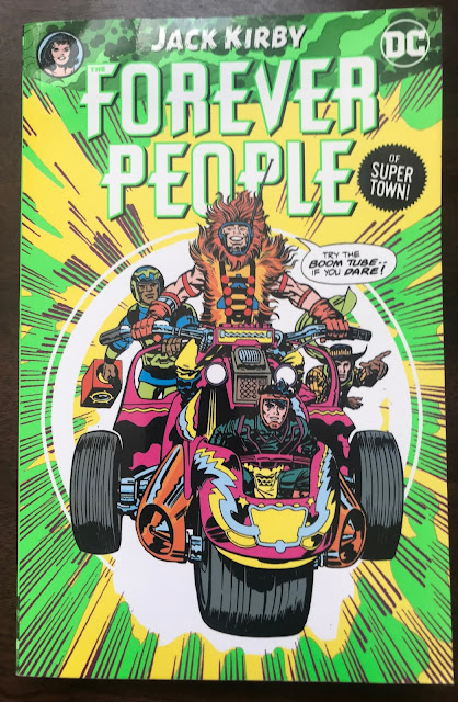
I Really Should Read This 11: Forever People, by Jack Kirby

Forever People, by Jack Kirby

1970, collected in 2020

I had read in some places that Forever People was one of the weak links in Kirby's Fourth World. After reading it? It's not his best!


Since last summer, I've read New Gods, Mister Miracle, and the Demon of 70s Kirby work, and the Eternals from his 70s Marvel. To be fair to the Forever People, it's worse by a matter of degrees, but none of it is flawless. All these works have really high highs, and really really low lows. I still had a ton of moments in this where I delighted at what I was reading.

Not one of these characters' names give a hint of their character

I'm not going to make a big issue out of it, the characters are what they are, but Vykin the Black is a poorly-named character. Around issue five, a Japanese character is introduced, Sonny Sumo. Vykin the Black is DC's first black superhero. Kirby was trying to broaden the scope of the comics, but he was also in his 50s. By modern standards, it's laughable, but his heart was in the right place.

All of these characters look great; Kirby was great at designing, but, like the New Gods and the Eternals, their names and powers are generally vague. Mark Moonrider has a "megaton touch." Serifan has capsules on his cowboy hat that can do what the story calls for. Only Beautiful Dreamer has a power that can survive an elevator pitch: she can pull images out of your mind and make them temporarily real. Compared to the characters he made with Stan Lee in the 60s, they don't have the same hook. Kirby was pretty free to run with his imagination, but maybe he was well-served by having someone to bounce ideas off of from time to time.

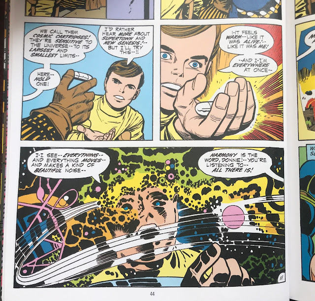
What else about the Forever People? They're from a place in New Genesis called Supertown, and when they put their hands together and say the word TAARU they change into Infinity Man (whom they have an arrangement with).

This is about all the explanation Infinity Man gets

It's not an easy read. Kirby had so many ideas, and he picks them up and drops them at a whim. On the stands, as single issues, they likely worked fine, with each issue overflowing with new concepts. But as an 11 issue collection, they don't make much sense when read as a whole.

He talks about the Omega Effect and the Anti-Life Equation, and as best I understand it the Anti-Life Equation is a kind of fascist mind control that obliterates free will, but I don't understand it. I just go along for the ride. I just finished Grant Morrison's Batman Omnibus Two, which uses these concepts from the New Gods, and I didn't understand it much there either.

I think if Infinity Man had become a bigger character, his look wouldn't feel so generic-Kirby

Infinity Man seems like a bad name, and an uninspired costume, and I didn't like him at all. After, I was looking at the costume, and it's not so much better or worse than other Kirby designs, but probably the name and lack of personality meant that it didn't click with me or with readers. It's not a bad idea, it's like Captain Marvel/Shazam, but with a team instead of a single kid, but then Kirby moves on from it. After issue three, this character I disliked so much disappeared from the book and this aspect of the Forever People is ignored. In the final issue, they announce Infinity Man is back! and I had all but forgotten he existed. 

Hmmm

The Forever People are modeled on hippies, and hippies are referenced in places. Kirby was trying to stay in touch with the kids. They sometimes talk about peace and love. The final issues of the book, the Forever People rent a room with a retired ex-flapper named Mrs. Magruder and we get to see the generation gap play out. Mrs. Magruder says things like, "Well, I never --!" It's entertaining, but it's not a justification to buy the book.

One of the first pages that really floored me. It's creepy, bold, and that's a Kirby gun if ever there was one

The art and relentless novelty of the images are the justification to buy the book. The book is reinvented a few times in its 11 issue run. This is part of the first wave of post-Marvel Kirby DC books, and he was still finding his new footing. By the Demon, he had really gotten into the swing of it, lots of splash pages and he regularly did double page spreads on pages 2 and 3 that I got really excited to see each issue. With this book, the art is good from the start, but it's a few issues in before he starts running wild with it.

That is a horse. Cut it out and plaster it on a giant canvas, and it's an futurist painting from the 1910s that sells for millions

The more New Genesis and Apokalips stuff he throws in, the better. It's weird, it's idiosyncratic, and I can't get enough of it.

Page 2-3 double page spread. It's so good

He has a time travel story in the middle, "I'll Find You in Yesterday!" where he goes wild drawing Abraham Lincoln, Spanish Conquistadors, and Roman Centurions. Sure, I'm happy to read that.

He just felt like drawing this

A lot of this Kirby work can be a hard read for modern readers, myself included. The pacing and the overdone narration can be a slog. It was made as disposable work for children and not to be overanalyzed by adults. So some of the criticisms I would have for a 21st century book aren't applicable. I appreciate the aspects that appeal to me now, and am able to brush aside the stuff that was never targeted at me. 
Over the coronavirus lockdown, I took the time to really read Kirby's work and not just admire the artwork. It took a long time, maybe 20 to 30 issues, to get my head synced up to the pace of his books. And this is the ninth fat trade collection of his work I've read cover to cover in the past year. I'm into it. I like it. Unironically, without reservations, it's just good work.