Showing posts with label 1980s. Show all posts

Wednesday, May 19, 2021

Reading Through 2021 99: Acts of Vengeance: Avengers, by Marvel's 1989 crew

Acts of Vengeance: Avengers, by Marvel's 1989 crew

1989

A company-wide Marvel crossover in the 80's that didn't revolve around the X-Men. What a fresh concept!

That was a good image
Marvel first got into the crossover business with Secret Wars and Secret Wars II, but it blossomed with the in-title X-Men crossovers. First was the Mutant Massacre, which was loosely connected between Uncanny X-Men and X-Factor, both telling aspects of a single event, but the characters never really crossed over. It was followed by Fall of the Mutants, which featured those two books and New Mutants, but was mainly a crossover in theme and format. All the books featured independent stories. A year after that came, what was for me, the pinnacle of X-crossovers, Inferno. All three books crossed over into a mega-storyline which pulled in every New York-based comic from Avengers to Spider-Man. At this point, editorial was convinced this was to be an annual event, but there was some fatigue in the X-offices. 
Who could these mystery villains be?
In 1989, the Avengers were made the center of its own crossover, Acts of Vengeance. The concept was brilliant, in terms of a crossover event. Villains would fight heroes they had never fought before, hopefully succeeding with the element of surprise. For Marvel's creators, it was a mandated crossover, but they could basically take any villain from Marvel's history and have fun with them. It was a corporate mandate that creators could enjoy.  Some books were better than others, as always, but it was fun to read.

The crossover has been split into three books, this one focusing on the Avengers, another one being Spider-Man and X-Men, and the last being the rest of the Marvel Universe. I have some nostalgia for the Spider-Man of this crossover, where he gets goofy Captain Universe powers, but none of it is essential. This book, I'd read about half of it at the time and had some fond memories of it, and wanted to revisit it. 

A random assortment of creators
The main creators in this are basically a who's who of people who worked under Jim Shooter. Three of the writers, Gruenwald, Mackie and DeFalco, were never major players in comics, just dependable Marvel Bullpen writers. Gruenwald is really interesting in that he was obsessed with Marvel, and spearheaded the nerdiest Marvel project of all time, the Official Handbook to the Marvel Universe. He did a lot to create a space where Marvel obsessives could explore their fandom. DeFalco at this point had replaced Shooter as editor in chief. I had no love for his work as a kid, but I've reevaluated it after enjoying a lot of his Thor run. I never enjoyed a Mackie book, and can't say I did here either.

Dwayne McDuffie was a newer writer at the time, and went on to be influential with creations like Damage Control and Static Shock, but this might be some of the first work I've read of his that I remember. He went on to work in TV and at DC before passing away too young.

And of course John Byrne, who famously threw a party with a burning effigy when Shooter was fired. I loved Byrne in 1989, and I like it a lot still, but there is a snideness in his work which turns me off. He seemed to think other creators were less than him, and it comes out in his work whenever he "fixed" what he thought was wrong with a book or characters. In this volume, he was writing Avengers, and both writing and drawing West Coast Avengers Avengers: West Coast. (His first act upon taking over WCA was to change the name, because it was a poor decision in his mind. Since he left, Marvel has gone back to the original title for its revival.)
Why would the Sub-Mariner attack his best human friend?!
So all the creators get to have fun. Gruenwald was writing Captain America and Quasar. His Cap run is not exactly beloved, but multiple ideas he introduced have stuck in the decades since, like John Walker and Crossbones. The first two issues feature the Controller, an Iron Man villain I've never heard of before or since, but the third features Magneto and is the high point of the whole crossover. I'll get back to that at the end. 
Eon basically just kills the conversation here. Awkward!
He also does Quasar with bland artist Paul Ryan. Quasar was not a comic I would pick up off the rack to even flip through. The costume, the hair... It was incredibly uncool. I have heard some Quasar fans in the years since say it was an interesting series, so I gave it a chance here, and there were positive and negative things about these issues. Quasar himself couldn't be more bland. A handsome, blond suit-wearing 80s corporate type. It was a dynamic that would have worked in the 50s or 60s, but he comes across as Marvel madlibs here: Tony Stark's aesthetic, Steve Rogers' hair, Peter Parker's bad luck. The peek into the cosmic stuff in the book is interesting though. Quasar's office has a cosmic doorway through which he can chat with tree-like entity named Eon.
Hey gloopy alien, I'll catch you in a net!
Quasar fights the Absorbing Man, the Red Ghost and the Living Laser, but Gruenwald rips on Venom. The pettiness on display here was shocking. The most popular new character at Marvel in a decade, and Venom is promised on the cover. Quasar fights Venom and wins in two pages! He just catches him in a net and then ties him up. Gruenwald is basically just saying Venom sucks and he hates him without explicitly saying it. Hey, Venom does kind of suck, but all the same, Quasar defeats him without breaking a sweat, but also without acknowledging Venom's power set whatsoever. They must have gotten a pile of angry nerd mail after this. The Quasar issues weren't great, but they were competent 80s comics. I can imagine getting into it if I were 10 or 11 years old, but not when I was 14.
The street has no life, the brick building has a hedge behind it. No effort was made on this, this looks like a paycheck
The issues of Avengers Spotlight weren't all competently done though. Spotlight was an Avengers spinoff meant to highlight Hawkeye and other Avengers. The Hawkeye stories here, written by Mackie, and drawn by Al Milgrim and inked by Don Heck, are the kind of comic that made me mad as a kid, but I didn't know why. Some Marvel books just had lazy art on them. Milgrim was a Marvel editor who liked drawing, and Heck 
drew the Avengers after Kirby left. Heck had some skills, but these stories look rushed and not up to par. Backgrounds are inconsistent or missing, the world looks like nobody lives there. I think if a young artist submitted them to Marvel in 1989, they would have been turned down and told to come back after some practice. It's a shame, because I want to find something to admire the old artists continuing to work in comics for decades, but I just don't think Don Heck is my kind of artist. I already knew I didn't enjoy Milgrim's work.
Dwayne McDuffie's dialogue was surprisingly fun. It calls back to Stan Lee's quips in the 60s
Iron Man was being done by Dwayne McDuffie, with Herb Trimpe pencilling and Al Milgrim on inks. I was not looking forward to these at all, but I really liked them. I wouldn't say they were good exactly, but there was some good stuff going on in them. They were basic stories of a good guy beating on a bad guy. McDuffie had a great sense of humor here, while Trimpe surprised me with some nutty illustrations. 
Just for this single image, I'll never have any doubts why Trimpe was working at Marvel for decades
Back then, I would read Iron Man for a few issues and then drop off. I wanted to like it. I loved the suit and technology, I hated the mustache. I was so turned off by 80s machismo as a kid, I never watched Magnum PI, and I couldn't vibe with Tony Stark. As an adult though, it's a lot easier to wade through the testosterone of it all enjoy what's going on.
Is this what they mean when they say PC culture is killing America? Would Iron Man be allowed to show off his junk to a random hot blonde in a convertible these days?
Meanwhile the Avengers themselves are fighting off random baddies. On the west coast, they fight Hulk villains the U-Foes, an evil version of the Fantastic Four, and the Mole Man's monsters. They are inconsequential stories. In both cases, the villains were duped into attacking the Avengers, and when it's revealed to them, they give up and go home. 
Byrne can draw some exciting stuff. X-Ray is one of the cooler character designs in the Marvel Universe
On the east coast, they fight Freedom Force, the renamed Brotherhood of Evil Mutants, and later the Mandarin and the Wizard. These are also drawn by Paul Ryan, with heavy inking by Tom Palmer. Palmer has such a strong brush that I can enjoy the meat and potatoes layouts Ryan gives. Byrne, for whatever frustrations I have with his attitude, always tries to do something inventive and new with characters. Shrinking Blob down and having him sink through the ground fits that bill.
Palmer brings a great John Buscema vibe to his inks
Next we come to Thor, by DeFalco and Frenz, who were in total sync at this point in their run. It's not a knock on them, but I definitely like their space and Asgard stories more than their New York stories. Here though, they bring the Juggernaut against Thor, which seems like a "why hadn't this happened already" idea. Not only that, they introduce a new team to the Marvel Universe: the New Warriors.
Ever since I read this, I want to send people a message the reads: It's war! Total war!
Thor can hold his own against the Juggernaut, but his infinite arrogance treats Juggernaut as a problem he can solve with punches, when in truth, nothing can stop the Juggernaut.
Skateboard to the Juggernaut's face! Frenz kills it in action scenes. These panels are hyper-kinetic while still being totally coherent
They fight for two issues, and Thor solves it by creating a vortex and dropping Juggernaut onto an asteroid. No matter how grounded a Frenz-DeFalco Thor story was, they always made sure something happened that was absolutely crazy.
How you gonna get home from there, tough guy?
One other book dropped in here is an issue of Cloak and Dagger, who were labeled as mutants at this point. Inker Terry Austin is writer, and I don't think it was very good. After a bunch of pages where it felt like the story never ended, I checked and it turned out to be a double sized issue. Avengers play a substantial role, which I guess was the logic for including it in this collection. It's competent, but very inessential.
The Hulk robot from the worst issues of the Eternals is brought back and stuffed with gags
The collection ends with the big revelation of the crossover, that the mastermind behind it all is Loki, who has never forgiven himself for causing the Avengers to unite in the first issue of the series. Byrne does a pretty good job portraying Loki as a person consumed with hatred and frustration that they just can never win.
Byrne is a fanboy at heart, and he gives the crossover a sensible foundation rooted in the Avengers history. Compared to the X-crossovers, which often seemed cobbled together under their editor's orders, this feels like a naturally occurring Avengers storyline. And Byrne gets to draw a fairly traditional lineup of Avengers doing their thing, as the east and west (and Great Lakes!) branches have come together at this point.
This image of Thor and Loki felt retro in 1989
All in all, this was a great crossover. It managed to do the things a crossover is meant to, without falling victim to the common weaknesses of them. It helped sell books to people following their favorite villains to other books, and create a feeling of a unified continuity. At the same time, none of the crossovers were essential, and you didn't need to read the central books to grasp what happened in the crossover issues. It was good for the managers, good for the creators, and good for readers too!
Kids paid for this sort of thing!
The book includes an epilogue that was printed as a back up story in an annual, that basically just tells what happened. This was published a year or two after, and is exhibit A of why Marvel's annuals became a waste of money. In order to pad out 64 pages, they created "stories" like this that only left readers confused about why they paid triple price for filler.
Not even the Wizard thinks Nazis are tolerable
The best thing in the book has to be the loathing of the Red Skull. It's questionable if a Nazi should be made a villain to sit along with Doctor Doom and Loki. Nazism is a real thing, Latveria and the Lord of Mischief aren't. But, at the very least, the writers are fully aware of how no matter how despicable Marvel's villains are, Nazis are at the bottom of the totem pole. 
Magneto is not taking this crap sitting down
Magneto is a character whose revamped 80s origin was that Nazis were the prime reason he has no faith in humanity to treat mutants humanely. If the story had had them working together without any of this commented upon, in retrospect, it would have gone down as one of those tone-deaf stories that failed so hard that "it was a different time" wouldn't let it go, like the time Carol Danvers gave birth to her rapist and everyone was fine with it.

Here, the writers make an issue out of it, and in the final Captain America tie-in, Magneto takes down the Red Skull.
Magneto levitating out of the room is a great image, as is the dark falling on the Skull
Magneto loathes the Red Skull and all he believes in. Upon confirmation that this Red Skull is the same as the one from World War II, Magneto tracks him down and promises to make him suffer. He locks the Skull in a windowless room with nothing but water, and I'd like to think the Skull is down there to this day. As this was still a point in time when millions of Americans weren't confused about whether Nazis were bad or not, Magneto is an anti-hero here.  Always, the cry of some folks in the industry is to keep politics out of comics, but these comics of the 80s were some of the things that started to make me politically aware as a kid. The politics were always there.
Yeah!
All in all, I burned through this, and liked it even where it was a bit shoddy. It's not on my top ten Marvel books of the 80s, maybe not on my top twenty. But if you have an appetite for the format of the time, that is, complete stories every issue; art which makes sense, and colors which are never muddy; and fun; you would probably get a lot of pleasure out of this.
That mess has been cleaned up
I've spent so many years reading superhero comics being written for adults, and sometimes they're amazing. But as I get older, I'm finding that I love the work that was made under the comics code and when comics were aimed at young teens. Superheroes were never intended to be obsessed over by 40 year olds. I'm enjoying these older comics that embrace that fact.

Tuesday, May 4, 2021

I Really Should Read This 27: Human Diastrophism, by Gilbert Hernandez

Human Diastrophism, by Gilbert Hernandez

1985-1995

That's two collections down, and another five to go.


This book is from the omnibus style collections, and contains the graphic novel Human Diastrophism, plus another 150 pages of comics. All are set in or in relation to Hernandez's fictional town of Palomar, and the intertwined lives of dozens of its residents. 

Things are back to normal!
Right up front, I really wish I'd read this twenty years ago. It is a phenomenal piece of work. I sampled some Love and Rockets issues in the late 1990's, and I found them hard to latch onto. By that point, the characters in both Gilbert and Jaime's stories had hundreds of pages of stories behind them, their writing was building off history that I simply hadn't read and I was lost. I probably had about eight issues that I half-heartedly read, and gave up on them until buying my first of these omnibuses about four years back. I loved the The Girl From HOPPERS and soon voraciously read all I could of Jaime's work, but had a hard time with the first Palomar collection and put it back on my shelf for a year or two unread.
There is storytelling at work here
Thanks to COVID-19 upending everything, I dramatically increased my reading time and made a commitment to finally get through that first collection around New Years... and I loved it. I had the enthusiasm that you get when you just can't enjoy something other people love but then something finally clicks and it works, and you wonder what the problem ever was.

Silhouettes are used liberally

With the Palomar stories, I know some of the things that kept made it a hard book for me to get into. For one, the cast of characters is huge, and following a story can be confusing. He has a character guide for each book, and I made use of it a few times. The second is that I still find something off about his inking. It's tight, and his drawing is great, but I still don't love the overall aesthetic. A third thing was his focal character Luba. She is a massive-chested woman, and as a reader, much like all the male characters in the books, that is all you notice at first. I had an issue or two of Luba, and I just didn't get it. After reading the first Palomar stories, which include Luba's introduction to the town, I saw her as a well-rounded and complicated character in a way I just didn't see at all in my first exposure to her.

A wordless sequence about crossing a trench becomes a statement of Luba's frustration and impotence regarding her new lover
At this point, I get what the fuss is about. Hernandez' art still isn't something I drool over like I do with his brother, but he has other points that I find incredible. His storytelling techniques are so potent, walking a fine line between camp, dreams and pathos. So much of what he does here would be told as talking heads by other artists. Hernandez uses old school panel design to amp up the drama of his story. And he fleshes out all his characters, even if it's just to give them a single motivation. Almost all the characters portrayed in his town are flawed and weak. Most are decent, but they are not perfect and usually do things they regret. It's very humanistic storytelling.  
Hernandez builds a real history in Palomar, the people don't forget their past
So what's this collection all about? It is sprawling, covering the lives of the people of the small Latin American town of Palomar across twenty years. There's a 100-page graphic novel tucked inside the larger 250-page collection that tells the story of a serial killer in the town, while the second half of the collection has a number of stories focusing on Luba's half-sisters in America. Much like Jaime's work with Maggie and Hopey, though there are mini-arcs, there isn't a larger arc other than these people living their lives. There is a difference here though, in that with Jaime's stuff, time is occurring roughly along with the real world. Gilbert's Palomar shifts and jumps. That's part of what makes following the story require a character reference page. A character who's ten years old in one story might be 23 in the next and takes some adjustment from the reader to follow. 
Probably his best creation, the one-armed Casimira
Some stories are 30 pages, some are five, some are single pages. The book was done over a ten year period, and you see Hernandez shifting his storytelling style and his focus of characters as he goes. I'm sure a lot of it was simply to keep the making of comics a fresh activity for himself. As a reader, it goes a long way to keeping the book novel. One of the treats of the book is seeing a character like Guadalupe, one of Luba's daughters, go from a little kid hanging out in the corners of a story to being a central character with a kid of her own. I've heard of Palomar being compared to Gabriel Garcia Marquez's One Hundred Years of Solitude, and at the level of them both being about rural Spanish speaking towns, it's not a useful comparison, but in terms of them both showing generations of development, it's apt.
Hernandez takes a stylistic departure to give a dense character sketch of Pipo
Palomar has it's own specific weirdness as well. For the most part, I wouldn't call the book surreal, but there are peculiarities. Tontazin selling her slugs. Her sister Diana who overdevelops whichever muscle she trains. Luba's handsome lover Khamo who becomes a burn victim, at which point they settle down together. Casimira, who was shot out of a tree as a toddler, runs around the town wielding her artificial arm. It's weird stuff, generally in the realm of "truth is stranger than fiction" weird rather than feeling explicitly like a writer's touch. And that's so important in a work like this to keep it from feeling cutesy or twee.
Young Fritz at home with her sister is a sad portrayal of neglect
Hernandez's Latino heritage gives him an ability to comfortably navigate both American and Latin American culture without any awkwardness. Later chapters taking place in California don't have the lived in quality of Palomar, but that's city life, where there are way more people you don't know then people you know. 
Maria's back story captures some 1950's goofiness. Fantastic use of negative space in those first two panels
As for the art, it's unfair to compare him to his brother Jaime, the tightest comic artist alive. Gilbert has great art as well, particularly in the layout. His characters occupy just the right amount of panel, the story progresses at a solid clip, and he's not afraid to reposition everything for the sake of a solid panel. Contemporary artists often try to do something more natural, as if the panel was a camera, and that's not Gilbert's school of work. As much as a camera-style perspective can be effective, it can also be boring, and the panel composition here is never boring. His pages have a lot of punch.
The book is not exactly magical realism, but there is room for poetry in the it
So, I'm into it. I'm going to get the rest of the Gilbert Hernandez Love & Rockets omnibuses, slowly over the next few years. This stuff is good, and is the kind of comic that resonates long after reading.

Thursday, April 22, 2021

I Really Should Read This 25: The Collected Toppi: North America, by Toppi

The Collected Toppi: North America, by Toppi

1977-2007, collected in 2020

This is my first time writing about Toppi, it won't be my last.

Magnetic Collection love their rounded corners

Over and over again, algorithms kept recommending Toppi to me based on what I do online, and about the 20th time, I took the machine's advice and checked it out, and it turns out it was what I wanted to read. I wonder if I had seen this some of this stuff 30 years ago in Heavy Metal or somewhere, but if I had, I was too young to really appreciate it. 

The stories in this volume range from 1976 to 2007, but most fall in the 70s and 80s
So, right up front, regardless of the quality of the writing, people are going to buy this for the art. Toppi draws the hell out of everything.

A shaman 
Every panel of every page is finely detailed and designed. I have no doubt that he got to a point in his art that he could produce this way without a lot of conscious planning: the textures, patches, spirals and strokes that make up his page have an organic quality like forms in nature have. I think that's the strength of it, his pages reflect the design of nature itself, like shapes in physics and biology. It's gorgeous to look at.
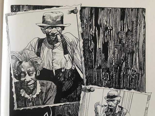
Not a lot of artists could make the grain of a wooden door look so compelling.
And there's more to it than just the images. He designs every page and panel to work with each other. Some combinations work better than others, but the guy has a rhythm of his own.

The inversion of positive and negative space between panels one and two is simple but striking, and lets the figures in the second jump out

Repeatedly as I read, I had to pause and take in how he was telling the story as much as I took in the stories themselves.
The bottom panels ascend in height as the characters ascend a slope
One other thing that stands out about his pages is that the panels are repeatedly broken, usually just a little, but it makes pages work as a unit rather than a collection of panels. Just a slight overlap here and there, but it prevents the panels from being rearranged. He's built a form-fitting construction of images.

The fourth panel commands the page by being the biggest, but it also does so by having the house slightly overlap into the first and third panel

This series, The Collected Toppi, is not typical of artist retrospectives. Often, books are done sequentially, with periods of an artist's work presented together. This series is by theme, with this book being North American stories. Other books feature Asia, Japan (technically Asia, but I get it, Japan gets more romanticized than the rest of the continent), South America, Africa, and a general fantasy theme one. Even within the book, the stories are not arranged sequentially. It frustrates the OCD part of me, but across 30 years Toppi's style was mostly consistent, so it isn't jarring to me as a reader. 

For the most part, North America means 19th century stories featuring white settlers and First Nations indigenous, with two stories in the volume about magical negroes, for lack of a better term. In some of the indigenous stories, the people have "magic", not in all. This is the writing of a man born in Italy in 1932, writing about the world, and so he worked in a lot of tropes verging on stereotypes. I'm fully aware of the contemporary discussion of topics in English Western culture, but I've also lived in Asia for 20 years and am aware that people in many countries enjoy their romanticized images of far away lands. The writing is not malicious in any way that I could notice, and generally had sympathy for the horror show that is the settlement of North America.

An Italian view of America's natives

That said, if today the Disney Corporation were to make a movie on the 19th century indigenous person's experiences, they're unlikely to consult the writing of a post-war Italian writer at any part of the process. 

I'm not going to say I'm blown away by the stories in here. These are largely old fashioned stories. These reminded me of Farley Mowat stories I might have read as a kid. In elementary school in Canada, here and there we would read tales of pioneers and explorers in Upper Canada. So they aren't super fresh to me now, but it's not a genre of story I see much in comics or film, so on that level, it's a change of pace.

A story with a samurai immigrant is colored with something like watercolors

What I like in the stories here is that there isn't a set morality or pattern of story. This isn't Uncle Scrooge where at the end of every story will have Uncle Scrooge rich and Donald Duck poor. A story where a man is warned to leave in peace could (and does) go a number of ways. He leaves and reflects on his wise decision. Or he doesn't leave and pays the price. Or he doesn't leave, and he deflates a myth and lives a long life. Toppi wasn't making stories in a clear tradition, and if there is any moral to the stories, it's that every story is different and one size doesn't fit all.


Ultimately though, if Toppi weren't drawing these stories, they'd be of limited appeal. Without his line work, they'd lose so much of their gravitas. 

There are four of these Toppi collections published, with two more on the way. I'm getting all of them. Maybe they'll start to feel repetitive after a few, but with the two I've read, I think that the six will be a very good amount of his stories and I may be interested in getting more.

Wednesday, March 10, 2021

Reading Through 2021 47: Batman: Son of the Demon, by Mike W. Barr and Jerry Bingham

Batman: Son of the Demon, by Mike W. Barr and Jerry Bingham

1987

I bought this when it was new, at age 11 or 12, and at the time I didn't get it. I didn't hate it, but it was over my head, and I never read it again. I was surprised now to see it was from 1987. In 1988 and 89, I was dropping $$$ on the Killing Joke, Arkham Asylum, the Cult, Legends of the Dark Knight and so on, but this was probably my second or third Batman purchase. Twelve dollars (Canadian) was a lot to me at that time. Still I never read it a second time. Reading the Grant Morrison Batman run, which features Batman's son prominently, I wanted to give this a second read.
It's a painted cover, but almost looks computer colored

I liked this, and I liked it a lot more than I thought I would. I don't know what I expected exactly, but I figured it would be very competent but unexciting. The story is probably best described as competent, but the art in this is beautiful, and elevates the whole thing. It's an exceptional looking book.
The back cover. What's missing? No writing, no blurb, just an image and a price. That is wonderful

At this point I've read enough of the O'Neil/Adams Batman run to know about Ra's al Ghul and Batman's romance with his daughter Talia. There's a 50/50 chance I had no idea who the characters were when I first read this. The Son of the Demon builds on their history: Ra's is a supervillain but not necessarily evil, his daughter is loyal to her father, and her and Batman are torn between their love and their ideals. That history is taken as a given in this story.
This is a graphic novel, and this is as "mature" as it chooses to get, flesh-wise. Lovely background wash on this page too
With that, the story begins with Batman stopping a terrorist attack and getting hooked up with Talia again. The story moves quickly, and soon he's eating dinner with Ra's and Talia, and they realize they have the same goal: taking down this terrorist mastermind Qayin (Cain, like in Cain and Abel). But the plot moves too fast. Batman says he'd like to work with Ra's, and Ra's replies that if he wants to, he has to marry Talia. Batman says yes. They start terrorist hunting as a team, and loving it. Soon though, Talia lets Bruce know she's pregnant, and Bruce cannot let his child suffer as he did so he decides to stop fighting. Talia immediately (like, during the same conversation, on the same page) fakes a miscarriage and Bruce can now stop the bad guy with a clear conscience. They split up and a final page reveal shows that an orphan child has been adopted.
Bingham doesn't use a grid, but his pages are sequentially readable

The story concepts are strong, the motivations are strong, but the pacing doesn't quite work. Fight scenes get six pages to tell their story, but character building scenes get one or two pages at a time. Barr was mainly a monthly comic writer at the time, so I can see he's branching out of his comfort zone. It's almost there. It works better in synopsis than it does on the page. He does a good job of seeding Bruce's childhood trauma throughout the book. The opening action scene highlights his compassion for a pregnant hostage.
Batman cares about kids


The art though, wow, I just didn't remember liking it much at the time. At that point, I was drooling over Art Adams and Todd McFarlane, and this art had more substance than I could handle. Bingham renders his lines like Neal Adams, with loose ink but controlled shapes. His storytelling reminded me of John Byrne: structurally sound with lots of full body shots. It is masterful work. And I don't even know another book he's done. I'm going to look him up after this, but I wanted to write this without any outside influence. My worry is that most of his career is doing standard superhero comics.
This scene reminded me of something from Robocop

He does the colors himself, lots of oranges and blues, and creates a consistent tone throughout the 80 page book.
And this really reminded me of something from Robocop. There is some of the 1980s in here

I don't know what the reputation of this book is among Batman readers. It hasn't gotten the DC Absolute treatment. Obviously the legacy of Batman's child is a very important one and Damian Wayne probably got a lot of people to go back to this to see where he came from. Being a graphic novel probably didn't help it stand out at the time though. With the Killing Joke or Arkham Asylum, and especially the Dark Knight Returns, DC was really thrusting Batman forward in narrative and style, while this was a a throwback to the 70's. It's not a life-changing comic, but it is a really good one.