Wednesday, March 10, 2021

Reading Through 2021 47: Batman: Son of the Demon, by Mike W. Barr and Jerry Bingham

Batman: Son of the Demon, by Mike W. Barr and Jerry Bingham

1987

I bought this when it was new, at age 11 or 12, and at the time I didn't get it. I didn't hate it, but it was over my head, and I never read it again. I was surprised now to see it was from 1987. In 1988 and 89, I was dropping $$$ on the Killing Joke, Arkham Asylum, the Cult, Legends of the Dark Knight and so on, but this was probably my second or third Batman purchase. Twelve dollars (Canadian) was a lot to me at that time. Still I never read it a second time. Reading the Grant Morrison Batman run, which features Batman's son prominently, I wanted to give this a second read.
It's a painted cover, but almost looks computer colored

I liked this, and I liked it a lot more than I thought I would. I don't know what I expected exactly, but I figured it would be very competent but unexciting. The story is probably best described as competent, but the art in this is beautiful, and elevates the whole thing. It's an exceptional looking book.
The back cover. What's missing? No writing, no blurb, just an image and a price. That is wonderful

At this point I've read enough of the O'Neil/Adams Batman run to know about Ra's al Ghul and Batman's romance with his daughter Talia. There's a 50/50 chance I had no idea who the characters were when I first read this. The Son of the Demon builds on their history: Ra's is a supervillain but not necessarily evil, his daughter is loyal to her father, and her and Batman are torn between their love and their ideals. That history is taken as a given in this story.
This is a graphic novel, and this is as "mature" as it chooses to get, flesh-wise. Lovely background wash on this page too
With that, the story begins with Batman stopping a terrorist attack and getting hooked up with Talia again. The story moves quickly, and soon he's eating dinner with Ra's and Talia, and they realize they have the same goal: taking down this terrorist mastermind Qayin (Cain, like in Cain and Abel). But the plot moves too fast. Batman says he'd like to work with Ra's, and Ra's replies that if he wants to, he has to marry Talia. Batman says yes. They start terrorist hunting as a team, and loving it. Soon though, Talia lets Bruce know she's pregnant, and Bruce cannot let his child suffer as he did so he decides to stop fighting. Talia immediately (like, during the same conversation, on the same page) fakes a miscarriage and Bruce can now stop the bad guy with a clear conscience. They split up and a final page reveal shows that an orphan child has been adopted.
Bingham doesn't use a grid, but his pages are sequentially readable

The story concepts are strong, the motivations are strong, but the pacing doesn't quite work. Fight scenes get six pages to tell their story, but character building scenes get one or two pages at a time. Barr was mainly a monthly comic writer at the time, so I can see he's branching out of his comfort zone. It's almost there. It works better in synopsis than it does on the page. He does a good job of seeding Bruce's childhood trauma throughout the book. The opening action scene highlights his compassion for a pregnant hostage.
Batman cares about kids


The art though, wow, I just didn't remember liking it much at the time. At that point, I was drooling over Art Adams and Todd McFarlane, and this art had more substance than I could handle. Bingham renders his lines like Neal Adams, with loose ink but controlled shapes. His storytelling reminded me of John Byrne: structurally sound with lots of full body shots. It is masterful work. And I don't even know another book he's done. I'm going to look him up after this, but I wanted to write this without any outside influence. My worry is that most of his career is doing standard superhero comics.
This scene reminded me of something from Robocop

He does the colors himself, lots of oranges and blues, and creates a consistent tone throughout the 80 page book.
And this really reminded me of something from Robocop. There is some of the 1980s in here

I don't know what the reputation of this book is among Batman readers. It hasn't gotten the DC Absolute treatment. Obviously the legacy of Batman's child is a very important one and Damian Wayne probably got a lot of people to go back to this to see where he came from. Being a graphic novel probably didn't help it stand out at the time though. With the Killing Joke or Arkham Asylum, and especially the Dark Knight Returns, DC was really thrusting Batman forward in narrative and style, while this was a a throwback to the 70's. It's not a life-changing comic, but it is a really good one.

Tuesday, March 9, 2021

I Really Should Read This 15: Berserk, Deluxe Edition volume 6, by Kentaro Miura

Berserk, Deluxe Edition volume 6, by Kentaro Miura

collecting work from the late 1990's, published in 2020

Berserk is one of the more popular manga out there. There are 40 published volumes in Japan, video games, anime shows and movies. For me, that's usually a sign I can just stay away. I've sampled popular manga like ONE PIECE and Attack on Titan, and not been very impressed. So I can't say exactly why I tried out Berserk. I saw images from one or two pages somewhere last year and decided it looked crazy enough that I would at least give it a try. It's good, but somewhere along the way while reading, I started to realize it might just be Great Art.

I'm going to take that sticker off

Berserk is the story of Guts, the toughest man in the world, who carries a two meter sword, and has been branded with a mark that attracts evil demons. He is accompanied by a pixie-ish elf, and they travel the land, generally going nowhere in particular. 


Volume 6 of the Deluxe Editions put out by Dark Horse collects volumes 16-18 of the regular collections. It starts mid-story from where 15 cut off. No effort seems to be made in collecting complete story arcs in these books. Each volume collects about ten chapters, and an arc could be six or sixteen chapters. Normally, this would frustrate me, and while I don't want to say it works for Berserk, I find the stories to be beside the point. I've read a 3,000 pages of this stuff now, and can barely remember how any plot ends. But I have vivid recollections of images and occurrences. So volume 6 starts mid battle with an elf butterfly that has been kidnapping children.


The sword often takes up a lot of the panel

I was thinking about what goes into making a compelling story. For example, a hero that has to overcome personal difficulties to achieve a goal. Berserk does not have this. It has an unhappy wanderer that makes mincemeat of anything that crosses his path. The difficulties may increase, but there is little doubt that Guts will cleave it in half. And there isn't a clear destination. There is an overarching bad guy in the book, but he's far removed from the center. The book operates much more like a video game than a traditional narrative, at least in terms of Guts' story. Guts walks into a new land, encounters new enemies, there will be a big bad he takes down, and then he'll move onto the next place. And that will be 500 to 1000 pages of story.

There is a McGuffin in the overarching story, the Behelit, an egg with face parts on it that can connect the real world to the demon world.


But it's all a framework for Miura to create insane imagery, rendered in a variety of techniques. Sometimes it's tight nib-drawn ink work, and sometimes brash brush work.

Miura shows all sorts of disturbing imagery

A common idea of modern storytelling is that the reader's imagination is more horrific than anything that could ever been shown (think the shark in Jaws), and Miura does the exact opposite of that. Miura intends to show you images that will haunt you.

They used to be dogs

It shouldn't work, but it does, and it works superbly because Miura (and likely a team of super-talented assistants) have to skills and imagination to pull it off. He's placing these characters in extreme situations, and because we can see how insane their experience is, we can better empathize with them.

This volume gets into the topic of religion, with a holy army overseeing a nation fallen into famine. As life gets worse, faith starts to evaporate, and like the medieval papacy, sometimes extreme means are used to keep people "believing." And it's one thing to show a torture device and then shut a door and hear screaming. Here, you see everything that is done with the device. In every single instance, Miura shows and tells, he doesn't imply or rely on the viewer's imagination.
Father Mozgus and his devoted Toruturers. The character design in this is good

A new character in this edition, the leader of the holy army Lady Farnese, tenaciously keeps her faith despite any doubt, and the story works hard to show how someone who believes they are working on God's behalf could do horrific things. It's an astute portrayal, and while I wouldn't want to call it sympathetic, it's at least giving the character an inner life.

How not to feel guilt for torturing others

The book doesn't shy away from sex or violence, and graphically shows it. It's crucial to give the story weight. I don't take issue with sex or violence in other books, but often it's used to excite readers without actually adding to the book. Here, it's the point. This volume and the last two had rape scenarios come up, something often used poorly by writers. In Berserk, each character has very different reactions and and there are lasting ramifications. As well, the character Guts himself was raped in an early issue and has lasting trauma from it making him process rape and sex differently. I can't go so far as to say it's well-handled, I don't feel qualified to, but Miura does not treat rape as a problem to be solved with revenge and a quip. 

There is a subplot with a demon worshipping orgy

All in all, the series goes in depth to places like nothing I've ever read. There's been horror and fantasy works out there before, but possibly not of this graphic complexity. It's hard to fathom he's done 8,000 pages of this so far. 

The dark world
It would be simple to just dismiss Berserk as a juvenile work of titillation.  On that level, it certainly works, it has violence and sex. But I think there's something a lot more to it, more in line with Hieronymus Bosch, where he's digging into extremes of human emotion and horror. This is an artistic exploration of human nature and society, draped onto a tough guy with a two meter sword.

I'm going to keep on with this, and read volume 7. Dark Horse may plan to eventually publish every one, but they'll be up to 7 this month and have announced up to 9, which will be 27 of the Japanese tankoban collections. I can't believe that this will end with any sort of satisfying resolution though. The story just keeps winding in and out of places and themes. That's alright. This book is like a jazz jam, bringing things up then bringing them down. I don't really want an ending.

Monday, March 8, 2021

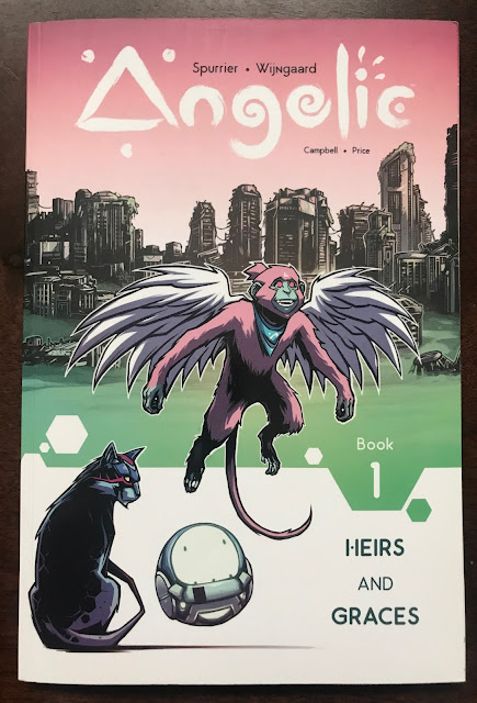
One Coin Reads 11: Angelic, by Simon Spurrier and Caspar Wijngaard

Angelic, by Simon Spurrier and Caspar Wijngaard

2018

At a glance at the cover, I didn't think this was going to be my sort of comic. But I've been trying to get out of my comfort zone and expand the kinds of books I read, because that's how I got into comics originally, that's how I learned about new books and creators. With this book, it's written by Simon Spurrier, who I've read a few X-comics from, but I don't know his work well. He has a fairly good reputation as a writer, and was widely praised last year for his work on Hellblazer. Plus, this is creator-owned work. This isn't the B-level stuff you give to the Big Two, this is the gold you want to own the rights to. That was my thinking, plus it was cheap...¥669?! I could have sworn it was closer to ¥300. It must have been a late night impulse order.

This is not comic sized! It's closer to A5 

Angelic is a post-apocalyptic sci-fi story, where a tribe of winged monkeys live in the skyscrapers of a human-less city, and the ground is covered in a poison cloud. One monkey, Qora, is soon to be married and have her wings clipped as is monkey law (or lore as they call it) when her adventure of discovery occurs.

Right from the start, it's trading in lots of tropes. The post-apocalyptic setting (did the human race do this to itself? Spoiler: yes.). The hero's journey. Monkeys. The ideas behind Angelic are variations on themes which can range from traditional to tired, depending on your experience with genre fiction. So, with that being the case, the book relies not on what the creators are doing but on how they do it.

Wijngaard can draw and has fun reimagining the world

For me, while there is stuff in the book I can praise, I found a lot of the book to be hard to enjoy. The number one challenge is the art.  Wijngaard is not a typical comic illustrator. He has flair that reminds me of spray paint graffiti in the 90s or cell-shaded video games. Characters are stylized with fat outlines. That in itself looks alright, but his choice to make the colors of the book turquoise and magenta are an eyesore. If you don't like the cover, you aren't going to like the insides more. I'm really open to non-traditional comics art, but this doesn't work for me. Good comic art should be read intuitively, and in a lot of the art in Angelic, I found my eye scanning the page for what to focus on. Design trumped readability here.
The images don't pop off the page. 

The second thing that makes it a hard read was the post-human dialogue. Spurrier wants to show the monkey society is it's own society and uses its own dialect, and the book contrasts it with a manatee society which speaks a dialect closer to our English. In practice, it means almost every page has Qora saying the word poop as a swear word. Poop. Poopest. Poop it. Is it for kids? The book is listed as teen. Who is it for? I just don't want to read a child's word for shit over and over again. The rest of her vocabulary, words like devildirt, nobedient, expendibubble; it's playful enough and not too much to sort through, but none of them are repeated so incessantly as poop. I was thinking back to great books like Clockwork Orange or Ridley Walker, which use invented language to show how language and meanings evolve and place you in a new frame of mind, but here it's more just cute. I wish he'd dialed it back a lot.
Repeat this one hundred times

There is something good here though. This is a self-contained story which is wrapped up but is open to continuation at the end. And the pacing from issue to issue is really strong. The mythology of the book expands in each issue, and everything is tied together well. On that level, it's very successful. The character design is good as well. The monkeys and manatees and cats (no spoiler, there's one on the cover) all look pretty cool. So while I didn't enjoy the book overall, it could definitely be retooled into something quite good.

The number one thing with Image works is that the creators keep their copyrights. And this is a simple, tight story with potential to become more. My guess is all Image creators try to get their books optioned for TV or movies these days, and a book like this would work really well as a season of animation, with a writers room and animators room hammering out some of the awkward bits.

Sunday, March 7, 2021

I Really Should Read This 14: Stray Bullets: Sunshine & Roses 1 "Kretchmeyer", by David Lapham

Stray Bullets: Sunshine & Roses 1 "Kretchmeyer", by David Lapham

2018

Of all the books I discovered during The COVID Year, Stray Bullets was the biggest surprise. I had heard of it for a long time, but one thing kept me away: the name David Lapham. He was the artist for one of the worst comics of the 1990s, Warriors of Plasm. That fact alone kept me from even reading a news blurb about his self-published book, Stray Bullets. It wasn't until I participated in a comic reading club last year that I gave it a chance, and I really liked it.


At this point, I love it.

Lapham, with help from his wife, have produced ten trades worth of Stray Bullets over the years, broken down into two runs with a long break in between. It tells the interconnected stories of low level criminals and the people orbiting them, mostly in Baltimore, mostly in the 1980s. But Lapham shifts periods and the characters move around in the course of their lives, so 1980s Baltimore is the base of the story more than an exact setting. It follows an ensemble of characters tied together by their relationship to an unseen crime boss named Harry. Some work for him, some date him, some are friends of those people, but Harry is a kind of invisible glue connecting all these pieces.

Kretchmeyer is the start of the second run of books. Pretty quickly you can place Kretchmeyer as occurring between the first collection, The Innocence of Nihilism and the second, Somewhere Out West. When I read those two books, there was a story gap between those two, with characters relationships having changed. It's interesting to see Lapham go back and flesh out those changes. The Innocence of Nihilism had a lot of time shifting, between the 1970s and the 1990s, so from the start, Lapham has set down various key points for characters, and then does a lot of exploration in between those points as volumes continued. It's a novel story concept, and he's now thousands of pages in.

Beth is not a role model

As I read these books, I'm amazed how well-delineated each character is. Lapham draws each character differently, of course, but the range of choices each character makes always fits or redefines their character. There is no one protagonist, but Beth is the closest to a lead character. She has some relationship with most other characters that appear. Lapham spends a lot of time with her, and makes her a complicated character. She's protective of her friends, but also quite callous. She's very street smart, but has impulse issues as well. One of the coolest details of the book is that Lapham gives her a character tick, like a movie actor might use. Beth often brushes her hair behind her ear. It's possible that Lapham has an idea of when she does it, like when she's tense or anxious, and I didn't go out of the way to try to figure it out, but it was interesting just to note how much she does it. It's a detail I've never noticed in a comic before. Lapham is treating her like a breathing person.

Rose is barking up the wrong tree

The other characters probably don't have quite the depth in their portrayal as Beth does, but they are still very well rounded. Beth's boyfriend Orson is a sad boy; a good, repressed high school graduate who is addicted to Beth. You could write an essay on his portrayal: he's an active protagonist in a self-destructive way, abandoning his bright future for a woman that thrills him. Beth likes him, and he seems to bring out a better side of her, but she's more possessive of him than loyal to him. He's having the time of his life with her though, so there's no chance he'll get away from her.

C'mon Orson

Another characters that gets featured in this volume is Rose, a prostitute who is probably a textbook-definition of nymphomanic. She's fairly well-intentioned and wants to be a good mother to her latchkey son, but she isn't a good person nor a good mother. It's heart-breaking to watch, especially her interactions with her son Joey. Joey never really stands a chance in this world.

The most surprising story in the book showed the life of Monster, one of Lapham's scariest characters. Up to now, Monster was referred to, and he showed up to break bones, but he wasn't someone who got a lot of characterization. He is the strong silent type. In his story, you see flashbacks to his childhood with Beth, and his home life. He's a scary guy.

At home with Monster
The Kretchmeyer of the title is a new guy who comes to town and wants to make a name for himself. He's handsome and charming enough, but he has a lot of menace bubbling just below the surface. There are three main "thug" characters in this book, Spanish Scott, Monster, and Kretchmeyer. Spanish Scott is tough and will hurt a person, but he's also friendly and looking for a good time. Monster isn't interested in fun, but does the job he's paid to do. Kretchmeyer meditates and keeps his cool, but gives off genuine psychopath vibes. Everything he does is in order to get something else. He made me feel uneasy.

Kretchmeyer probably thinks he's more evolved than other thugs

All in all, it was a thrilling, if dark, read. There are eight issues collected, and though there is a general overarching plot, each issue has its own self-contained arc. Because of this, the book is genuinely unpredictable and reading another issue is exciting rather than a countdown to a resolution. 

Lapham is a detail-oriented artist, who works mostly in an eight-panel grid. As a result, the emphasis is on telling and showing the story. It's so easy to get sucked into this world. I have three more volumes of Sunshine and Roses left to read and I'm excited to read them!

Friday, March 5, 2021

One Coin Reads 10: Kill The Minotaur, by Pasetto, Ketner, Cantamessa and Beaulieu

Kill The Minotaur, by Pasetto, Ketner, Cantamessa and Beaulieu

2018

<all spoiler review>

This ain't your daddy's ancient Greek myth! And that's the main reason I didn't enjoy this book.


Athens lost the war to Crete. Now, they pay tribute to King Minos by sacrificing their best citizens to his unearthly labyrinth. Conspirators believe Theseus can be the hero they need, who can end the mad king’'s bloody reign... but no one on this world has ever encountered anything like the savage minotaur.

-Amazon listing (bold emphasis by me)

Expectations can really affect the enjoyment of something, and in this case, it hurt my enjoyment of Kill the Minotaur. I barely bought this, because there were some signs this wouldn't be up my alley. The cover is a little bland, and I'm just a little tired of Image Comics. On the other side of things, I love ancient myth from any culture, and of course I love the Greek myths which have been mined in popular culture since before I was born. And it was only ¥464.

I spent a good part of 2020 COVID hibernation playing Assassin's Creed: Odyssey, which liberally uses myth in its storylines. I'm not some traditionalist desiring a textbook retelling. I realized this would be drawn in a mainstream comics style with overdone computer colors and maybe some flippant humor in the character portrayals. It's always hit or miss with me but I was willing to take a chance on that. My number one hope was some azure blue skies and water in portraying ancient Greece, as a contrast to the grunge of a lot of modern books.

The first issue has some nice scenes in Athens

So the minotaur is a space alien.  That should have been the title. Space Minotaur. If it was, I would have gone into this a lot differently, and considered it a sci-fi tale mixing in Ancient Greece, and would have liked it a little more. Most of the book is still Alien in the labyrinth, which isn't my thing, but it's a concept that will appeal to some audience. I was hoping to read a fun modern comic take on the tale of Theseus and the Minotaur, not some what if...? take on it.

The labyrinth absorbs the dead or something. It uses the concept, "Any sufficiently advanced technology is indistinguishable from magic," and doesn't have to explain anything

There are some positive things to say about this. The artist, Lukas Ketner, is decent. I know what's happening from scene to scene. One of his strong points is character design. He has a cast of eight or so characters in white tunics running around, and for the most part, you can tell them apart at a glance. In a comic like this, that's an essential skill. And he has fun rendering the labyrinth. In this, the labyrinth is a spaceship made of organic technology that grows and shifts, making it the maze of myth. It's pretty H.R. Giger influenced, but it's hard to escape Giger's influence when making organic technology.

The writing is credited to two people, Chris Pasetto and Christian Cantamessa, and it's competent, though unexceptional. The hook isn't as crazy as it's presented (I'll get back to this at the end). The arc of the book is decent throughout the six issues and is paced well. The characters, especially Theseus, aren't overly dramatized. They are written like people as opposed to legends. It's all fine, though not exciting.


This is my first time reading anything from Image's Skybound sub-imprint. All I know of it is that it's Robert Kirkman's imprint and that he helps out. So when you read the advertising blurb or look at what it revealed on the cover or even the title of the book or that its listed genre is fantasy and not sci-fi, I can't say if this was the authors' wish or something that was an outside influence. The thing is, the minotaur as space alien isn't a great twist. It could be a hook, but it's not a twist. Having ancient people interact with modern genres is a very fun hook, for example in the movie Stargate. This is an Image book, and there is almost nothing from the company that doesn't have sci-fi or supernatural elements in it, so when this twist appeared, I just sighed. All I wanted was a straight old Minotaur story. Instead I got a straight old Image book.

Thursday, March 4, 2021

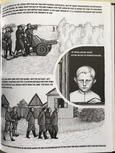
I Really Should Read This 13: Fatherland, by Nina Bunjevac

Fatherland, by Nina Bunjevac

2015

I've heard Bunjevac's name come up for the last few years, especially since Bezimena came out. I actually ordered that book around New Years, but am still waiting on it. In the meantime, I found a copy of Fatherland and decided to give it a read.


This is a good book. It's not a fun book, it's a mature, personal, thoughtful book.

The idea behind this book is very strong. It's a history of Bunjevac's family, specifically her father. She lays out her own personal situation in the opening chapters of the book: she was born in Canada in the 70s to two immigrants from then-Yugoslavia, and was soon taken back to Yugoslavia with her mother to be raised with her mother's family. There, her father is either never spoken of or spoken badly of, until his reported death in a bomb-making accident.


From there, the book delves into what made her father who he was. Bunjevac herself doesn't remember him, she only knows him from pictures and stories. In order to understand him, she has to delve into the history of Yugoslavia and the Croatian and Serbian conflicts there. The book does some information dumps here and there, but for the most part keeps things personal, highlighting how the government regime changes and ethnic tensions affected her family, pushing and pulling them, and traumatizing them as well as most of the population.

The key with this is that it is personal. History can be a dry or abstract subject, but the history in this doesn't feel like that. Her father is directly affected by the tide of history and ends up in Canada, but he never lets go of his Serbian upbringing.

The most striking thing about the work is the art. It is very controlled yet manages not to be stiff. There is a photographic quality to it, but it's a byproduct of the rendering style as opposed to everything being rooted in photographs. Bunjevac certainly uses photos in places. The cover is a family photo, and in different places in the book she uses old photos to show snapshots of family memories. It's not an art style that I love, but it's impressive and quite unlike any artist working today. 

Fatherland tells a story that I've never read: the life of a man leading up to him becoming a terrorist and losing his family. He's not a good guy, but he's not a bad guy in the book either. He's a troubled guy.

I go into books like this, true family stories mixed with real history, with trepidation, because they can be so heavy (for another example, Thi Bui's The Best We Could Do). This is heavy too. After reading this, I'm glad I read it, and it left a strong impression. It's really good. I have to go read something more escapist after this though.

Wednesday, March 3, 2021

Reading Through 2021 41: Daredevil by Bendis and Maleev, vol 2

Daredevil by Bendis and Maleev, vol 2

2010

I read volume 1 for the first time in years last month, and, with caveats, I liked it a lot. I plan to finish off the third volume this spring. It's a series worth reading or rereading.


This volume is much like the first volume, but it is more. It is more confident, more loose, more Bendis. Brian Michael Bendis is a really interesting writer to me, not always for the books he makes, but his approach to writing and his enthusiasm for working in comics. He's not someone obsessed with a golden age of comics, but he still stays true to the characters, in my experience with his work. With volume one, he did a noir, mafia-heavy take on Daredevil, and it was a good read, but in this collection, he gets into one of the key character traits of Daredevil/Matt Murdock: he's horny, often for unstable women. 

Milla's main character trait is that Daredevil turns her on

Milla Donovan is a good addition to the book, and Bendis writes her character. She's saved by Daredevil at the start of the book, and as a blind woman, she instinctively feels his face. Upon meeting him as Matt Murdock, she knows he's Daredevil because she's not relying on her eyes. Bendis gives her reason to find Matt attractive, and within a dozen issues, they are married. The only weakness here for me is that in the story, Matt is called out as having a nervous breakdown and marrying her for those reasons, but the the story doesn't criticize her at all. She's a woman who chooses to chase after a guy who goes out superheroing and decide to marry him, then has buyers remorse. That's not healthy. It's passionate and understandable, but it's not healthy.

This is such a good scene, but the clip art quality just jumps out

The book also gives Daredevil a leading role. In the first book, he was a background character in the first arc, and most of the second arc featured him as Matt. Here, he has a lot to do in costume. This book shows the ramifications of the Kingpin being removed from New York and the vacuum that pulls in wannabe crime lords like the Owl, Jigsaw and the yakuza. Bendis introduces MGH, mutant growth hormone, a party drug that makes you mildly super powered for a short time. They don't go into detail about it, but it sounds like when Viagra was going around as a super-sex party drug that let functioning people last for hours. it's a good concept, which Bendis runs with into his X-Men run, but it's not something explored very deeply. 


One of the major plots is that Daredevil decides to take over Hell's Kitchen, declaring himself the new Kingpin. It's explored somewhat, as other street level heroes like Luke Cage and Spider-Man take issue with him pushing crime in their direction as opposed to stopping it, but it's a storyline that seems to fizzle out. The last storyline of the book is a Black Widow arc which doesn't address it at all. I just read it and can't remember how it ends.

I also wonder about Daredevil wanting the drugs and the "whores" out of his neighborhood. Of course crack and heroin are damaging to communities, but is he is going after dime bag dealers too? As for "whores", er, sex workers, again, I think Daredevil could spend his time making things safer for them rather than going after them. It's one of the difficulties of writing a crime comic in the 21st century while applying the values of the 20th century.

This is a double page spread, to be read across two pages

The following two pages are single page spreads. See that bar in the center? That's how you know. You have to pay attention to that bar in the middle

The art by Maleev still frustrates me. In the course of the book, I can enjoy the tone and the coloring, but he does a lot which yanks me out of the experience. Number one is reusing the same pics over and over. His individual images are fine; seeing them across a few pages makes the image effectively dead. It's not cinematic. It's not dramatic. It's a still image. He can't even be bothered to adjust a hand or add a blink. 

He does a lot of double page spreads which aren't obviously double page spreads. Multiple times, I read down a page before realizing I was supposed to be reading across the page. If you aren't using long, widescreen panels, why make it a double page spread? I'm curious to see what he is doing now. Is he still doing stuff like this in his work? Because it's poor comics making. 

"Aaiiee!!"
Generally, he gets away with his photo reference. It doesn't disturb the book too much. Sometimes though, it makes pages pretty sterile. A character like Typhoid Mary, who is meant to be sinister and sexy, comes across like an office lady playing dress up. His version of her was definitely the worst offender. Maleev's best villain work is with the Owl, who appears reliably angry and unstable across his short arc.
Now that's a face which tells a story (art by JR JR)

Like with volume one, Maleev's art doesn't break the book for me. He can create mood really well, and he is doing clear storytelling. There are just a lot of moments where I have to stop when reading and wonder why a page passed editorial (answer: Marvel was recovering from bankruptcy and didn't know who it was, so they were willing to try anything, and people were excited by Maleev's art).

Other notes: Bendis tries to use some Japanese, and I'm sure that it reads to most people like it does when I see Spanish used in a comic: simply like foreign writing. As a Japanese speaker, it's a little cringe. English people like Japanese stuff. I get it, I moved to Japan 20 years ago. I like Japanese stuff too.

”Stupid"

I noted it in volume one, all the Maleev issues there were in caps, and the final guest drawn arc was in lower-case. Here, the book is all in lower-case.  The Bendis age of comics has arrived!

Tuesday, March 2, 2021

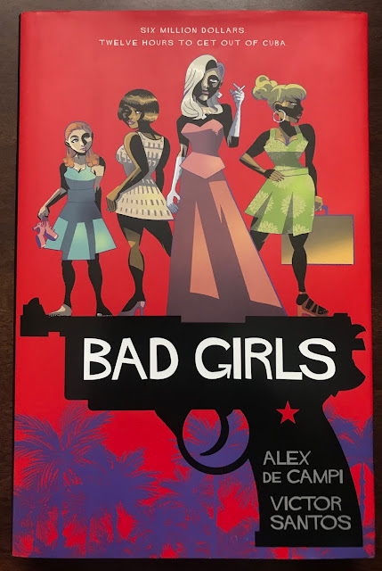
One Coin Reads 9: Bad Girls, by Alex de Campi and Victor Santos

Bad Girls, by Alex de Campi and Victor Santos

2018

I try to get out of my comfort zone with comics these days, just because sometimes I'm really surprised with what I enjoy. It's a reason to throw down some cash on cheap book, just to see what it's about. Sometimes I really like it, and sometimes it's Bad Girls by Alex de Campi and Victor Santos.


It was only ¥438, so it cost me more in time spent reading it than in hours worked to pay for it. Up front, this isn't egregiously bad or anything. I'm not angry about it. My take away from it was likely influenced by its presentation. This is a nice hardcover book with beautiful paper and the support of an international publisher. It is being sold as a "good" comic, not one of those disposable leaflets on the rack. So I just expected something better. I've read comics of equal quality in poor packages which I enjoyed more simply because they embrace their low class roots. What this book reminded me of was when HBO and other cable outlets were making great serious dramas in the 00's, and networks tried to copy them by making more mature works. But the network shows were always weak, and felt like they were trying to be something special rather than just being something special. This is like a network drama trying to be a cable drama.

I like the colors, but somehow I don't like the coloring

With this book, you have a dramatic setting, Cuba on the eve of the revolution; interesting characters, three women of different social statuses and ethnicities linked by their workplace at a mafia nightclub; and strong motives for all to take the money they have access to and get out. It's all competently written, but it's not surprising. There's an affair, a mafia boss who's got a bad temper, feisty burlesque dancers. I know something could be done with this set up, but de Campi seems content to let it play out as expected. 

I thought the characters were pretty simple. They had their goals, and didn't stray from them. I wonder if it were drawn by another artist whether or not it would get more out of the characterization.

The book veers into noir, a page like this would read better without the lyrics. It makes sense as a concept, but in execution it's awkward

The artist, Santos, is competent, and is coloring his own work, but I found it to be sterile. I love the work of Bruce Timm and Darwyn Cooke, and Santos seems to be a fan as well. But Timm and Cooke have a lot of life in their lines. Santos has controlled lines that lack their spark. It could be the digital panel work, or the song lyrics digitally imposed through a lot of the book. The polish on the pages took away from the feeling. I would have enjoyed the book more if it were more stripped down graphically.


Whatever the reason, I just didn't get into this book. It was very competent, but not memorable. Some people might really get a kick out of it. If you like the setting of Havana in 1959, it might be worth a read just for that. But there are already too many good crime comics not getting the deluxe book treatment for me to spend more time on this book.

<Edit> I just checked Amazon to see the page count on this, 224 pages, and saw that this was nominated for three Eisner Awards. Ugh. The more a book like this is put on a pedestal, the less interesting it gets.

Monday, March 1, 2021

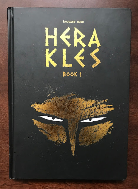
One Coin Reads 8: Herakles Book 1, by Edouard Cour

Herakles Book 1, by Edouard Cour

2018

This is exactly why I buy discount comics. The number of books which fall through the cracks in the market is beyond count. This was ¥525 and I thoroughly enjoyed it.


In the last few months, I've bought a few books from Lion Forge, enough that I was curious about their publication history. A quick wikipedia search reveals that they aren't that interesting as a publisher. Like Dynamite, IDW and a few other start up publishers, they copied the Dark Horse model and secured some licenses to guarantee an audience, and made a publishing line from there. I understand the importance of licensed properties to get kids reading comics, as I enjoyed Marvel's Star Wars comics in the early 80's. As a comic reader, they aren't interesting whatsoever, except in the odd case where an idiosyncratic creator wants to make a book as opposed to merely get paid to make one, like with Tom Scioli's nutty Transformers Vs G.I.Joe book.

So why have I been buying Lion Forge books? They bought out a publisher, Magnetic Press, a few years ago and made it a sub-brand, Magnetic Collection. They publish international comics in English. While more international work than ever is getting an English release, there still seems to be mountains of work yet to be translated. This stuff is really interesting to me, I want to see more of what is being done around the world.

So with this book Herakles, I'm hearing of Edouard Cour's name for the first time. It was first published in 2012, when Cour was in his mid-20s. This is a great early career piece of work.

Once you get used to the stylized illustration, it's very easy to sink in to

Cour is writing and drawing with an animator's eye. It's a book which would take effort not to read, with the images on each page coming alive. He has a strong design sense as well. At a glance, the stylization of Herakles was a little off-putting for a few pages, but pretty quickly it simply becomes the aesthetic of the book and is unnoticeable.

Herakles chases the Ceryneian Hind around the world for a year, eating as he goes. The book isn't a comedy, but it has a mixture of light and dark tones


Graphically, the pages are bold. I'm not sure what he's using to draw. It might just be pencils straight to scans and then colored. His website shows a deluxe black and white edition of the books, and it looks like pencils. However he's doing it, his pages have a nice texture and depth thanks to his technique.

He works in silhouette a lot, and one of the great motifs of the book is the dead and the gods appearing in the world in shadow. When the design is already strong, silhouettes can take it to the next level.

Side by side the black and white and colored editions

I don't have any strong criticisms of the book. It's part one of three, telling of the 12 challenges Herakles undertook in myth. It's a story I'm familiar with, but don't know well. It's great subject matter. Ultimately, this would be easiest to sell as an all ages book, but in a few places Herakles gets full frontal naked. I would let my kid read it, but it's a decision that Cour and his publisher have made that goes against publishing rules in the States. Likely in France, it's not a big deal. But without that minor thing, the book would be an easy purchase for any elementary school library in America.


Herakles speaks to Apollo and Athena

I enjoyed this a lot, and I'm tempted to buy the next two books, except that they aren't readily purchasable in Japan. It's a timeless tale, and these books will age well.