Thursday, February 18, 2021

I Really Should Read This 10: Batman by Grant Morrison Omnibus Volume Two, by Grant somebody

Batman by Grant Morrison Omnibus 2, by Grant Morrison and a long list of artists

Collecting work from the 2010s, published 2019

Of any comic I could possibly write about, Grant Morrison's Batman is the best selling, most read and written about one, and relatively recently too. Perhaps my main value as a reviewer here is as someone who actively avoids Batman comics. 


For the most part, I just avoid Batman. I was there for Death in the Family, Bat-mania in 1989, I bought Arkham Asylum and Killing Joke on the stands (as well as Son of the Demon!), so I'm up on the character. But somewhere in the 2000's, it stopped being fun for me. Sometimes I was into it (Batman Begins! Arkham Asylum/City on PS3!), but usually I was tired of his saturation in the culture, and the excessive, incessant voices of Batman fanatics (they could give Star Wars fans a run for their money). Good product shines through, but a lot of the Bat-products were coasting on the brand more than quality. 

When Morrison was writing Batman, there was a big shakeup with the character, which was that Batman "died", and Dick Grayson, the first Robin, took over the role. Detective Comics had an arc called The Black Mirror. I read it and it was fresh! Dick brought a whole new vibe to the role, and Batman seemed new again. I read the first arc of Batman and Robin as well (reprinted in this volume), with Morrison reuniting with his All-Star Superman partner, Frank Quitely, and it was exciting! This was the last time I read Batman. When Bruce came back, I stopped. I just wasn't interested in the flawless human that is Bruce Wayne.

Characterization is a key to making this book sing
Why did I decide to read this now? I spent the summer reading Grant Morrison comics, and I wanted more and this was a reasonable price (for an omnibus). My take on Omnibus Two? Because it combines three different series and so many artists, it isn't quite consistent in quality, but it ranges from good to incredible. 

The first thing you notice in it is that Dick Grayson isn't Bruce Wayne. He's thinner, more humble, and more acrobatic in his movements. That's a lot for an artist to convey, but the artists here really do their best to do so. Frank Quitely stands out as the best of the book. He has the line, the design, the movement; pretty much everything he draws is perfect. There was not a thing I would change. He designs a new character, Professor Pyg, who is a disgusting new addition to Batman's rogues gallery, as are his horrific dollotrons.

Oh yeah, Quitely did work the word smash into the wall Damian hit. Frank Quietly is a precious treasure

All of this is personal taste, but I prefer the 'clean' artists in the book; Cameron Stewart, Chris Burnham, and Andy Clarke stood out to me. I'm not so into Tony Daniel, or Andy Kubert's rougher lines. And I actively dislike Philip Tan and Frasier Irving's art, which veered into the grotesque for me. It's all personal taste though, and the art I didn't care for didn't break the book at all.

This was some nice narration from Bruce Wayne

The story has two parallel plots that converge at the end. In one, Gotham is being terrorized by a mysterious criminal organization called the Black Hand, while the second has heroes trying to track down a not-dead Bruce Wayne as he travels in time. I feel this way with a lot of big stories: the big plots make no sense. Bruce Wayne was shot with an Omega Beam which sent him back in time, and he makes time jumps at every solar eclipse, and when he arrives in the present, time will collapse? I don't know, it's gibberish. The Black Hand stuff makes more sense, but it's still a lot of hand-waving. 

That's fine, you don't read a book like this because the over-arching plots all make sense. I had to learn that the hard way with 1985's Secret Wars. This book is about the character, the interaction, and above all, the awesome. Dick Grayson is a great Batman, but Damian Wayne is an incredible Robin. Both of them learning their capabilities at once makes for an engaging read. Damian is an egotistical monster of a kid, but he can do way more than most kids. When he gets in a dangerous situation, you don't know if he's going to surprise you by pulling it off, or if he'll be mortified that he's gotten in way over his head. It is exciting and unpredictable, in a way most superhero comics aren't.

The coloring and the rendering are just not my tastes, but I understand why there has to be a Wild West Batman
I wasn't into the Batman through time story as much, but I get it. Caveman Batman, Pirate Batman, Cowboy Batman. It's almost like Morrison couldn't not do it once he had the concept. Again, the ideas behind why it's happening is absolute nonsense. But Batman is a cowboy, so fine!

I remember reading at the time that Morrison wanted to unify the goofy Batman of the 50s and 60s with the modern one, and to a good extent, he does. He creates a sense of joyous excitement that I don't recall in other Batman comics. Every closing page of the Batman And Robin series ends with a three panel teaser of the next issue. I can hear the rock and roll soundtrack as the credits come in.

It's like he's daring you not to keep reading. It's a great modern update to the Silver Age "Next Month!" box
It's a real shame the Dick Grayson era couldn't have lasted longer. Like, ten years or so. When I read the Black Mirror, it felt like the actual new status quo. Reading this, I see that almost as soon as Dick started as Batman, the 'real' Batman was already being written back into the book. It's a shame, but that simply wasn't what Morrison was writing. Seeing these three omnibuses, it's clear that the death of Batman was simply part two of a three part arc. 

I have Omnibus Three sitting on the shelf, and I'm looking forward to reading Batman Inc, a storyline that was buzzed about at the time, but I've never read. And the number one reason I'm looking forward to reading it is this: it sounds fun.

Wednesday, February 17, 2021

One Coin Reads 5: The Case of the Vanishing Bandit, by Paul Murry

The Case of the Vanishing Bandit, by Paul Murry

2018, reprinting comics from the 1950s

Fantagraphics make the most beautiful books! I had no intention of buying this, but the two-book slipcase set was marked down 90% to ¥773, how could I not buy it?

Absolutely gorgeous production, right down to the paper quality


(I knew a lady who couldn't handle seeing stray kittens in the street, she had to give them some food and in some cases shelter. That's how I feel when I see comic collections marked down over 80%. They need love, they need a home, and I'm there for it.)

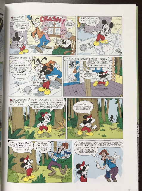
For a lot of this book (only one of the two in the slipcase), I kind of hated it. Going in, you have to accept it's a product of it's time, it's really aimed at kids, and not in a wink-wink EC way. The art quality is fine, but this thing read like a story that they threw together to get out on a deadline. The obvious point of comparison for this book and the whole Disney Masters series is Carl Barks. Fantagraphics is already around 20 books into its Barks' Duck reprints, and they decided he would get a line of books to himself. Murry and some other Disney comics artists are getting a single line to share. Though it probably reflects the realities of publishing, that Murry doesn't have the name draw to justify his own line, Fantagraphics has been willing to create a name for artists they deem worthy. This work seems more in the vein of historically interesting than it is historically important. 

Some nature shots

The big problem I had with it was it felt uninspired. In the Barks books, the world is populated with all manner of character in Duckville. Bringing in Gladstone Gander or Gyro Gearloose gives a little punch to stories, different flavors for each adventure. Here, you get a side character like Chief O'Hara, who is Irish. That's all I could tell you about this character. These are Murry's early stories, and the book notes state that he later created The Phantom Blot, who became Mickey Mouse's comic nemesis, so I might simply have read stories which don't reflect the breadth of Murry's career. 
That final panel: not even a pun or a callback. Just a statement summarizing the plot. It's shaped like a joke, but it isn't one

A much greater flaw is just the construction of the stories themselves. A crime is established in part one, investigated in part two, and solved in part three. There's no real cleverness in the unveiling of the plot, it is textbook writing. No "Chekov's gun", just Mickey solving a mystery in 24 pages. It's not bad, but it's fairly boring.

Some pages are dynamic and have really solid cartooning that would work today, with some updates to the settings
As I read the book, I started to enjoy the illustrations more. I wonder if it was a kind of Stockholm syndrome, but Murry was a strong illustrator with great consistency. I enjoyed the final story in the book the most by far, and flipping back to the first story, the art started looking better than when I first read it.

The lettering looks close to that of Barks' books, and it looks amazing. That was probably my favorite part of the book. I can only dream of that sort of hand-eye coordination.

A guy was trying to blow Mickey and Goofy up with dynamite, but they decide not to press charges. If this was an EC book, he would have gone to the gas chamber
The book notes aren't extensive, but they did help me understand just why the book existed. Murry was a Disney animator in the 40s before doing their comics in the 50s, and continued drawing them into the 80s. In the stories in this book, he wasn't the writer, and that is the weakest part of the book. Apparently, drawing trees and nature was what he enjoyed most. And he created Super-Goof, a character I enjoyed reading a lot as a kid. Murry was a solid comic artist.

I'm glad I read it, and by the end I could find some things to enjoy in the book. If I were to read more of his work, I'd probably want to skip to the 70s to see what he was doing then. But it's not something I'm dying to track down unless it's a good deal.

Tuesday, February 16, 2021

I Really Should Read This 9: Transmetropolitan Book Two, by Warren Ellis and Darrick Robertson

Transmetropolitan Book Two, by Warren Ellis and Darrick Robertson

1998, collected in 2001

Yesterday, I wrote about Abe Sapien, a book I was warned wasn't the best of the Mignola-verse, but I ended up enjoying. Today, I'm writing about Transmetropolitan, a book that seems to be pretty universally beloved, assuming 'universal' to be 40-something comic fans.

Pills!

Transmetropolitan is about the life of celebrity journalist Spider Jerusalem as he fights the City, achieving greater and greater success every time he takes society down a peg.

It was interesting, it was readable, but I wasn't blown away by it. I've been trying to put myself in the shoes of someone who mainly read mainstream superheroes, and Vertigo was their notion of "out there" comics, and yeah, this probably would have been mind-blowing. My small town comic shop flirted with indie books in the 80s after the TMNT boom, but by the 90s, it was mainly Marvel, DC, Image and Dark Horse. I don't even know they ventured much into Valiant territory. So Transmetropolitan was likely the most dangerous comic they carried the year it came out, followed by Preacher. It satirizes and attacks normalcy, so it probably read to 17-year-olds like Mad Magazine read to 9-year-olds.

Drugs and random references

I'm a 40-something art school graduate who's spent decades digging into the counter culture, and this thing read like the Cliff Notes of Hunter S Thompson, Philip K Dick, Dadaism, and a ton of other things Ellis was likely excited by at the time, rather than an incredible new and original vision of the world. When you read a book, you're not just reading a book, but it's competing with all that you've read before. Some work that wears influences on its sleeve breaks out into its own thing, but I didn't quite get there with this (I read book one a few months back, so I've read 24 issues total). Rather than see Spider as a character, he just read like a delivery method for Ellis' ideas.

On one page, Ellis spends the page setting up a dirty joke I've heard multiple times, but he changes the punchline from "goatfucker" to "chimpfucker". It's content for his comic he was churning out, and I doubt Ellis would hold it up as an example of writing he's proudest of, but it emphasizes the collage nature of the book. Transmetropolitan is not so much an idea as a bunch of ideas Ellis enjoyed and assembled. I recently read Grant Morrison's The Invisibles, and that also reads like a stew of things happening in the 90s, but with that series, I feel like it really coalesced into its own thing.

It wasn't worth it

Another thing that turned me off of the book is that Ellis is torn on what its viewpoint is, and what Spider's take on the world is. Lead character Spider is constantly hyped about getting drugged up, but society is also criticized for being drugged up and medicating their lives away. It's not so much that I want Ellis to take a position on it, but it's not consistent. Is being wasted a 'punk' action or a form of sheeple denial? In my most Dionysian points as a young man, I was similarly confused. I thought getting legally wasted (drunk) was for braindead losers, while getting illegally wasted was underground cool, even though they shared a lot of overlap. I don't really want Ellis to go into a treatise on the differences between stimulants, depressants, and hallucinogens, but compared to the use of drugs in Grant Morrison's Vertigo books, or Alan Moore's pre-Vertigo Swamp ThingTransmetropolitan looks shabby in comparison. 

In the same vein, Spider is a self-proclaimed rotten bastard, but he spends his time sticking up the underclass, so is he? Is he about the destruction of society, or just the unfairness of the system? The character of Spider is a have-your-cake-and-eat-it too construction, switching modes as the story calls for it. Sometimes he's an evil, violent bastard, sometimes he's a sensitive hero. Maybe the notion is that he's a Robin Hood, attacking the rich to give to the poor, but he's not consistently that either. He's fluid.

What a self-proclaimed bastard! Using his influence to highlight the issues!

I get it, I really do. I have no idea how old Ellis was working on this, and honestly, I shared a lot of the same conflicting viewpoints as a young man, this frustrating rage against the world. As an adult reader though, trying to view Spider as a successful, influential writer is pretty hard, it's a bit too much to swallow.

That criticism out of the way, what can I say positive about the book? It's about stuff that a lot of other comics wouldn't be about. This is a twelve issue run about a presidential election. The main themes are that the candidates are self-serving and have no cares for what they say or their constituents beyond what gets them elected. That wasn't a new theme when it came out (this book came out a few years after "Don't blame me, I voted for Kodos."), and politics has only gotten more cynical in the decades since, but it's not an overdone theme in pop culture either. On a very basic level, Transmetropolitan is tackling topics which would be too polarizing for the mainstream in most cases. At the very least, it gives the reader something to think about.

Probably the thing I like most about the series is the concept of the City, which is only named as the City. Living in Toronto for a decade, I certainly had my own love-hate relationship with the place, and the strongest part of Spider Jerusalem's character is his own push-pull with the City, wanting to experience all of it and wanting to go hide in the mountains again. I've since moved to a smallish city and lost all those conflicting feelings, but yeah, living in a metropolis can make a person crazy.

It's not trying to be subtle

I've never been crazy about Darrick Robertson's penciling. He's a workman-like artist with Mark Bagley energy. He's made a solid living doing grotesque images with this and the Boys, so I'm glad he's found a niche. He draws everything, he gives people individual faces, and has fully rendered backgrounds, so he's doing really good work on the book, better than most could. He's a good artist. I'm just not a fan of his line work, which is a matter of personal tastes.

This really reminds me of someone, but who... what president could ever be so immoral as to think the job gives them blanket immunity?

Some of the original covers were done by Geoff Darrow, and those are gorgeous. It's absolutely unfair to compare a monthly artist to someone like Darrow, who is very slow and in the top percentile of the medium. But they are gorgeous, it has to be noted.

I'm not going to read more, unless book three gets sharply marked down. I enjoyed some of this, but it doesn't have the bite it should to get me excited. I suspect this is one of those books where you just had to be there at the exact right point in your life to get the thrill from it that people still carry with them today. For me, it didn't hit, it didn't meet the hype. 

(Books I read for the first time in 2020 that met the hype:

-Swamp Thing

-The Invisibles

-Akira

-Berserk

-Doom Patrol

I'm not just trolling by saying I wasn't crazy about the book.)

I do think if it were updated and adapted, it could make a very strong TV program though.

Monday, February 15, 2021

One Coin Reads 4: Abe Sapien Dark and Terrible and The New Race of Man, by Mike Mignola's crew

Abe Sapien Dark and Terrible and The New Race of Man, by Mike Mignola, Scott Allie, John Arcudi, Sebastian Fiumara, Max Fiumara and Dave Stewart

2013

Shortly before I read this, I was told by an acquaintance not to go into the Mignola-verse through Abe Sapien, but it was too late, I had already picked up this at a bargain price of ¥391! It couldn't not be worth that price, could it?

How much does Mignola do on these books? Is he Stan Lee-ing it?

Sometimes low expectations are key to enjoying a book. I'm currently finishing a fan favorite book which isn't blowing me away, and the high expectations probably made me overcritical. With this, I kept thinking it was alright. Expecting work-for-hire stuff let me enjoy it for what it was.

Up front, I'll make the criticisms I have before getting into what worked with it. The book asks for a lot of tolerance from the reader up front. I am a lifetime comics reader, but I know Abe Sapien only from the movies. The book collects issues 1-5 of his self-titled series, so it should be pretty easy to slip into, right?  Then the book is numbered 3 on the side, and the back cover lets me know the stories take place after B.P.R.D. Hell on Earth: A Cold Day in Hell. So it's meant for people who've bought into the universe already? It's not a deal-breaker: I still pick up X-Men old collections where I'm lost for the first 20 pages because it was one of four simultaneously printed series and was overly bogged down in continuity, and I still manage to enjoy them. In the opening pages of this, a bunch of B.P.R.D. folks sit around a table spouting exposition about things like Crab Point and the Frog Wars. It's not inviting. I think they would have been much better off having a character introduction or guide at the back to introduce readers. Just acknowledge it's continuity heavy, and leave that there for those who need it, rather than try to work it into a table meeting scene.

Great tree, great shadow in the room (Sebastian Fiumura)
Once the story starts moving, I could pick up the broad strokes: some big Kaiju-style monsters have attacked, some monsters have turned people into monsters, and human society is having a crisis of faith over all of it. It's a solid hook for a series, making it more about the repercussions of monsters than about cool fights. They'll put fights in, but there is a heart to it. 

The collection has two stories, one drawn by Sebastian Fiumara, and the second by Max Fiumara. Sebastian's is about Abe taking refuge in a small town church, thanks to the kindness of the preacher, who is embracing the change as part of God's will. His congregation is about to lose their mind, and are ready to string him up over his acceptance of the monsters and people transformed. Abe, who is a monster of sorts but apparently unrelated to the madness in the world, just wants to keep the peace, but is pulled in. The art is really good. Clean, clear, noir work with a good sense of movement, reminiscent of Jae Lee's art. In small moments and bombastic moments, Sebastian pulls it off. 

Reading about rural American Christians readying the nooses to string up the enemies in their midst is a bit nauseating in February of 2021 though.  Probably not the creators' intent when it was made.

Very strong silhouettes in action (Sebastian Fiumura)

The second story is a smaller story, about a trio Abe meets at the Salton Sea. The one guy is all about the changes that are happening to the world, and feels it's the birth of a new religion. His girlfriend is all with him, and the third guy is bitterly there only out of support for the first guy's girlfriend. It's a smaller story without any big action, but Max gets to draw some crazy monsters through flashbacks and detours. The art here is similar, although I liked it a little less. The faces are heavily stylized which I wasn't crazy about, but beyond that, it was very good. He also had very good motion and movement in his work.

The coloring by Dave Stewart gives a strong through line to the book and keeps it tonally unified.

I liked this page a lot, the knife going in, the throw in panel three (Max Fiumura)

I wouldn't want to pay full price for this myself, but if I were a fan of the Mignola-verse, I think I'd be quite satisfied with it. I have another discount Abe Sapien book still to read, so I'll find out if this was a better quality collection or if I just personally enjoy the quieter talky books more than most.

Getting to the back of the book, I saw the list of Mignola-verse books for sale in 2013! I was tired looking at the list already, and that wasn't including any of the Hellboy books. Power to Mignola for building an empire, and for keeping the lights on at Dark Horse. It's off-putting for me though. I know that if you hook people in, you can get some people to buy all of it, but it makes me want to steer clear of it. There's no clear entry point for readers, and it seems like a huge time investment. 

I'm so tired already

Sunday, February 14, 2021

One Coin Reads 3: POS by Pierre Paquet and Jesus Alonso

Piece Of Shit, by Pierre Packet and Jesus Alonso

2017

This was not technically one of my ¥500 books, but it was pretty close: ¥683, marked down from ¥2884. How could I not sample an oversized hardcover 250 page French book at that price?

If all the line work in the book was like those figures in red, I would have been a very happy reader

I know lots about American comics, but with French and European comics, I only know the broad strokes, generally the stuff published through Heavy Metal, Fantagraphics, or Drawn & Quarterly. I'm working on learning something about Humanoids.  Probably I should know about Pierre Paquet, publisher of Paquet Editions, but I don't. This is the first time I remember hearing of him. So I went into this cold. The cover is good. It doesn't exactly reflect the insides of the book, but it's a compelling image.

So, this autobiographical book is about Pierre and his falling outs with people over a decade or so of his life, roughly the lifetime of the dog on the cover, who is the one *person* he's able to maintain a healthy relationship with. He is a "piece of shit" in the story, a paquet de merde in the original translation (playing on his name), and the book is advertised as a mea culpa of sorts. But it's not. He burns some people on publishing by not being able to sell their comics, but this book shows he really tried and had things working against him. He is sued by an artist for not being paid, but the real truth was the artist was lying and abusing their relationship. Paquet as the big bad publisher ends up taking the heat. He has a falling out with an old friend and misses seeing them on their deathbed, but it was communication failure, not actually Paquet's fault. The stuff with women (the stuff on the cover), is late in the book, and he is wishy washy in a supposedly good relationship, so in that case, he is a piece of shit, but not really? Like, he lets the relationship trail off, he's not abusive or cheating. He's pretty human in his self-portrayal.

Paquet and Alonso aren't afraid to show a story visually

And so as I was reading, it was interesting to read, and it's well-told, but it's weird to see a book a guy wrote about his own life where he's taking blame in the title and concept of the book, but the book itself is him basically saying it wasn't really his fault, that he was doing his best but everything was working against him. Probably if the title and the description of the book was just about him being a screw up, it would have made more sense on the whole. 

I had a lot to think about and consider after though, which is more than I can say for a lot of books, so that's a positive thing. I'd rather it was interesting but frustrating, than competent but boring.

Alonso adjusts his palettes based on the lighting of the location. It's really subtle work

All of that before I even discuss the art! I didn't love the style overall, Jesus Alonso's art is a little looser than I care for. Especially for the main figures, I prefer tighter lines. I'm okay with impressionistic backgrounds. But it's still really good art. The color in it is near perfect. It has different color schemes on every page that look completely naturalistic, but aren't sampled from photographs. This is the kind of color work from the 50s and 60s in illustration that I marveled at as a kid. It's really a beautiful looking book. It's digitally drawn, and I don't love seeing digital brushstrokes compared to real brushes. I got over that pretty quickly though.


And the storytelling is great, panel to panel, scene to scene. His dog gets sick and has a bloated stomach, and Alonso is able to communicate that in a panel. He does a good job of animating the dog's facial expressions as well, without going into Disney territory. Alonso captures mood and expressions well, and each figure has their own distinct face and way of being drawn. 
I get this feeling there are hundreds of incredibly hardworking comic artists in Europe like Alonso, super competent in the fundamentals of comics, whose work rarely sees the light of day in English.

So I kind of liked this book? It was interesting, good looking, and easy to read. If it was just a fiction book, and not autobiography, I'd probably would have liked it more, but I can just pretend it's fiction on the re-read in a few years.

Friday, February 12, 2021

Reading Through 2021 25: Daredevil by Bendis and Maleev, vol 1

Daredevil by Bendis and Maleev, vol 1

2010

Alright, let me get this out of the way first: I don't hate Brian Michael Bendis. To the extent that I follow mainstream talk, I'm aware that whenever his name comes up, a lot of people are compelled to explain why he's terrible, and it's a pretty boring thing for Internet folks to insist on sharing with the world over and over again. He must have really hurt their feelings somewhere. My thoughts on him are this: he writes dialogue well, works well with artists, and is good at coming up with novel concepts. I've mainly read his Daredevil, Ultimate Spider-Man and X-Men, and it seems that his thing on books is shaking them up with outsider thinking. This isn't like John Byrne, who would come into a book with a "I always thought this was so stupid, so I'm going to fix it," mentality, but rather, "what if..." It means that his books tend to have a very fresh vibe. Once the novelty wears off, that's another story. But this book is mostly novelty.

I've just been talking about DD recently, and it made me feel like going back to see what this was like. I read it one time, probably around 2012, when Bendis came on to the X-Men. I liked it enough to pick up all three collections, but I also had a number of issues with them. I didn't love them. This book collects a four issue arc drawn by David Mack, a twelve issue arc drawn by Alex Maleev, and a three issue arc drawn by Manuel Gutierrez and Terry Dodson. In this collection, the "What if..." hook is "What if Dardevil's identity was made public?" And it was a great hook for the run.

Years later, some of the old problems remain, but others have disappeared. Right off the bat, I have to say it's a good read. The strength is in the storytelling.  The story is decent, but Bendis uses time jumps to let story beats play against each other and make a decent story into a very compelling one. The main arc, about a douche mafia guy named Sammy Silke trying to make his way to the top of Kingpin's empire, is really compelling. Silke is a disposable character, and in my first read though of it, I was confused that he was made to be a main character, then just gets removed, but it really works on the reread. Daredevil's life is going to go to hell, and it's not because of his arch-enemies, it's not because of his own hubris, but because of some lowlife has oversized ambitions that make Daredevil a convenient target. It wasn't the storyline I was expecting when I first read it, but knowing how it went, it all works really well. Silke is like a two-season supporting character on the Sopranos, who makes a mess for the main characters, but was never intended to become a feature player.

This is a pretty good-looking sequence. Daredevil is surprisingly not in the book that much. Matt Murdock probably has twice the page space, but it's not a big problem. 

Maleev has generally good pacing, and a good atmosphere for the book. It's gritty. Sometimes the coloring wore me down, but I liked it more than I didn't. But it did bother me just like it did when I first read it: there is way too much panel repetition and photo use in the book. Every few pages, I'd swear under my breath seeing the same photo background repeated, seeing the same faces used multiple times. This technique of repeating panels, I can accept it here and there to show a stunned character beat, but that's not what this is. This is like in the Flintstones when they repeated the backgrounds over and over to save the animators time and money. It sucks, it's boring, and I can't believe it has become an acceptable technique on mainstream books. 
A car that might simply be a stock image with a Photoshop filter, the guy on the left has two faces drawn, the guy on the right has three, plus two illustrations of the hand on the wheel. I don't know why this makes me so irritated.

It's not that I need the artist to draw every little thing on the page, but noticing how much they aren't drawing sure yanks me out of the narrative. And when the artist draws every little thing, I respect them as an artist. What Maleev does here is making comics, but I don't know that I have any interest in him as an artist.I've seen sketches he's done, so I know he can draw, but he doesn't interest me as an artist based on this Daredevil work.

When this was coming out, comics were at the point that they were already being collected and analyzed to death, and Maleev cut so many corners art-wise. Compare that to the work of previous generations, who expected the art to disappear the month after it came out, yet they drew every damn page.

I'm not a fan of David Mack either. He's super talented, but I just don't like his comic work. He slaps so much noise on the page. I know for some people it looks like art, but it ends up being filler to me. It's artsy as opposed to art. I just wasn't into the art here. I liked the story itself though!

This book did not have Mazzuchelli power going on.

Mack is quite happy to use the exact identical pic over. If folks liked it once, they'll like it twice, right?  Only the most obsessive nerds would even notice, anyway.


The other thing I noticed is that between Maleev's arc and the fill-in by Gutierrez, the text balloons switched to lower-case, a famous feature of Bendis-era Marvel. Will that carry over to book two? I think I want to read the whole run again, so I'll see when I squeeze it into my reading list in a month or two! I might rant about the quality of the art in this run, but it is still very readable stuff and very enjoyable overall, and at the end of the day, that's what's most important to me in a Marvel book. I know I've seen way worse art in a Marvel book and still loved it.

Thursday, February 11, 2021

Reading Through 2021 24: Seeds and Stems, by Simon Hanselmann

Seeds and Stems, by Simon Hanselmann

reprinting stories from the 2010s, published 2020

Is Simon Hanselmann the most successful indie creator out there right now? He's prolific, self-promoting, and it seems like his work is all over. If he's not the most successful, he's one of them at least. I've enjoyed his work since his days over on Tumblr and have got each of his books through Fantagraphics, so it was an easy choice to pick up his newest release, Seeds and Stems.

Without the slip cover
Upon getting it, I was a little disappointed. The page count is higher than his other books, but the book is a smaller size. Putting them next to his hardcovers, it's not a huge difference, but it feels like a pocketbook rather than a small book.

I like his work a lot, but I just had some apprehensions with this one. The size, but also it's a collection of odds and ends, leftovers, or seeds and stems as a disappointed stoner might say in the days before legal weed. The book collects work from anthologies and minicomics from the past decade. A lot of it is single color printing on colored paper, not the full color of his other books. One of the earlier appearing strips was originally printed as a poster, and man, my old eyes couldn't read it. Chris Ware makes tiny writing, but it's intentional. This is just shrunk down for economics. 

Actual printed size

But I burned through this book. I really, really enjoyed it. Maybe more than his longer stories in the other books. I don't know what it was. Probably because everything is so short, if you're not enjoying one story, you're quickly onto the next one. The thing this reminded me of most was those fat comic strip collections that were so popular in the 80's. I'd read a Calvin and Hobbes or Bloom County collection, and just lose myself in them. With this, it's 350 pages, and I probably read 70 pages at a time. That's a lot for me.
I relate to the choice of drugs, but yeah, drug rut, that's a real thing

There's a sitcom quality to it, but it's also got a newspaper comic strip vibe as well. The characters are constant, the setting is constant, and there are lots of jokes. Probably that's a major part of Hanselmann's success, that these strips are, despite the depression, drug use and fistings, very digestible. These are peak Megg, Mogg, and Owl strips. For the majority of these, he's in the zone. 
Hanselmann is always good with his silent panels and reaction shots
Personally, I relate to a lot of these strips. I spent a few years on the sofa like Megg, Mogg, and Owl. They watch How I Met Your Mother and Young Sheldon, I watched the Simpsons and Everybody Loves Raymond. The type of depressive antics of that lifestyle, you can't even tell what you honestly enjoy and what you ironically enjoy. There's just extreme boredom and a wish to escape it. Hanselmann has made a thousand pages capturing this weird nichey lifestyle and I'm all there for it.
He uses a variety of page colors in the book. It's an interesting production value

I don't know that I recommend this book above any of his other collections. It's good, there's a lot in it, but the others are good too, and lots are in them too. It's like those old newspaper strip collections. Some folks will want to own each and every one, but probably most people will be satisfied with a book or two. This one is as good as any of the others. I laughed.

Wednesday, February 10, 2021

Reading Through 2021 23: Or Else, by Kevin H(uiznega)

Or Else #1, by Kevin H(uiznega)

2004

I miss Drawn and Quarterly's textured paper covers!

This comic was one of the last indie "issues" I bought. I know Fantagraphics and Drawn And Quarterly occasionally print some at the request of the artist, but those companies have pretty much moved to the graphic novel format. For me, I remember enjoying this issue at the time, but not being blown away by it. After a decade of reading Eightball, Palookaville, Black Hole, Hate, and Peepshow off the stand, this didn't resonate too strongly with me. 

The art stood out though: a simple, classical cartoonist style; and Huizenga has stuck with this character, Glenn Ganges. I saw some of his work on his Tumblr some years back and really was blown away. I read Glenn Ganges in: the River at Night last year and was immediately convinced it was a Great Comic. That's a book that every reader should own.


So I had my eye on revisiting this book. What first stood out is that this wasn't original work; it was a collection from his mini-comics and anthologies around that time. D&Q must have been quite taken with his work to republish it.

There are three longer pieces, and some one pagers here. The first full story, NST '04, is indie fare, trying to find poetry in daily life in a slow town. It works because Huizenga is somewhat formalist in his construction, cutting between scenes from panel to panel, creating a patchwork experience of life. I don't love it, but it's different from what was being produced at the time and manages to stand out.

The final page of NST '04 is quiet and poetic

By its length, Chan Woo Kim is the meat of the comic. It's, again, a formalist comic, overlaying adoption agency notes over Asian ink paintings (I live in Japan, it's called sumi-e here, I'm guessing Huizenga is following a Korean tradition in his piece). The art is refined, and shows that Huizenga has skills outside of simply cartooning. I don't know that it's a great comic, but it's an interesting experiment at the very least. 


I don't think this is a must-own comic that people need to track down, but it definitely shows the seeds of an artist who is interested in exploring beyond the established boundaries of comics. In his later work, he has very good linework, but it is in story construction, abstract concept illustration, and the use of repetition and tropes where I think he shines. This book shows some of the promise of that work yet to come.

Tuesday, February 9, 2021

Reading Through 2021 22: X-Men Reload Volume 1 by Chris Claremont and Alan Davis

 X-Men Reload Volume 1 by Chris Claremont and Alan Davis and others

2000s, collected in 2018

Is this series remembered well by people who didn't grow up with Chris Claremont X-Men? It was a weird time for X-Men to try to go retro. 


I don't remember Alan Davis drawing women's necks so long

In the mid-2000s, I started getting back into mainstream comics, and I read a trade of the first six issues of this, issues 444-449, and it was okay, but I'd just read Brubaker's Captain America and the Grant Morrison New X-Men run. Whedon's Astonishing X-Men may have been coming out at that time as well. Alan Davis is one of my favorite mainstream pencillers, so I was expecting to love the book, but I just didn't. In comparison to those other books, there just didn't seem to be much going on in these issues, and I never read beyond issue 449 of UXM until Brubaker took over writing duties.

Recently, this collection of 444-461 was at a discount, so I decided to give it another shot. Over a decade had passed, and I've been reading a lot more older comics, so I just had very different expectations going in.

You get the feeling Davis could draw these characters from any angle

And I liked it better! There were some problems with it, some major problems, but on the whole, it was enjoyable to read. The thing is, it still wasn't great, so I don't know that its high points made up for the lows.

I want to start with the praise: Alan Davis kills it. Every page has love and attention to detail. Claremont's strong point is character work, and Davis draws every emotion on everyone's face. Davis might be the guy most capable of realizing Claremont's talent. I especially enjoyed the conversations between characters, the smiles and the facial expressions. Davis can draw action well too, but it's not where he shines. He's given all different locations to draw as well, and each come out fully realized. It's exceptional work.

That's a ridiculously well-rendered night club

Claremont does do great character work... with Davis. His work with other artists falls flatter. They try, but that's just not what they're good at, and it can be hard to look at. Davis draws most of the book, but three other artists draw short 2-3 issue arcs between Davis' longer arcs and they all suffer in comparison.

I had remembered Claremont's writing in this as being too wordy, and it really isn't. Narration is limited to a point of view character, and isn't too obtrusive. I actually liked the pace of these stories quite a lot. Breezier than the 80s, and meatier than most modern books.

That's the main stuff I liked and I enjoyed it a great amount. I was buying Claremont and Davis Excalibur off the stands, and it's pleasurable to see them write and draw characters they both seem to have enormous affection for.

The bad stuff though...

This is the worst looking page I saw in a Marvel comic in quite some time

As I wrote, the other artists just aren't up to the task. It's not bad work, but it's pretty bland. 

And Claremont isn't giving them gold to work with either. In four of six arcs, the X-Men lose their powers, and two of those times it's because of nanites. I just shrugged my shoulders and powered ahead. 

The villains aren't what pretty much anyone wants to see. The first story has the Fury from the old Captain Britain comics, followed by the Viper taking over Murderworld from Arcade, a mutant mafioso named Geech, Sebastian Shaw, and finally some evolved dinosaurs in the Savageland and the Savage Land Mutates! Nobody likes the Savage Land Mutates, do they? But Claremont keeps bringing them back. It's like the book is a nostalgia series for Claremont himself, the things he misses writing. I suppose he should be writing stuff he's passionate about, but sometimes...

Claremont is forced to juggle a lot of continuity in this. He brings Psylocke back from the dead, Colossus is brought back from the dead in Astonishing, Jean Grey is killed off in adjective-less X-Men, Wolverine goes rogue in his own title, and I think X-23 is brought in from somewhere else. I don't know if he chose to deal with it all or if the editor forced him to reconcile all this continuity, but he ends up doing it. It is a noble effort, but, as a reader, that's a lot of other titles you're forced to discern the happenings of. And at the end, House of M is teased, so it is only going to get worse in the next collection.  

Finally, he loves Sage. I kind of know who Sage is, she's been used a bit in the current HoX/PoX run, but she is Claremont's Poochie here. When she's not the center of the story, other characters are talking about her and trying to figure out what she's doing. And at the end, I had no real idea of who she was, and wasn't interested in it either. Her use was a prime example of tell, don't show.

Nobody was asking for this

The other disappointment in this was the use of Psylocke and Captain Britain's brother Jamie Braddock as a subplot, which would seem to be resolved in the next collection. I think he's as uninteresting a character as it gets: a malicious reality warper that generally treats characters as playthings. In a series with a roster of villains like Mr. Sinister or that Shadow King, Jamie 
Braddock just isn't bringing much to the table.

I enjoyed reading the book overall, because I enjoy the experience of Claremont and Davis doing X-Men so much, but it's not a great book, and I probably would never recommend it to anyone not already partial to the X-Men. Now to see how much that second collection currently is selling for. I can't stop myself.

Monday, February 8, 2021

I Really Should Read This 8: Battle Angel Alita Deluxe Edition 1, by Yukito Kishiro

Battle Angel Alita Deluxe Edition 1, by Yukito Kishiro

1990's, deluxe edition 2017

I've lived in Japan 18 years, and I love comics, but I've had a pretty small appetite for manga in that time. In 2020, I tried to remedy that with deep dives into Kentaro Miura's Berserk and Katsuhiro Otomo's Akira. After finishing Akira, I told a friend I was going to get Ghost in the Shell next, and he suggested Battle Angel Alita.

This book collects the first two Alita books in an oversized hardcover package. It's a good looking collection with strong production values.

I bought it, and left it up on the shelf for months. I didn't really want to read it. On the outside, it seems a natural companion to Ghost: sexy robo-woman with a gun, a futuristic sci-fi setting, and coincidentally both had big budget Hollywood flops within a few years of each other. I'm just wary of sexy lead characters in books made by guys these days. I read a lot of that stuff in the late 80s to early 90s.

I read Ghost a few months ago, and while I could appreciate it, it felt like a book that I had to be reading at the time to really get its impact. It's visually incredible, but the complicated story is buttressed by an excess of footnotes and jargon. It's a dense book told in a single volume (with later sequels) made up of short stories. Alita is really different in execution. The focus is much narrower: there's Alita, her savior Dr. Ido, and a third character is introduced in the second book. And the story is manga paced, meaning there is relatively little story in its 400 pages. Fights can last 100 pages. At the end of the collection, the characters have been fairly clearly established, but not a whole lot has happened.

What year is this?

What's good in here? The art is exceptional. It's tight and clear, but you can see the human hand involved in most of the art. It doesn't suffer from the mechanical lines of manga that often turn me off.

My favorite thing in the book is the rendering of her leather suit. It looks like it was done with Sharpies 

While there isn't much of a story, it's interesting nonetheless. Akira and Ghost are established to take place on a future Earth, but Alita is much closer to a fantasy world. Probably it is future Earth, but it doesn't necessarily have to be, and it isn't relevant to the story as of yet.  They live in a dark, industrial place called the shipyard, with a massive floating city, Zalem, above them. They never go there, and people talk about how nobody goes there, and that is something I want to see. If I read more, that's the hook for me: I want to see what life on Zalem is like. Kishiro builds up the world really well as it is so that Zalem is a mystery.
There's a lot of this

There's nothing about it that is bad, but some of it is merely perfunctory. Most of the first book is a long fight scene with a super cyborg, and calling it a story would be generous. The character Yugo introduced in the second book would have had more narrative weight if he'd appeared in the first book. All the arcs are pretty standard tropes of sci-fi/fantasy. But, it was an enjoyable read.


Ultimately, this story does what it's aiming to do really well, and lays just enough groundwork to make me interested in the larger world. My worries about the sexiness of it were pretty unfounded. Alita is attractive, but this isn't a cheesecake comic.  I'm looking to pick up the second deluxe edition when I can.