The Red Hook, by Dean Haspiel
2018
Image puts out a ton of books these days, more than I can keep track of. Every year, Amazon Japan marks down a bunch from the past few years, and I sample ¥2000 collections marked down to ¥500. I bought about eight this December, including the Red Hook.
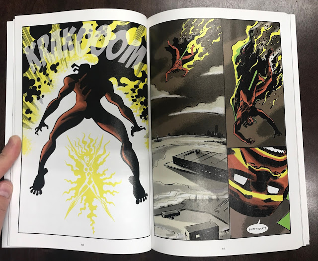
It was totally fine. The liner notes, at the start and at the end, describe it as part of a New Brooklyn trilogy, about a world where Brooklyn secedes from America, and art becomes its natural resource of sorts. It's a cool hook for a story, but it's not in this book. This book is 95% fight scenes.
The concept behind the character is stated to be a mix of Jack Kirby and Alex Toth. The Red Hook is a boxer with a hook punch that left opponents bloody and red. He starts a thief, but is is magically forced to help people due to the dying final act of another superhero.
The art is good, retro cartooning, with some flourishes into loose brush work. He gets the boombasticness of Kirby, and the movement and shadows of Toth. It's very confident. The color is unusual, this brown/gray background with bright figures.
But that's the book: a bunch of fights, with an origin story thrown into one of them. Maybe the closest book to it is COPRA, a book done for the love of superheroes, capturing the vibe, but not always a coherent story. There is a relationship between the Red Hook and his girlfriend, the Possum, but she's not a very clearly delineated character. And I have to wonder if it had to do with the original format...
Most of the book was originally printed in LINE Webtoon, and I wonder what difference it would be to read it that way. I'm not going to do read it like that. I like comics on paper, and am about as interested in reading comics on my smartphone as my grandpa was when I tried to get him to play my Gameboy in '88. Anyway, I don't know how much of a story Webtoon distributes at a time, but I imagine there's some demand to keep people's attention, and that might mean less time is spent on slow scenes. I don't know, I'm trying to think about why the book was so fight focused. Probably that style does work a lot better when scrolling on your phone.
It won a web comics award, so some people were excited by it.
 |
| "Break your heart," a reference for the type of people who read retro superhero comics |
Of the Image Comics I read, I rarely want to read more. (Price and the joy of uncovering a gem keep me sampling them.) Most of them end their trades on a cliff hanger and an incomplete story. This has a tag on the end promising further adventures, but it's a relatively one-and-done trade, so it was satisfying in that way. I don't think I'd read more unless it was similarly marked down in price though.
The actual concept of New Brooklyn as described is cool. A pro-art new society is totally something I want to read about. That wasn't this. Since there are other books in this world, maybe as a piece of the whole tapestry, this works really well, but on its own, it's not quite compelling.


No comments:
Post a Comment